


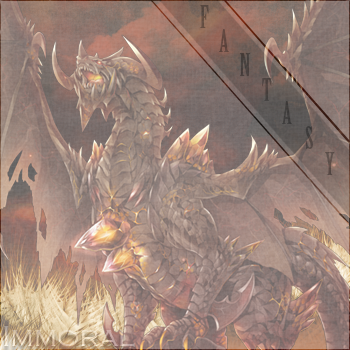
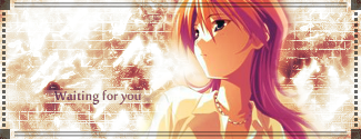
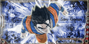
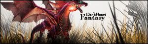
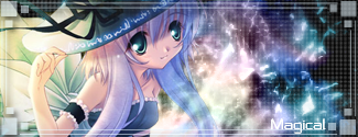
I haven't done much with Photoshop in a while, but have been considering getting back into it. All comments and critiques are welcomed. These are in no particular order as to when I made them.

 AnimeGalleries [dot] Net AnimeGalleries [dot] Net |  AnimeWallpapers [dot] Com AnimeWallpapers [dot] Com |  AnimePedia [dot] Com AnimePedia [dot] Com |  AnimeGlobe [dot] Com AnimeGlobe [dot] Com |


 Reply With Quote


Bookmarks