

 AnimeGalleries [dot] Net AnimeGalleries [dot] Net |  AnimeWallpapers [dot] Com AnimeWallpapers [dot] Com |  AnimePedia [dot] Com AnimePedia [dot] Com |  AnimeGlobe [dot] Com AnimeGlobe [dot] Com |
| AnimeGalleries [dot] Net | AnimeWallpapers [dot] Com | AnimePedia [dot] Com | AnimeGlobe [dot] Com |


Last edited by blueangel06661; 07-21-2012 at 09:13 AM.
Sig ^ made by @Kaleohano *hugs*
 Mugiwara-no-Basuke thanked for this post


i like the third one best. Thee words go along with it very nicely
Hmmm... Been a whileSit back some time and simply ask yourself, [Link]->"Do you even lift, bro?"<-[Link]


The second one looks insanely cute although it could use a bit more advanced detail. I like the girl in the third one, but first one is certainly interesting though.


Love all three, but the first is my favorite, must be the wolf.All three though have great coloring and mixture to them. Plus I like the fact all three are have a different feel and look as well as mixture of techniques, at least thats what it looks like to me.
Nice job

Really nice sigs, thanks a lot for sharing!
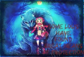
1) Very nice, love all the blue contrast plus the wolf envolving her. But I think it'd be better without all that text
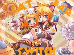
2) Really like the colours, by far my favourite from those 3
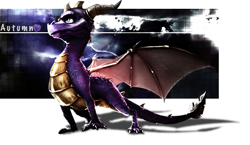
3) It's the simplest of them. Again too much text on it, I'm afraid and I also think you could improve the colours a bit, make it more shinning
And you should make them bigger
Last edited by Mugiwara-no-Basuke; 07-23-2012 at 03:59 PM.
"I never think of the future. It comes soon enough."
"The secret to creativity is knowing how to hide your sources."
"Great spirits have often encountered violent opposition from weak minds."
"Common sense is the collection of prejudices acquired by age eighteen."
"I want to know God's thoughts; the rest are details."
"Imagination is more important than knowledge."


I'm not good at signature making, but here's my honest opinion. In all of your three signatures, I can't read what you wrote. The colour of the fonts do not stand out or blend too much with the background colour, making them very hard to read. Try to make your fonts blend well with the background. Of all three, I like the 2nd signature's font because it's the only one that stands out. Also, the renders all look like they are copy-pasted on to a background. Try to create more depth by using sharpen/blur, especially for the second signature.
I like your use of colour though (except for the fonts). Some are light and some are dark. Hope to see you improve in the future, good luck!
>>Enter My World<<
Thanks to Ms Lucy for this awesome, funny gif.
The person that you are now is not the person that I used to know. You're becoming a stranger that I've never met before. Not liking the change though.
for my bestest guy friend on AF!!! comments are well accepted!! love you guys!!!
Sig ^ made by @Kaleohano *hugs*


I wish I was your bestest guy friend now. I dig that last signature. Keep it up!
[x]
Haha. You're too sweet @~Aki anbā~ . You've been missing for a while. My sig making as improved by A LOT. check out my thread. I'd be happy to make you a new one. Just tell me what you want on it. Or should i surprise you?
Hmmm... Been a whileSit back some time and simply ask yourself, [Link]->"Do you even lift, bro?"<-[Link]


If it was used as a signature, the maximum size would be 500x250.Originally Posted by ~Aki anbā~

Allow me to evaluate. The render you used is stretched out so badly that it's focused more to her breasts than anything else. It doesn't look good at all. I'm a little curious on what program are you using to make your signatures.
I suggest using some brush, textures, colours, etc. to make things look a little more decent though. Lastly, I'm not digging on your typography style and placement. I can't see Kale's name, and you're placing your subtext in an area where I can't see anything at all. All I can say really is that: you should be good as your reference. Get good ones.
 Ape liked this post
There are currently 1 users browsing this thread. (0 members and 1 guests)
 Posting Permissions


 Reply With Quote


Bookmarks