
Originally Posted by
blueangel06661

At first I wasn't going to vote because of the poll. It just makes things too easy as no one goes in depth as to WHY they voted for an entry. But here we go. I vote for B
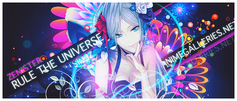
Entry A: There is no flow to this signature. It's just a bunch of squares behind a render. Some large text and some smaller text. The animegalleries text does not blend with the text above it and sicks out like a sore thumb.
Entry B: This one has an elegant but sandy/beachy sort of flow. It reminds me of a music fest held at a beach. The vectors are nice and flow well. There is more pop than Entry A with a clear background middle ground and foreground.
------------
Seriously? No better reason to vote for a signature other than "oh.. I like the bg and it's colors.." "oh! I like the musical notes ^___^" /facepalm


 AnimeGalleries [dot] Net
 AnimeWallpapers [dot] Com
 AnimePedia [dot] Com
 AnimeGlobe [dot] Com

 Reply With Quote


Bookmarks