


Decided to mess around with smudging and blending in this one. I like the result very much
With legs or without? I kinda like without a bit more

 AnimeGalleries [dot] Net AnimeGalleries [dot] Net |  AnimeWallpapers [dot] Com AnimeWallpapers [dot] Com |  AnimePedia [dot] Com AnimePedia [dot] Com |  AnimeGlobe [dot] Com AnimeGlobe [dot] Com |
| AnimeGalleries [dot] Net | AnimeWallpapers [dot] Com | AnimePedia [dot] Com | AnimeGlobe [dot] Com |


Decided to mess around with smudging and blending in this one. I like the result very much
With legs or without? I kinda like without a bit more
Last edited by Kaleohano; 08-06-2012 at 04:12 PM.
Hmmm... Been a whileSit back some time and simply ask yourself, [Link]->"Do you even lift, bro?"<-[Link]
 Mugiwara-no-Basuke liked this post
If you like FMP, I hope you get at least a giggle out of this one
---------- Post added at 01:56 AM ---------- Previous post was at 12:27 AM ----------
@Ellipsis
I wanted to enter this for the 5 min sig. But it won't let me

Hmmm... Been a whileSit back some time and simply ask yourself, [Link]->"Do you even lift, bro?"<-[Link]
Ape liked this post
Just messing around. Figured this one fits me pretty well
---------- Post added at 07:29 PM ---------- Previous post was at 04:25 PM ----------
You just gotta love Toa. How could i resist making a sig?

Hmmm... Been a whileSit back some time and simply ask yourself, [Link]->"Do you even lift, bro?"<-[Link]
Here ya go @Ape . I made one thats more your style (not as good as you woulda done it. but still, lol)
You're turn to go for happy and bubbly!
Hmmm... Been a whileSit back some time and simply ask yourself, [Link]->"Do you even lift, bro?"<-[Link]


Oh man, you're really gonna make me do this bubbly crap. Haha. I think this is your best one so far. You're excelling pretty quickly, I guarantee by the end of the month your stuff will be sick and we will need to collab on something :P
[x]
@Ape
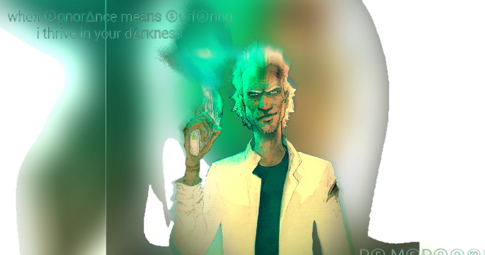
Heres some more dark. lol
I gots mixed emotions about this one. Don't know if i like it or not.

Hmmm... Been a whileSit back some time and simply ask yourself, [Link]->"Do you even lift, bro?"<-[Link]
The only thing I'd say is to figure out gradient maps and photo filters so it looks like they are on the same level. Btw, for fire, putting it on lighten is a great way to add some effect to the render/stock itself. It's great. I'd say this one is your best so far in terms of colors and overall fundamentals. I like it, find some new text though dammit! :P I like the gradient you put on the text though, real talk.
[x]
@Ape
Thank you very much for the tips. I'll have to hit up google and youtube cuz i have no idea what gradient maps or photo filters are. i'll figure it out over a few beers though haha
I'll edit this sig some more later and post the results.
as far as the text
I like my text, but i guess people do like seeing more variety. haha okiday. next one will be different
Hmmm... Been a whileSit back some time and simply ask yourself, [Link]->"Do you even lift, bro?"<-[Link]
We have to get together on MSN or Skype one day and just go over some basics and help each other out, if you're down :3Originally Posted by Kaleohano

[x]
hell yea dude. i'd be down!
---------- Post added at 06:25 PM ---------- Previous post was at 05:30 PM ----------
@Ape
Ok played around with the Photo Filter and Gradient map. Tried out the lighten thing. I can see where i could use that. It just didn't work to well with this one. anyways, heres what playing around a bit resulted in.
Then i played some more and suddenly was like
cuz i made it like this lol
i diggit haha
Last edited by Kaleohano; 08-09-2012 at 11:26 AM.
Hmmm... Been a whileSit back some time and simply ask yourself, [Link]->"Do you even lift, bro?"<-[Link]
Ape liked this post
That green one is sick! Looks like a solid improvement from before man. Color me impressed
[x]
Ok. this wasn't originally intended to be a sig.
My goal was to make an anime girl blend n to a non anime background as a way to familiarize myself with different filters and editing techniques.
But i then turned it into a cute sig
here is the background
and here is the girl
and v-There-v is the sig
I'ma use this thread to sorta document my learning Photoshop lol
Last edited by Kaleohano; 08-09-2012 at 01:27 PM.
Hmmm... Been a whileSit back some time and simply ask yourself, [Link]->"Do you even lift, bro?"<-[Link]
Ease up on the top left corner a little bit, you can start off completely white for lighting but take a soft round brush around 30 percent opacity and erase inward (toward the corner) until it's not as bright as it is now. I do like how the lighting hit's the render, it's very good placement, but you could take some off the light off of her face. You have to assume the light source is coming from behind and up, so the front of the face wouldn't have all that light on it. Not much to critique here, a very simple signature, and very nice looking. I like how you haven't settled with one particular style yet.
[x]
Thanks for the advice again. I'll see what i can do.
as far as settling for one style,I've never really been one to settle for just one style in anything i do. Call me greedy, but i want it all lol. Even in car audio, i never settled for just Sound Pressure, Sound Quality, or Cyclone. I studied and built everything so that now a days i know how to combine all of them. I have that same goal with these sigs. I wanna be able to do it all and combine different elements at my will.
Real talk cuz thats how I do!
---------- Post added at 09:49 PM ---------- Previous post was at 09:04 PM ----------
@Ape
Alrighty. Made it darker, did some shading on the dime, and quoted zombieland.
i think i might have gone a bit too dark though.

Hmmm... Been a whileSit back some time and simply ask yourself, [Link]->"Do you even lift, bro?"<-[Link]
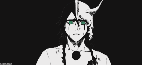
I had to go for retro at some point. Heres my first attempt

Hmmm... Been a whileSit back some time and simply ask yourself, [Link]->"Do you even lift, bro?"<-[Link]
As far as my small library is concerned, this one is a very different direction for me.
And its for @Ape . Thanks for the support man.
Heres a less blurry version

Last edited by Kaleohano; 08-10-2012 at 04:36 PM.
Hmmm... Been a whileSit back some time and simply ask yourself, [Link]->"Do you even lift, bro?"<-[Link]
@Dr.LeDoom!
Dude i made a trippy sig while totally wasted. It kinda makes me think of you haha
---------- Post added at 06:18 PM ---------- Previous post was at 03:06 PM ----------
Made this sig for a Member. She wanted an Evil Miku with specific writing.
Its hard to find an evil picture of Miku, so I ended up using this.
After much editing ended up with this
I hope she likes it!
Last edited by Kaleohano; 08-11-2012 at 12:28 PM.
Hmmm... Been a whileSit back some time and simply ask yourself, [Link]->"Do you even lift, bro?"<-[Link]


N'yeaaah, I do sorta feel like what that sig depicts, at times.
Tell ya what, I accept it. And tonight, or some other night that I'd have some spare time, I'll get totally high and make a sig for you! Hopefully, I'll remember.
Last edited by Meenah; 08-11-2012 at 04:58 PM. Reason: Do not quote images


I love it!~ You are just awesome! :3
So much of the other sig I had, this one is way much better!
Arigatogozaimasu~
Thats wassup bro!
btw, what you wrote under the sig, Dope as F***. haha i diggit!
Last edited by Kaleohano; 08-11-2012 at 08:44 PM.
Hmmm... Been a whileSit back some time and simply ask yourself, [Link]->"Do you even lift, bro?"<-[Link]
Ok @SIZARY-MOMO . I done made a sig for you. Why? Cuz i'm just that much of a sweetheart I am.
http://i.imgur.com/MFpzA.jpg
Last edited by Kaleohano; 08-12-2012 at 09:01 AM.
Hmmm... Been a whileSit back some time and simply ask yourself, [Link]->"Do you even lift, bro?"<-[Link]


Oh my god! Ezio!!! I love @Kaleohano !!!
*death hugs Ezio and Kaleohano*
Last edited by Meenah; 08-14-2012 at 12:41 PM. Reason: Do NOT repost image
Darling you'll be ok.❤ ~Pierce The Veil
Sig for miss @~Aki anbā~ Ejoy
http://i.imgur.com/AwNwh.jpg
---------- Post added 08-13-2012 at 12:25 AM ---------- Previous post was 08-12-2012 at 10:33 PM ----------
[/COLOR]eh. nothing special. just tired, bored, and watching Rosario+Vampire atm
and a bit of a variation

Last edited by Kaleohano; 08-12-2012 at 05:51 PM.
Hmmm... Been a whileSit back some time and simply ask yourself, [Link]->"Do you even lift, bro?"<-[Link]
Ape liked this post

Brah, you need to work on having a balance. A lot of your sigs feel waaaaaaay to simple and while some...well, they look like a mess.
You got tight concepts, bro some of them come out blah but some come really good, I personally think you set up a bar with your Chibi Amaterasu sig, maybe make the font more clear but otherwise, you did pretty good there but then after that one, you went down. The one in post 26 is decent as well.
You shoud really use tutorials and look at other work to give you ideas and inspiration to make things. That's what I do when I have no idea what to create....
Nice work though, but gotta improve.

I have to go what @Kaibro says and some of them now come out as good but some of them are a little bit messy. View more tutorials around deviantArt because it helps out so much when you are improving on your work.
http://i.imgur.com/AwNwh.jpg
This may be so far my favourite work from you. I like the overall composition of it.
There are currently 2 users browsing this thread. (0 members and 2 guests)
 Posting Permissions


 Reply With Quote


Bookmarks