


Right, I just woke up this evening and in a mid-hour of sobriety, I finished the rest of the sig I promissed ya.
I think I'll fit you by analogy.
 AnimeGalleries [dot] Net AnimeGalleries [dot] Net |  AnimeWallpapers [dot] Com AnimeWallpapers [dot] Com |  AnimePedia [dot] Com AnimePedia [dot] Com |  AnimeGlobe [dot] Com AnimeGlobe [dot] Com |
| AnimeGalleries [dot] Net | AnimeWallpapers [dot] Com | AnimePedia [dot] Com | AnimeGlobe [dot] Com |


Right, I just woke up this evening and in a mid-hour of sobriety, I finished the rest of the sig I promissed ya.
I think I'll fit you by analogy.
Last edited by blueangel06661; 08-14-2012 at 05:18 PM. Reason: thread is for kales works only


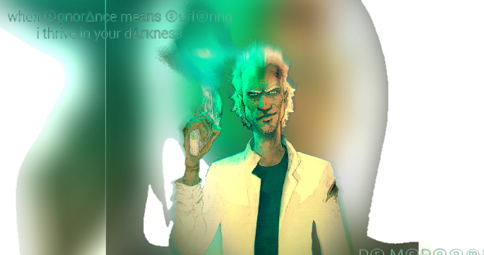
Bored, being bored. Drank too much. my head hurts. oh well. made a sig
---------- Post added at 06:39 PM ---------- Previous post was at 04:01 PM ----------
yup

Hmmm... Been a whileSit back some time and simply ask yourself, [Link]->"Do you even lift, bro?"<-[Link]
Sig made by request of Khronik
---------- Post added at 05:06 PM ---------- Previous post was at 12:40 PM ----------
Here ya go guys
more boredom
---------- Post added at 09:23 PM ---------- Previous post was at 05:06 PM ----------
Sig for @animeyay
Felt like thuggin your sig a lil
feel free to use it if you want
http://i.imgur.com/reNDh.jpg
Hmmm... Been a whileSit back some time and simply ask yourself, [Link]->"Do you even lift, bro?"<-[Link]
 Ape liked this post
Did something a lil different. I Think i was Semi Successful. Any imput on this one would be greatly appreciated.
The main problem was that i wanted to make the car look a little more like a drawing.
like i said, i feel that i was semi successful.
troll sig for gerll loves somethingoranother

Last edited by Kaleohano; 08-19-2012 at 10:17 AM.
Hmmm... Been a whileSit back some time and simply ask yourself, [Link]->"Do you even lift, bro?"<-[Link]
George Carlin for the win!
and once with them borders that i love oh so much

Last edited by Kaleohano; 08-20-2012 at 08:36 AM.
Hmmm... Been a whileSit back some time and simply ask yourself, [Link]->"Do you even lift, bro?"<-[Link]


I really love how vibrant the colors are :O The stocks also look wonderful (Can I get those stocks? ; U; ), but they look slightly blurry. I also think there's a bit too much white in the background, and the font bothers me a bit. Maybe a skinnier and smoother font would do, but that's just me.Originally Posted by Kaleohano

Did you use Photoshop for those? If you did, you should mess around with the Color Balance or Selective Color some more to balance out the white.
Last edited by blueangel06661; 08-20-2012 at 02:43 PM. Reason: Do NOT quote images
Thanks for the input. I'll go play around with it some more. and yes, i use CS6.
Background
George Carlin
Hmmm... Been a whileSit back some time and simply ask yourself, [Link]->"Do you even lift, bro?"<-[Link]
Your welcome, and thank you for the stocks. I just wanted the background
Mmk
@A. D. Angelo tell me, waddaya think of this one?

Hmmm... Been a whileSit back some time and simply ask yourself, [Link]->"Do you even lift, bro?"<-[Link]
Hmm....It's really cute, and you did a very good job on the color combination, and I like what you did with the yellow stuff going over the border. But, I personally think you should remove the borders, because that adds a whole different theme to the signature. You want to try to stay with the same theme as much as possible. Also, the light turquoise glow around Miku and the plant to the left of her doesn't blend in as well as the other colors. You can change it to a different color that's a shade of green or yellow, or remove it. Oh, and add a watermark, and I really mean it >.> Your work definitely has a mild chance of getting ripped, and trust me, you may not care so much about it now, but in the future, if it gets ripped, there might be a bunch of chaos, and,..yeah v.v And yes, I've had my graphics stolen before, and the problem lasted for a week.
Other than that, everything else is wonderful, especially the background and how the vibrant the colors are
I see what you're saying. and i still have some time to skedoodle around some. thank you!.
as far as the watermark goes, i'm a soldier. Not a graphic designer or anything. this is just something i picked up like 2 weeks ago. If someone steals my stuff, it really don't bother me. Not like i'm losing money over it. If someone feels that my stuff is good enough that they'd want to claim it as their own, i'll take it as a compliment and have some of my buddies track down where they live. bahahaha!

Hmmm... Been a whileSit back some time and simply ask yourself, [Link]->"Do you even lift, bro?"<-[Link]
LOL xD
That reminds me, you should try out different styles, and I'm talking about messing around with the shape of signatures. You don't have to do it if you're not comfortable with them, but if you want to try it out, I can provide you with a few tutorials, but not now. I have to look for them first v_v The styles can give you some new ideas to use.
I'd love to!
colors came out a lil different this time. kinda like it though lol
i think i need to blur it a little

Hmmm... Been a whileSit back some time and simply ask yourself, [Link]->"Do you even lift, bro?"<-[Link]
Then please wait a while 8D
I like this one better
Last edited by Meenah; 08-21-2012 at 11:36 PM. Reason: Do NOT quote image
Well i've got till the 3rd of october lol
k. Lil blurrage

Hmmm... Been a whileSit back some time and simply ask yourself, [Link]->"Do you even lift, bro?"<-[Link]
@A. D. Angelo
gave the styling thing a try after one that you made. I don't think i'm quite good enough for that yet lol

Hmmm... Been a whileSit back some time and simply ask yourself, [Link]->"Do you even lift, bro?"<-[Link]
It takes practice v.v And you should start off with a more simple style. It seems like I'll have to make the tutorials, because I want to make things simple for you.
But anyway, I like the concept of the triple background, but I'm not 100% sure about it. For some reason, I feel like it's not a necessary thing to do, even though I like the concept of it. The sparkles look blurry, and I feel like the white and sparkles are kind of overpowering the other colors of the graphic. Also, to make your life easier, I don't think it's necessary to leave the render in the background. If the background wasn't made by you, you should make it yourself. But, if you want to keep that style, personally, I think you should only remove the parts of the render that's on the background that are popping out.
Also, the 3D style isn't always the render popping out like that. The main factor of the style is the background. The render doesn't have to appear out the background. It could be standing out, or sitting on the background or whatever. As long as the background looks like it's floating, then you got the 3D. To be honest, I think this style should be called the "Floating" style, but hey, can't do anything about it :/
Have you tried doing animations? :o If you haven't, then you can try that. If you want to try an animation like my iPod-tan signature in my gallery though, I can make a tutorial for that, but you're going to need a lot of layers v.v
Last edited by Meenah; 08-21-2012 at 09:37 PM. Reason: Do NOT quote image
yea, i was trying to make it look like they were getting peeled out of the background. Looking at it, i see all the mistakes you pointed out. It also doesn't help that i worked on it with a black background. On a brighter color, it does make everything look much more overpowering. I may try to do another on at some point, but i think theres still a lot of basics i need to get down first.
Hmmm... Been a whileSit back some time and simply ask yourself, [Link]->"Do you even lift, bro?"<-[Link]
Not a good idea to work with a black background when it comes to styles like this. I suggest to always work with a transparent background, even if it'll be hard to see the light stuff. But, when using light colors outside of the background, you can use the dark background to check if anything's being cut off. If there are any parts being cut off, then erase those parts.
As for the basics, when dealing with styles like this:
 Kaleohano thanked for this post
Which sig(s) are you talking about?
@A. D. Angelo
Made my own background with this one
heres the render
Last edited by Kaleohano; 08-22-2012 at 10:11 AM.
Hmmm... Been a whileSit back some time and simply ask yourself, [Link]->"Do you even lift, bro?"<-[Link]
o.o Did you use more stocks than brushes? Because even though stocks are nice to use, brushes are also important. It's nice, but I feel like it's lacking something, maybe a bit of creativity. To be honest, it looks typical and simple because all I can see is the render, something in the back, and light. I'm not trying to offend you or anything. I'm just trying to say that you should go with something with less simplicity, because simplicity is way too popular >.> I know this is just my opinion, but don't always concentrate on making it contain every single element of GFX like having a flow, effects, and a good amount of stocks.
Anyway, try making backgrounds with a good amount of brushes, and the amount of stocks and brushes used should be blended in well enough where you can see both the brushes and stocks easily.
Na. i totally get what you mean. it is missing something, was hoping for some ideas on what lol
As far as stocks, its just the render. All the rest is brushes and smudging. oh. and a effect c4d
Hmmm... Been a whileSit back some time and simply ask yourself, [Link]->"Do you even lift, bro?"<-[Link]
Oh....-facepalm-
You can add some kind of effect behind the render that looks like it's going towards the light. You can use a few abstract brushes for that kind of effect, but make sure they look like they have a flow to them.
@A. D. Angelo
well, the idea is to make it look like the render is being blown apart from whatever the light is. how would i go about doing that?
Hmmm... Been a whileSit back some time and simply ask yourself, [Link]->"Do you even lift, bro?"<-[Link]
@Kaleohano :
I think you did it just fine since I'm not an expert on that, but I guess you can use small splatter brushes on a new layer that kind of outlines the render.
Steps:
1. Create new layer and use small splatter brushes that kind of outline the render.
2. Select the new layer, inverse the selection, go to the render layer, and erase some of the parts.
I hope this will work >.>
There are currently 2 users browsing this thread. (0 members and 2 guests)
 Posting Permissions
 Reply With Quote


Bookmarks