


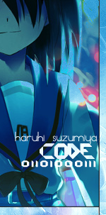
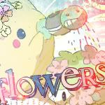
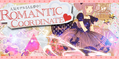
Here is a special. I have been debating on uploading these to my thread for a while now since they are banners/advertisements for a local convention form. But they are still my works so I'd like to showcase them here.
Banners-

 AnimeGalleries [dot] Net AnimeGalleries [dot] Net |  AnimeWallpapers [dot] Com AnimeWallpapers [dot] Com |  AnimePedia [dot] Com AnimePedia [dot] Com |  AnimeGlobe [dot] Com AnimeGlobe [dot] Com |


 ----
---- 
 ----
---- 


 ----
---- 


Bookmarks