


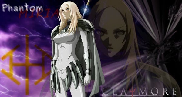
Ok, so I actually made a super simple no-effect sig before just cut and paste a few pics, but this will be my first creation using effects I guess you could say.
Now I am pretty much a complete newby to digital art. I mean I know basics about photography and basic photo editing but thats it. I had no clue what to do so I watched a few tutorials, including blueangel and elepsis's here to get the basics. I even had to google the terms like c4d, and I still don't know what a few of the instructions actually meant. I had only learned what layers are recently trying to do HDR photo editing by watching a few tutorials on that.
I know I already put it as my sig - I was happy with it personally and that was good enough for me. But the more I think about it, if there are ways to make it better I am all ears. I'm using Gimp 2.6.12 on Ubuntu just FYI, and I know that version I think is out of date I just havent upgraded yet to 2.8 or whatever it is.
 AnimeGalleries [dot] Net AnimeGalleries [dot] Net |  AnimeWallpapers [dot] Com AnimeWallpapers [dot] Com |  AnimePedia [dot] Com AnimePedia [dot] Com |  AnimeGlobe [dot] Com AnimeGlobe [dot] Com |
 Reply With Quote


Bookmarks