


These are the ones that I like so far.
SETS


^awesome wp by blueangel066601^

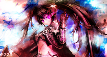
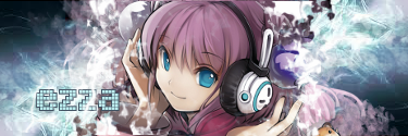
SIGS
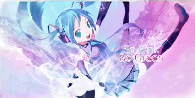
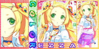
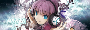
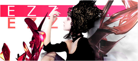
So.. I've been doing some tinkering. I just want to ask you guys which one looks nicest. Please give me comments, tips and advice. Thanks!

 AnimeGalleries [dot] Net AnimeGalleries [dot] Net |  AnimeWallpapers [dot] Com AnimeWallpapers [dot] Com |  AnimePedia [dot] Com AnimePedia [dot] Com |  AnimeGlobe [dot] Com AnimeGlobe [dot] Com |


 Reply With Quote


 kind of getting lazy and it was just a last minute detail.. thanks for the comment.. ill try to do better next time..


Bookmarks