


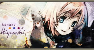
All I can say is Awww it so cute o.o... Gj keep it up ^^Originally Posted by karuto

 AnimeGalleries [dot] Net AnimeGalleries [dot] Net |  AnimeWallpapers [dot] Com AnimeWallpapers [dot] Com |  AnimePedia [dot] Com AnimePedia [dot] Com |  AnimeGlobe [dot] Com AnimeGlobe [dot] Com |
| AnimeGalleries [dot] Net | AnimeWallpapers [dot] Com | AnimePedia [dot] Com | AnimeGlobe [dot] Com |


Gla you liked it ^^
New one for me:

Request by Kana-kun:
I didn't like the signature at all. I was so mixed up, I didn't know what to do...
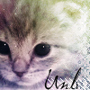
Oh, yeah!! I just remembered. Does anyone want a tut on the kitten avatar? Everyone likes it so much, I thought I'd do one.
Outcome of .lovebeat's tutorial:
and collab sig by Knufflies and me. This took a month or more to do...
We BOTH suck at text placement though >_<

Don't worry, I suck too at text placement.
However, you shouldn't spread your text too far away next time.
But ti is pretty unique.
The circles don't really seem to fit the overall color theme though.
Oh yeah, by the way...
The avatar is win. =D
Thank you Balance!! Yo've got WAY WAY better at text placement, you know. I'm still on that old level even after six months of practice. I guess I just need more.
Update: LOTS OF NEW AVAS!!!
Request by Licium:
and:

Last edited by Hautalken; 09-18-2008 at 12:50 PM.

I know I spoilt the second one. It just didn't come out right...wasn't being co-operative at all...
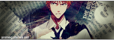
Here another one I just did 5 minutes ago:
The stock is a screenshot from Fullmetal Alchemist Episode #4: A Forger's Love.
EDIT:
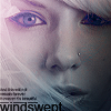
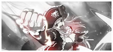
SOTW entry!
Last edited by Hautalken; 09-14-2008 at 02:12 PM.


Thank you so much for the avas! Reps!
I was gonna comment earlier but I forgot...
Glad my avatar tutorial was of help to you, the outcome looks good!
You're very good at avatar making, but I don't like that there's so much effects going on on their faces. (Post #181) The colours are pretty nice though.
WOOHOO!!!!!!!!!!! Finally! Some critique ^o^
I'll try to lower the usage of effects. I know I overdo stuff, but I can't help myself.
I'm a sad case :/
More stuff:
The stock for the second one is by Resurger from deviant art.
Last edited by Hautalken; 09-18-2008 at 12:55 PM.
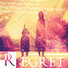
Twilia...
You seem to be the only person who's interested in my stuff. I told you guys my stuff was dumb :/
And I know that hting is oversharpened. I tried erasing out a lot of the sharpened layer but I guess it didn't work. I think I'll have to remove it altogether. But I'm too lazy to edit >_>
2 new avas:

I'm not ok with the second one. Something isn't right and I can't quite put my finger on it.
My signatures are turning out crappier than ever. So I'm going to stop for a while and keep to avas. They're easier anyway...

~Dude oÔ....omgawd!! You are WAY better than me!! I love your avas...both of them....oÔ....how can you say that the 2nd one's isn't right? It is awsome!!
and how can you say that your stuff is dumb??? it is WAY better than mine
Last edited by .fnhvmnvmv; 09-21-2008 at 08:27 AM.
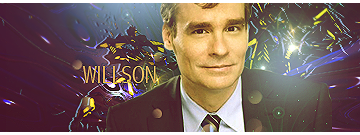
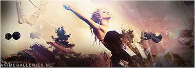
I'm gonna comment on that D.N. Angel avatar you're using and made, because that's the kind of style I like.
Yes, it's a nice style. The colours are warm and nice. But at the bottom you put a copy of the stock (whatever) into this little stroked square. Rather than just doing that, you could've put two of them beside each other, or a big one that will fill the whole layer out at the bottom rather than just a part of it, like this:
X | XXX
X | XXX
--------
xxxxxxxx
OR
X | XXX
X | XXX
--------
xxx | xx
You did this:
X | XXX
X | XXX
XX | xx
X = Image, big. x = Copied image you're using at the bottom, - or | = stroke/border
Get what I mean? At least I believe that would make it look better. But you're very good at avatar making. (And I might just be too picky about what I like/don't like...)
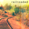
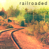
"railroaded" you got this big transparent square on the right, that's the problem.
Last edited by .Lovebeat; 09-21-2008 at 08:57 AM.
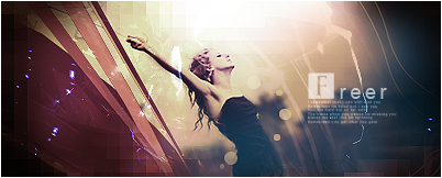
Wow, your avvies are so awesome that I couldn't choose which ones to address... ^^
The first one is brilliant - I love the coloring, and the text fits perfect with the image. I love the colors one the second one. Maybe the thing that is off is the kind of odd bright line on the right that goes through the road portion of it. Other than that, it looks perfect to me.
I am interested in everyone's work.
I truly love and admire art, especially when its people spending their time who I talk to who I'm aware take quite a bit of their time to make it.
Don't think your work is stupid at all.
It will then become stupid if you begin to think that, because you effort and passion will decrease and definitely begin to show on your work.
Also, I struggle with oversharpening, and I hate it with a passion.
That is exactly why I usually don't make Anime/Manga and cartoon signatures and avis.
It always looks too oversharpened.
It takes a LOT of work in my opinion to work with sharpening, smudging, and texting tools.
They are the little connections and details that make the work lot whole and fabolous.
I feel like I am looking out of a train window in your railroaded avi.
The way you messed around with the colors gave it a vintage vibe into alil presence with that streak.
~I have got a request...^^
I want you to make me an set with this hwat pic ... jared leto.
Siggy size: 500x200
and 100x100 avatar...please....^^
*hugs* thank you! =)
oh and i want the sixpack in the sig XD
http://jlczgallery.jl.funpic.de/albums/From%20Yesterday/bscap0252.jpg
Last edited by .fnhvmnvmv; 09-23-2008 at 03:57 AM.
I just had a REALLY evil thought.
.Lovebeat: You don't like it?? You seem to have a point though. I'll see if I can make changes. Thanks for stopping by.
Mira: Thanks for your comments. So the white line isn't good, huh? I guess that's what was bothering me. I'll fix that in a jiffy ^^
Twilia: Inspired me a lot. Thank you ^^ I really appreciate every word you said. You cheered me up, actually.
Miss-a: You should have PMed me the request instead of putting it down here...
I don't know if I can do this. I'm horrible with real-people-sigs and I already have a few requests hanging. But I'll give it a shot later this week and let's see if you're satisfied.
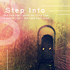
New sig for the time-being:
DARN!! I forgot to make an ava for that one. Shoot...
Ooh, I like that sig! The text looks just fine and it's readable! It's rather hard to have a lot of text on a sig imo because sometimes it's just too much, and sometimes there's not a good space for it, but you did it really well.
I like the background, and the colours, together it looks really good. And I think you did a good job at blending the extraction in IF it was an extraction that is...
I find the light spot a little bit odd though, but it's on the right place, just maybe lower the opacity a bit.
And about that avatar I earlier commented on: I like it. It's good. The colours and text is nice, it's just the bottom part I thought you could change a bit with the placement.
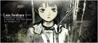
I'm glad I could pull off the text like that. However, I'm still not so sure. Oh and that's not an extract. It's a whole pic of Lain standing somewhere. I got it from digik.net.
& Don't worry about the ava, Megi. I know what you mean and I'll try to correct it. But for the time being, here's a corrected version of the railroaded ava.
The white line was bothering everyone wasn't it?
*EDIT::
New ava. Similar to the railroded one.
Last edited by Hautalken; 09-27-2008 at 11:56 AM.
Since the last SOTW:
I'm a TOTAL failure at these sort of sigs.
I think this next one is a better version:
I used a bit of Dot's tutorial for it.


I almost voted for your SOTW it was my second favorite, but did you see dotz entry?
Your entry was honestly amazing, I don't see why you didn't place, I love the smudging here, seeing as I epic fail at smudging. I love what you did with dotz tutorial, it's the "Oh em gee signature" tutorial right?
There are currently 1 users browsing this thread. (0 members and 1 guests)
 Posting Permissions


Bookmarks