


I made a few large signatures for usage at another forum. I'd like some critique on them.
 AnimeGalleries [dot] Net AnimeGalleries [dot] Net |  AnimeWallpapers [dot] Com AnimeWallpapers [dot] Com |  AnimePedia [dot] Com AnimePedia [dot] Com |  AnimeGlobe [dot] Com AnimeGlobe [dot] Com |
| AnimeGalleries [dot] Net | AnimeWallpapers [dot] Com | AnimePedia [dot] Com | AnimeGlobe [dot] Com |


I made a few large signatures for usage at another forum. I'd like some critique on them.


Well for starters they are insanely large. Most people are not particularly fans of signatures that take up half of the screen alone. Your font style is nice and I like it a lot but it can get a bit hectic to read IE: Shana and the Sora one. Though you are on the right track as far as effects n stuff go.
今日...明日...永遠に...
Interested in Pop-Up Cafes in Japan? Dango News is the place for you.
Dango News | Twitter | Facebook | Instagram


I'll start off by saying though they are large, they're not horrible. You've managed to use the space to your advantage on most of them, but here I go.
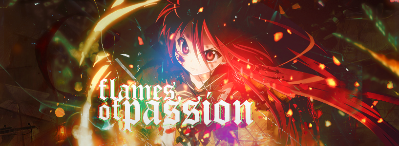
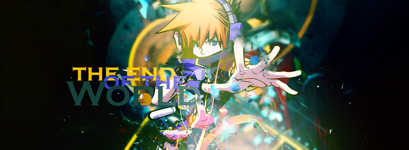
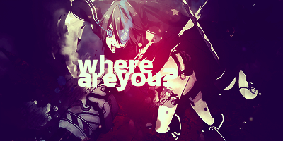
first: I really like the typography work here, but the red seems too strong for the rest of the sig. The depth is great, but the people in the background are a little distracting. You could try blending them in with the background a tad more, just so they don't stand out as much. Lelouch's hand looks weird as well. It looks like you started smudging but never quite finished it. All in all it's not great but not horrible.
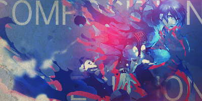
Second: Stronger than the first but there looks like there are too many effects randomly placed. There's a flow but it's harder to see than some, and the effects should go with the flow. The text is nice but distracting. Large text generally means another focal point, and with it so close to the character it sort of breaks your sig. The font somewhat works with it, but I'm sure you could find a better one.
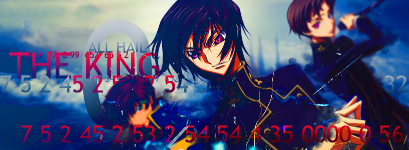
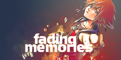
third: Probably the best of the 4. As always the depth is good, the placement is good as well. The only thing bothering mt are the clipping masks in it. They seem randomly splattered over it and most stand out too much. A suggestion would be to use the clipping masks near the bottom of your character to make it blend better, like in my sheik one for example. Apart from that there's only a few minor things, like the clipping mask on the text and his oddly blurry fingers.
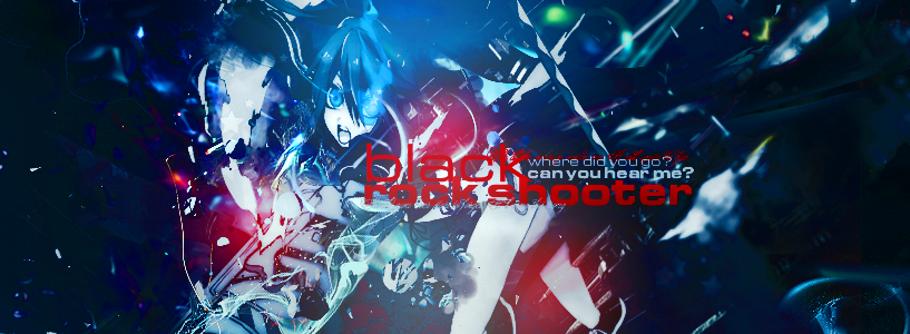
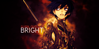
Fourth: In all honesty I can't tell what I'm looking at. there's a person, but the effects overwhelm it so much I can only make out pieces of it. The text is...okay.
From what I can see you're good but you overuse your effects a bit (like me). Maybe try doing something simpler, and only using 2 C4D's at the most. Or only using clipping masks. Try something that'll break your boundaries and expand on itI look forward to seeing more from you as well.
Last edited by Bulf; 12-11-2010 at 08:23 PM.

Very nice work. If I didn't make my own signatures, I'd ask to use one of these, for sure.
However, and these have already been mentioned I'm sure:
1) In the third one, there is a blotch covering the R in WORLD. Also, the text could be spread out more, the overlapping letters makes it slightly difficult to comprehend.
2) A different color of text in the fourth would be much appreciated. Too much red in one place.
Did one for my sig.
Another one out of boredom.
Last edited by under the rain; 12-18-2010 at 12:13 PM.
The fourth one is really hard to look at, mostly because there's too much going on. If you could simplify it, then that would be good.
Another thing is...the size. There are lots of people out there that will give you beef just because your signatures are to big.
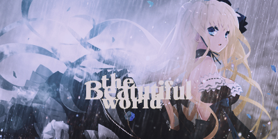
On the second two, the downsize is a vast improvement and the colors are nicely used together. (:
❝you're horribly facinating.❞

I don't understand why everyone is saying things about the size, he said that they were large signatures already in the first line o_O
For the third one, the colors you chose for the fonts just weren't...pleasing to the eye for me, mainly because of the goldish/yellowish one. Also, for the 4th one, I feel like she should be...stretched more? Not really sure how to put it, but her picture should be "wider".
I really liked the first one though
They may be large... But most forum goers do not like overly sized sigs that take up most of their screen. Thats why everyone has a problem with it. Though the two recent smaller ones were just fine. Even when you enter a signature in a contest they cant be that big.Originally Posted by PinkCherimu

Last edited by UrusaiSevera; 12-18-2010 at 09:15 PM. Reason: Someone needs to take off their cranky pants >___>;
今日...明日...永遠に...
Interested in Pop-Up Cafes in Japan? Dango News is the place for you.
Dango News | Twitter | Facebook | Instagram
Those last two are fantastic. The second one is a little washed out and I can't read the text, but otherwise great!
Some more:
With some contrast:

Last edited by under the rain; 01-06-2011 at 09:42 PM.
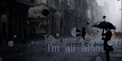
The second Sora (with contrast) is better than the first (without). My favorite is the one with rain "I'm all alone". It really establishes a mood, if that's plausible enough for anyone else.

Wow your signatures looking amazing! I love your use of color and text! ^_^ Try adding some borders in your signatures.
They Look real cool and Would look nice on a fourm but they are a bit big thow
I usually find borders annoyingly overused and unnecessary, but I may try at some point.
There are currently 1 users browsing this thread. (0 members and 1 guests)
 Posting Permissions
 Reply With Quote


Bookmarks