


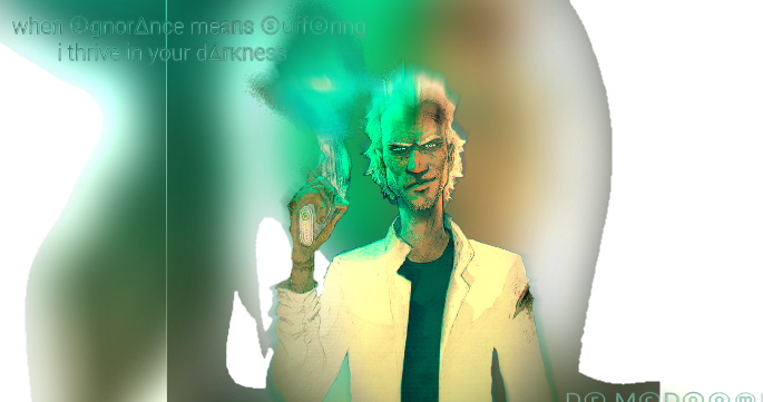
What are some of your favorite fonts? I'm sure everyone has one. Mine are probably Century Gothic, Helvetica, and Asinine. I don't really like a lot of fonts with serifs. D:
 AnimeGalleries [dot] Net AnimeGalleries [dot] Net |  AnimeWallpapers [dot] Com AnimeWallpapers [dot] Com |  AnimePedia [dot] Com AnimePedia [dot] Com |  AnimeGlobe [dot] Com AnimeGlobe [dot] Com |


 月の光は愛のメッセージ


Bookmarks