


this
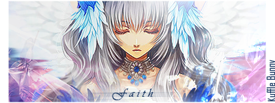
Too washed out. Makes it kinda boring. Amazing, there's flow O.O usually washed out, used-to-be vibrant colors just creates chaos. You'd have to thank the c4ds. =3
Other than that, maybe a light source? Focal point? Legible text? Get rid of the white space? Just some stuff to think about =D
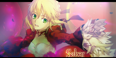
Edit: Not the white space on this sig, but on your saber and judgment sigs, there's too much unused area on the sig.
 AnimeGalleries [dot] Net AnimeGalleries [dot] Net |  AnimeWallpapers [dot] Com AnimeWallpapers [dot] Com |  AnimePedia [dot] Com AnimePedia [dot] Com |  AnimeGlobe [dot] Com AnimeGlobe [dot] Com |
 Reply With Quote


Bookmarks