


BLEH.

 AnimeGalleries [dot] Net AnimeGalleries [dot] Net |  AnimeWallpapers [dot] Com AnimeWallpapers [dot] Com |  AnimePedia [dot] Com AnimePedia [dot] Com |  AnimeGlobe [dot] Com AnimeGlobe [dot] Com |
| AnimeGalleries [dot] Net | AnimeWallpapers [dot] Com | AnimePedia [dot] Com | AnimeGlobe [dot] Com |


BLEH.
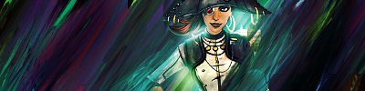
Out of the two Mass Effect tags that you've made, I prefer the second one. The colours work much better. Probably due to the fact that there's a good analogous colour scheme going on. The first just seems bright and dull at the same time. I think it's because the lighting makes her face appear more gray. Don't get me wrong though; I love what you've done to the first tag. Execution was just a little odd.
Something to add on the second tag. I think you can do better with the smudging. It seems very patterned. Do something more creative with the flow as you have done in the first one. If I could, I would have you ask Midnight Rider how to properly smudge.
Third tag, beautiful.
Fourth tag, I feel the same way about the smudging as the second tag.
Your style did change a little bit the last time I checked stuff out.
This, this, and this is pretty damn amazing.
 Vintniv thanked for this post


Comparing between two of your Mass Effect sigs you've done, I think if you used the colours you did with the second one for the first one it would look stunning. Same switch goes for the second sig, too.
The first sig is can really grab out my attention but it bothers me a little to see that her face looks gray for some odd reason, unlike the second one. Maybe it's out of your control, but it just a minor thing really.
I really love the smudge work, again something I wish I can do well for myself. ;_; But like what Balance said, it seemed so patterned. I feel like it should be like your other sigs and have that creative flow as well.
Your third sig, I think you were in a good mood doing it and it shows up. :3
Lastly for your fourth sig, it's not so much of my cup of tea. I love almost all of your sigs, but this one sets in more of "this is just okay". Maybe it's the colours, I would of used purples, oranges, and maybe some pink here and there.
I don't say it often, especially for you, but you have no idea how you can inspire me. The signatures are amazing just like the creator himself. Keep making more, I love coming here and getting inspired.
*whistles*

Nope.

 Famahama liked this post
*_____* M-may I use this...?
http://www.yinyanganime.com/intgfx/Lima.jpg
More.

Le sigh. This is post 6, without a reply. Jeez.


I know that feel bro
I love the colors and layout of the first sig and the type gives it a nice, completed feel
The smudging on the next two are very well done, but they both feel empty. They need a little more to them, possibly just something as simple as type.
The last is nice with its use of primary colors, but its just overall really distracting. The stock is just buried in a mass of shapes and lighting and its all on the left of the sig while the right is -really- empty
.-.
(o.o)
|=|
__|__
//.=|=.\\
// .=|=. \\
\\ .=|=. //
\\(_=_)//
(:| |: )
|| ||
() ()
|| ||
|| ||
==' '==


http://www.yinyanganime.com/intgfx/Romeo.jpg
The depth and how centrally focused it is, is outstanding. Nicely focused and well sharpened. (not too much, not too little)
http://www.yinyanganime.com/intgfx/Victor.jpg
I really just like the orbs color and flow of this tag.
http://www.yinyanganime.com/intgfx/cc.jpg
Outstanding typo. Very catchy and interesting. Good use of colors!
http://www.yinyanganime.com/intgfx/Exile.jpg
Multiple things going on here, yet you make it work. Though I will say the ray of light going over the extraction collides with the flow of the smudging from behind. Could've warped it a little to flow along with the smudging, but never the less still a good tag.
Last edited by blueangel06661; 11-24-2012 at 12:34 PM.
今日...明日...永遠に...
Interested in Pop-Up Cafes in Japan? Dango News is the place for you.
Dango News | Twitter | Facebook | Instagram

sera
what the hell
sera stop
omfg you're so good
These all stood out to me, I love your work <33
ein, zwei, drei, vier bin endlich weg von Dir
fünf, sechs, sieben, acht Du hast jetzt keine Macht
♥


http://www.yinyanganime.com/intgfx/Quint.jpg
Yes yes yesssssss
I have to say I really like the variety in styles on the last few. The lighting on the Mass Effect (i think that's what it is) one looks great, and the yellow one looks pretty good on its own.
I love the Raiden and Mass Effect ones <3 But especially the second last! I wish I could vector ;_;
ein, zwei, drei, vier bin endlich weg von Dir
fünf, sechs, sieben, acht Du hast jetzt keine Macht
♥
http://www.yinyanganime.com/intgfx/Wat.jpg
LOVE
I really admire the way you use C4D's ;;
And the Lyle/Lockon vector one is good too!
ein, zwei, drei, vier bin endlich weg von Dir
fünf, sechs, sieben, acht Du hast jetzt keine Macht
♥
http://www.yinyanganime.com/intgfx/Wat.jpg
I just really love how vibrant the colors in the lighting are. I like when lighting is done like this.
今日...明日...永遠に...
Interested in Pop-Up Cafes in Japan? Dango News is the place for you.
Dango News | Twitter | Facebook | Instagram
http://www.yinyanganime.com/intgfx/Gears.jpg
Gah, I'm so in love with this one. It's probably one of your best works yet. Every time I look at it I just can't believe it. Everything seems to be in the right place. All the lighting, the little small details, everything. Good job.
http://www.yinyanganime.com/intgfx/Helion.jpg
This one could use more work.. I'm assuming you were using Cloeryu as reference to this one? Always wondered when you were going to try this style if it is. If not, look them up. Their stuff is pretty neat.
今日...明日...永遠に...
Interested in Pop-Up Cafes in Japan? Dango News is the place for you.
Dango News | Twitter | Facebook | Instagram
I'm in love with how you do C4D's in http://www.yinyanganime.com/intgfx/Ecstacy.jpg and http://www.yinyanganime.com/intgfx/Gears.jpg Any chance of a Tut? I'd use it!
ein, zwei, drei, vier bin endlich weg von Dir
fünf, sechs, sieben, acht Du hast jetzt keine Macht
♥
Prepare the doom fortress!

Ωmega liked this post
There are currently 1 users browsing this thread. (0 members and 1 guests)
 Posting Permissions


Bookmarks