


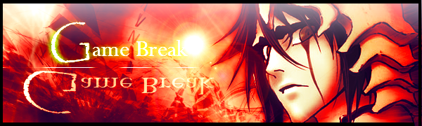
Here's another one a logo from our Website =.= got the border wrong~
ill update this soon while im uploading my 1st abstract :P
 AnimeGalleries [dot] Net AnimeGalleries [dot] Net |  AnimeWallpapers [dot] Com AnimeWallpapers [dot] Com |  AnimePedia [dot] Com AnimePedia [dot] Com |  AnimeGlobe [dot] Com AnimeGlobe [dot] Com |
| AnimeGalleries [dot] Net | AnimeWallpapers [dot] Com | AnimePedia [dot] Com | AnimeGlobe [dot] Com |


Here's another one a logo from our Website =.= got the border wrong~
ill update this soon while im uploading my 1st abstract :P
Hello Guyz it been a while so i have these signatures with me hoping
that i have lots of changes in my previous thread.
Thanks to Serated for the Extractions
---
Signature1/A.
---
Signature2/B.
---
Other Sig:
it has InnerApple at the Bottom of Irony Apple ^^.


From your latest signature, I'd say I like the first version the best. With the second version, I feel like there are too many stray aspects that sort of make everything a bit distracting. I think the purple light that you've pentooled? would look better if it wasn't so pointy. Try using more curvier lines to create more flow. It'd really help. I like how you've got some smudging in the background, but I think it needs to be a bit more developed. Maybe you could add some more smudging in the foreground and play around with some different layer settings. To add some more, I guess the word would be "color balance", without actually using the color balance feature, I'd say you should play around with some gradient maps and layer settings. It'd help balance out the colors in the signature. Now with the text, from what I've experienced, italicized fonts tend to take away from the sig and not look so good with the style you've got there. I think you should try some bolder fonts (try dafont.com for more fonts) to have the typography tie everything together.
Overall, great improvements. I look forward to seeing more. Aha. :3
thanks jagan but im still wondering about the pen tool you said i used 3pix brush
with 100%hardness whats the excellent hardness?
I don't really know what you're talking about, but there is no excellent hardness. Personally, I never touch the hardness meter thing. But with pentool (I'm assuming you use pentool), you can try different brush thicknesses and stimulate pressure and such.
ok here's a update u don't know if i got your attention this time...=.=
i din't posy my other signatures yet =.= because this looks..kinda weird.


Holy crap! Looking at that sig, and your first post, you've improved a LOT! Now onto the newest sig: Not much really wrong with it from what I can see. His face is a little too sharp, but I don't really like sharpening sigs, so that's probably just me. Also, he could be centered a little more. I'm just being nitpicky now though xD
Oh Dude, Thank youthank you very much.
i got my new sig...
c&c pls..

Those ^^ Are amazing. They're really detailed, and clear. You can see EVERYTHING that is going on. ^^ Really good job,!(:Originally Posted by InnerApple

And by those, i included your signiture (;
Last edited by UrusaiSevera; 03-21-2010 at 12:05 PM. Reason: Don't quote images
Legit, the best signature by: Kirako Shima <3"Maybe if my heart stops beating
it wont hurt this much
and never will I have to
answer again to anyone"
woah thanksupcoming siggy
--
i don't know with this. its my outcome in Hypens Tut. "Bruning Mario"
maybe i failed maybe not..
Ohohoho GOTS MY NEW SIG wuv it :3
--
c&c pls
sorry if i don't always update my sig. ^^ V so here's a new one
ill need a c&c please.
Last edited by Tranquiose; 04-07-2010 at 08:48 PM.

Can't tell if he's supposed to be upset, sad, angry or what. Oh and I love how the floating triangle fits right over your pet's head.
Yeh x) great timing lOl
Ok another Step Back for me.

I don't think its a step back! I think this one has its own essence that makes it good. (: Good work!
Legit, the best signature by: Kirako Shima <3"Maybe if my heart stops beating
it wont hurt this much
and never will I have to
answer again to anyone"
Thanks Rull
ok here's another sig :3 c&c please.
Probably, my favorite one you've done. Though part of that is probably the over sized hand gun. Text is a little hard to read, though that may just be me or my monitor.
Thanks
the hand gun is just big cause of the render,
this is the render I used. Ok gonna make more :3
Last edited by UrusaiSevera; 04-10-2010 at 08:39 AM.
WOops forgot to Hide the link xP
kk another update eureka :3
failed wireframe isn't it? lol ok c&c is 100% welcome.
What wire frame? And is that another render on the left?
I really like the latest one, it's just a tad bright over her face though. I don't see any wireframe though D:
the wireframe you can see it on the left and right hand of eureka

Gotta say, the tags from posts 38 and 42 are my favorites ^_^
I like the composition and execution on both of them.
Cnc on latest - I'd suggest trying to clean up the leftover overlays. Also, text seems a bit sharp, might want to check that out.
Hope to see more tags; I think you're improving a lot.
I think I can see it but not sure, I have an old TV like monitor which may be part of the reason I can't see it.
There are currently 1 users browsing this thread. (0 members and 1 guests)
 Posting Permissions

 Reply With Quote


Bookmarks