


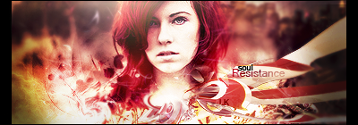
A Fail sig, outcome from a tutorial D: i topaz cleaned it D: and it looks hard.
 AnimeGalleries [dot] Net AnimeGalleries [dot] Net |  AnimeWallpapers [dot] Com AnimeWallpapers [dot] Com |  AnimePedia [dot] Com AnimePedia [dot] Com |  AnimeGlobe [dot] Com AnimeGlobe [dot] Com |
| AnimeGalleries [dot] Net | AnimeWallpapers [dot] Com | AnimePedia [dot] Com | AnimeGlobe [dot] Com |


A Fail sig, outcome from a tutorial D: i topaz cleaned it D: and it looks hard.

The ones in your first post are kinda blurry this is not a bad thing but it was a little much for my liking. They seem to get better by quite a bit as you post more. I love your use and choice of blending options in the second bunch you posted.
Gero Server Guru


That one reminds me of what happens if you invert the colors of an image.
thats nice xP thanks here's a batch of sigs i made yesterday D: my Thread on the other forums made up to 38 pages of requests D: so here's the latest one's; comments and c&c's are always welcome.
@gero5
Im sorry but i already encountered that critic pls comment and critics in my new sigs pls.
V1:
V2:
honestly thats 4 layers D: but it seems it loooks cool.

Last edited by Tranquiose; 04-13-2010 at 11:36 PM.
The light source in the third one is too bright. I really like the last one though.
thats the last one i made its quite a rush xP like 15 layers without thinking xP thats the last sig i made after all of those D:. but thanks i understand.
@offtopic
D: dude how do you change your mood xP
Im gonna release my new tut :3....after the SOTW.*other forums* D:


blue one: darken the white bit on the arm a bit, just too bright tbh; your sigs are getting better!
green one: top row of text is too hard to read; got a nice effect going ut i dont really like your borders ^.^ might be just me though
In this sig i can't focus >.> its seems like there 2 focals at a time.
Then I could have my C&c about this to avoid this dizzy sigs.my sotw#37..entry..
then i have my sotw#36 that is now starting with my record of 10 vote's vs 10 votes...so as now its a tie..
My eyes keep getting drawn to the light under the text. The eye being lazy is drawn to white spots. As for the second one, the dude needs a fire extinguisher. And should have laid off the matches.
xD lol two light source and a big c4d flood xD

Messy.Originally Posted by InnerApple

What is the focal? :P
Looks like the render is part of the c4d, too much blending.
Hmm... c4ds are great, but try not to drown out your render.
The focal point is clear on your newest one, but there's no flow.
Ask yourself, what's the path that I want people's eyes to travel? What should I look at next? @_@
The c4ds in the sig also take away from lighting. Your light source follows the render, which is good, but you can barely tell because of all the other conflicting light sources given off of the c4ds.
Believe it or not, C4ds are not just to make your sig look shiny xD
Another thing, sigs need a color scheme, or else it'll just be chaotic. There can be many colors, but the colors should complement eachother. Adding every color in splotches won't work.
By the way, this is the eleventh time i'm looking at the sig, and it's the first time I realized that there's text. (This is generally not a good thing...)
I hope I didn't sound to harsh xD
Siggeh made by me. Taking requests ATM! =3
Ive been thing in a while...and always surfing for tuts..
i think ill be getting sick.......
here's a updated sig...
A gift for our MOD..
2sigs i made a sec ago..its very meaningful to me...i wonder why...
V1.
V2
Comments and Critics are Welcome..
another one...
AND ._. another one..

Last edited by Tranquiose; 05-08-2010 at 11:21 PM. Reason: don't double or triple post, just edit the original post of the day.
c&c
...." "
haven't made a sig for 2 weeks ._.
STEPP BACKK NOOOO!!!
Ok this is enough i need to study harder ='_'= i can't get any critics i need more studies! Moar sigeh!
1.
2.
3.
4.
5.
not sure with this one ^
==============================
CRITIC PWEASEE x3
I wonder how long ill wait for critics >.>
new one..


Wow, talk about a dead thread. Alrighty, lets see what I can do.
(from bottom to top)
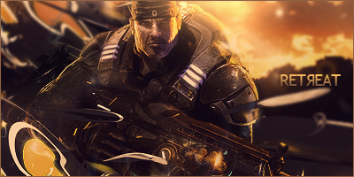
The newest one, the Gears one is alright. I think the right side could use something to balance it out a little though. It's pretty nice though!
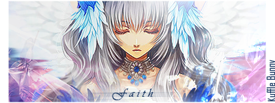
I like the ones in post 70. Your style seems pretty weird to me, but on the first one, I think you could erase the C4D covering their face. The second one is good too, but there's a weird line all the way to the left. The text doesn't stand out enough either (I'm not sure if you wanted that or not though). Something looks weird on the third one...I'm not sure what. The fourth one would've been really really nice if it wasn't -so- distorted looking. I like the whole thing, but the lines next to her look a little too strong. Maybe drop the opacity on those. And the text probably would've been better as sans-serif. I really like the last one though. My only concern is that it's so far off to the side; it could've been a little closer to the center. The colors are nice though, and the text could be a -little- more legible.
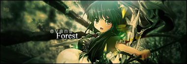
The green one in post 69 is pretty darn nice. I really like the colors and the lighting on it. Not really much I would change in it besides the "Forest" text. Maybe a slightly....happier(?) font could work for it. But other than that I'm loving these. Only thing I can really tell you to improve on if your text for now. Just go download a whole huge collection of fonts you like (aim for a lot of Sans-serif fonts, but still grab some others too). When I'm stuck on text, I type it out, highlight it, then just scroll through all of them until I find something nice. I'll be checking in more often though, so this thread doesn't die out!
Ok ok hell yeah xD i can't dl fonts now I got my pc broken the anti virus deleted internet explorer >.<..but i can still survive using task manager..but hell yeah thanks for the c&c sajin
and btw i have a question..whats the difference between "opacity" & "FIll"
i can't really understand D:
Well lets say you put a stroke using the layer styles, on object X. If you lower the opacity to 0, then the stroke will go away too. But if you set the fill to 0, then your stroke will stay, but object x will disappear. I can't really explain it better than that, so just play around with it until you see the difference. I suppose the opacity is the whole layer, and the fill is just what's there?
One more time !
Yes another one >
v2.
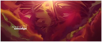
meh first abstract smudges
siggy new =3

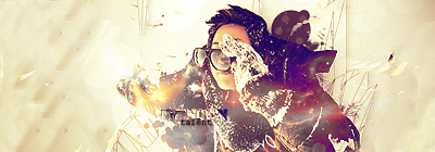
Very nice, very nice. Only two things bother me with it though:
1. the bottom left looks smudged, and it doesn't seem to fit it.
2. the second line of text is almost unreadable. The colors match too well.
But this is one of my favorite sigs from you
thanks ellipsis ill be moar active in graphics now =)
There are currently 1 users browsing this thread. (0 members and 1 guests)
 Posting Permissions


 Reply With Quote


Bookmarks