


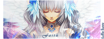
Here are a few siggies i made. ^_^ I'm new at this and would appreciate all the help i can get... So please tell me what you honestly think.. Enjoy~!

 AnimeGalleries [dot] Net AnimeGalleries [dot] Net |  AnimeWallpapers [dot] Com AnimeWallpapers [dot] Com |  AnimePedia [dot] Com AnimePedia [dot] Com |  AnimeGlobe [dot] Com AnimeGlobe [dot] Com |
| AnimeGalleries [dot] Net | AnimeWallpapers [dot] Com | AnimePedia [dot] Com | AnimeGlobe [dot] Com |


Here are a few siggies i made. ^_^ I'm new at this and would appreciate all the help i can get... So please tell me what you honestly think.. Enjoy~!
Last edited by Jamie5192; 12-26-2007 at 10:08 AM.
"Sometimes I wonder if you remember when I loved you""And sometimes.. I wonder why it's you.. whom I still run to"


Nice but the text is to hard to read....
1,2,4, and 7 are very nice looking. Your color work is good and placement of the pictures/people are well done. The text is hard to read like Hybrid said and to me seems a little wordy.
Sigs are like road signs, many skip over them or glance at them so they should be too the point (at least that is how I think) - but the quotes are nice, I'd just rather see them on like a wallpaper or something to that effect.
>< Yeah i guess your right... i tend to get wordy. ^^ Thanks.. i'll keep that in mind you guys. I'll try to make them easier to read next time.Originally Posted by darkjester

"Sometimes I wonder if you remember when I loved you""And sometimes.. I wonder why it's you.. whom I still run to"
I can't read most of the text, so that bothers me.
I pretty sure I like the paine one the best. The reason is this, none of your images look extracted. It simply look like you cropped an image and slapped some text on it. :/
The one under paine looks like there's some extraction going on, but the backie doesn't match the pic at all.
Are you using photoshop?
Keep practicing, you'll get better =3
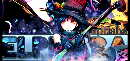
Siggeh made by me. Taking requests ATM! =3
Here are a few more that i hope you enjoy. ^_^

Last edited by Jamie5192; 12-29-2007 at 06:19 PM.
"Sometimes I wonder if you remember when I loved you""And sometimes.. I wonder why it's you.. whom I still run to"
That's nice but the quote is too long. Keep it up!
Sigs and Ava by me! And thank you for the Reps and Points-
~Donation needed; kindness really appreciated!~

i love them all
they really catch my attention.
i love all of their eyes so pretty and innocent.
hope to see more.
keep it up.
[set by blueangel06661]♥
Here are my latest collection of Avatars and signatures... Comments and Critiques are Welcomed!!!
Avi's:


Signatures:
The reason some of them say "brokenlover101" is because that is my username on a different website that i create them for also.
Last edited by Jamie5192; 10-25-2008 at 01:43 AM.
"Sometimes I wonder if you remember when I loved you""And sometimes.. I wonder why it's you.. whom I still run to"

~This is cute <3. I love the pink background. Although it is very simple created. But I love it <3 Which programme do you use? you should try to work with bruhes/textures...^^

This is my honest opinion...
If you are going to put a quote in your signature, put it in your text editable part of your signature rather than on your actual image signature.
I feel that when there is too much text in a signature, it really loses its focus and the interest is lost.
So if you are going to make signatures, then you are going to have to realize these few things.
Keep the words to a very low minimum.
When putting your subjects in your signature (which would be whatever extracts that you used), be sure to centralize it like you did with this signature.
Although it is very cute, in my opinion, it's too simple to a point to where I think you only used five layers.
Yes, it's true, the more layers doesn't mean the better the signature will be, but if you try different things and perhaps even put a gradient in the background, then perhaps it would have looked a lot better.
Lastly, your avatars.
Make the colors more vibrant. What a lot of people tend to like in an avatar is the bright vivid colors in avatars that signatures normally can't achieve. And keep your subjects in proportion. The subjects look thinner than they really should be.
I don't remember creating a thread in here and I know that I could use some constructive critizism.. So I figured I'd create one of these threads and see people's thoughts and ideas about my signatures and avatars. Please Enjoy!
BTW BROKENLOVER101 IS ME FROM A DIFFERENT WEBSITE CALLED ANIMEONLINE THAT I NO LONGER GO TO!!!
Set1:
Set2:
Set3:
Set4:
Set5:
Set6:
Set7:

"Sometimes I wonder if you remember when I loved you""And sometimes.. I wonder why it's you.. whom I still run to"
SORRY ABOUT THE DOUBLE POSTING BUT HERE ARE MORE!!!!!!!
Set8:
Set9:
Set10:
Set11:
Set12:
Set13:

"Sometimes I wonder if you remember when I loved you""And sometimes.. I wonder why it's you.. whom I still run to"
OMG I'M SO SO SO SO SO SORRY I HAD TO TAKE THIS INTO A 3rd POST!!!!!!
Set14:
or
Set15:
or
LATEST SET!!!!
Avatar:

"Sometimes I wonder if you remember when I loved you""And sometimes.. I wonder why it's you.. whom I still run to"

Hmm...well, I think the part that you can improve most on is the font. Try to make the amount as little as possible, it seems to me like in some of your signatures, the font is overtaking the actual picture, which is a no-no. For some of them, you might also want to try and keep the pictures high quality, so they don't seem pixellated or blurry. The last point is, you might want to add something else rather than adding brushes in the background, or sticking a picture in there without blending the original stock picture into the background.
But with that said, I think if you improve your typography first, it'll start looking a lot better =)
Hopefully this helps!
^ Basically what this user said. The font does not really match well with the picture itself and I know with practice you can easily improve on that.
Also the backgrounds, seems too bland and way too stock. Maybe adjust it up a little bit and try getting creative.
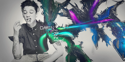
Nonon Jakuzure - Best Kill la Kill baePretty damn great! #spoke2soonOta "The Cutest Otaku" 2016 - Lol, how's your account doing lately? Oh wait.


Well everyone has room for improvment, maybe you should try less font on your pictures, just your name would be fine on them instead of all that extra stuff. You could also make it to where your signature quality is better then it is, and they could use a little bit of sharpening. Might I suggest saving them as PNG.
Some things looked stretched out to me, there is a easier way of resizing things to were it wont look stretched. I cant really tell what the main focus is in some of your signatures, if you improve on all that stuff I bet your signatures would look way better. Looking at tuts always helps. I hope to see more signatures of yours in the future. Good Luck.
Last edited by Daken.; 01-11-2010 at 07:22 PM.
Avatar:
Signature:

"Sometimes I wonder if you remember when I loved you""And sometimes.. I wonder why it's you.. whom I still run to"

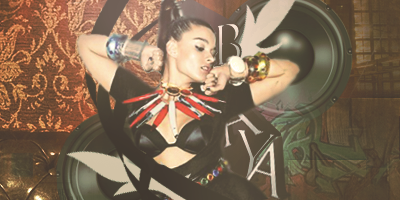
Your newest set is amazing (: I really liked the way the text matches the image well.
Just a couple of things;
I think the avatar should have a little bit of green in it. But not too much or else the avatar gets messy.
Andd the text colour on the signature, its good but it seems a bit odd to me. Like it's a bit too light for the colour scheme.
Buuuut overall- It's fantastical ;D
AVATAR
SIGNATURES

"Sometimes I wonder if you remember when I loved you""And sometimes.. I wonder why it's you.. whom I still run to"


Alright, lets just get this out of the way as soon as possible. Unlike what everyone else says, I think the main thing your signatures lack is a type of theme. What you seem to be doing is taking an image and then copying about a paragraph of text in order to explain why it looks the way it does. And that just isnt necessary.
Your most latest tag, while superior to your previous efforts, is probably the best of the bunch. You are using more effects, and applying more thought to the overall construction of the image. What it mainly lacks as above, is a theme. Am I supposed to feel warm and fuzzy? Or dark and lifeless? The use of the word 'love' and the heart used really are competing ideas since the tag is just so dark and empty.
This may sound stupid, but make a happy tag. Use a bright stock image, use bright colors, and combine the effects and we should work from there with other improvements such as your uses of blending, and hierarchy.
Best of luck to you.
Hmmz.. Here's me trying to do a more happy and upbeat one! lol I don't knowz right now it's kind of hard for me O_o
ENJOY~!
Avatar:
Signature:

"Sometimes I wonder if you remember when I loved you""And sometimes.. I wonder why it's you.. whom I still run to"
sorry in advance if this sounds harsh.
what i see right off the bat, is the stock is a little blurry.
the flowery things around the sig doesn't go with the stock, it just looks like everything is pasted on there, so there's not much to critique.
find better higher quality renders/stocks, try some C4D's, and the text placement doesn't really look nice. it just looks slapped together.
Try to lay off the text a little, blend more, don't just use those brushes to surround your sig, use the brushes to make it flow more and to make it more appealing, not to just "decorate"
overall just keep on making sigs, you'll get better easy if you keep at it.
{}
New sets

"Sometimes I wonder if you remember when I loved you""And sometimes.. I wonder why it's you.. whom I still run to"
There are currently 1 users browsing this thread. (0 members and 1 guests)
 Posting Permissions


Bookmarks