


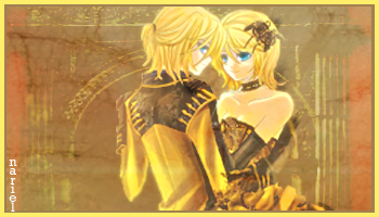
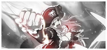
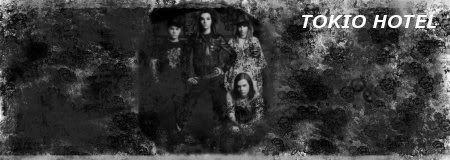
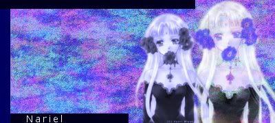
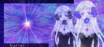
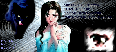
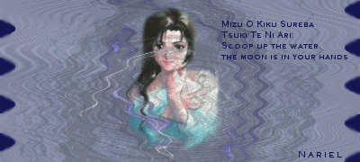
This is where I'm going to post my siggys and avatars. Please tell me what I can do to improve them, because I can tell they need work. I use GIMP. I'm deleting my oldest ones, because I really don't like them.
 AnimeGalleries [dot] Net AnimeGalleries [dot] Net |  AnimeWallpapers [dot] Com AnimeWallpapers [dot] Com |  AnimePedia [dot] Com AnimePedia [dot] Com |  AnimeGlobe [dot] Com AnimeGlobe [dot] Com |
 Reply With Quote


Bookmarks