


I actually like the border of the Ne-Yo signature. O.O I like the text too. All of that gray feels a little too plain though for me though.
 AnimeGalleries [dot] Net AnimeGalleries [dot] Net |  AnimeWallpapers [dot] Com AnimeWallpapers [dot] Com |  AnimePedia [dot] Com AnimePedia [dot] Com |  AnimeGlobe [dot] Com AnimeGlobe [dot] Com |
| AnimeGalleries [dot] Net | AnimeWallpapers [dot] Com | AnimePedia [dot] Com | AnimeGlobe [dot] Com |


I actually like the border of the Ne-Yo signature. O.O I like the text too. All of that gray feels a little too plain though for me though.


Three moar
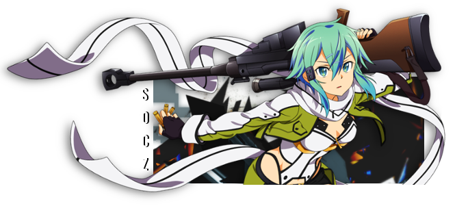
For the previous SOTW of course.
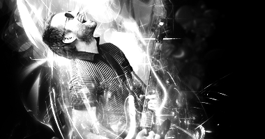
Trying my luck with the liquify tool.
For sotw on another site, theme was cars. Name had to go somewhere on there, so yeah.
I've yet to decide on a particular style, so I think I'll keep on experimenting for a few more posts.
Last edited by Bulf; 01-11-2011 at 12:24 PM.
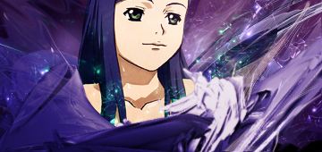
I like what you did with the liquify tool. Who is that though? She looks like Namie Amuro a little...
I didn't even notice the text in the car signature, and I think you could of added more to the signature, because the top left of the signature looks quite empty.


Wow cool! You've improved your signatures, keep up the good work. ^^
Last edited by ::SomeOtherCookiez::; 01-16-2011 at 02:07 AM.
Signature and avatar made by me
~


Hm, you seem to be improving. I like the top two, but with the pink haired girl one you could have done something on left besides leaving it white. I like the flow of the middle one, but it needs some kind of text. The last one I'm not too fond of, the background just seems too plain =/
Sig by Feferi <3
"Don't go around saying the world owes you a living. The world owes you nothing. It was here first."
-Mark Twain
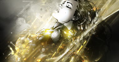
It's been a while since I've done sigs with the liquify tool but I always love seeing people working with it, so much stuff you can do with it. It's my favorite from your latest batch as the first seems too low quality and the third doesn't seem to have enough contrast for a B&W which makes it seem boring.
Good work, though.
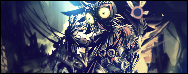
|Power of The Mask|
Yeah, I think the car one couldn't have been b/w now that I look at it. I'll go back and make a second version of it later though. Also, I'm not sure who that is in the liquify one, I just saw her and had to use her.
---
Two more.
for sotw on GFXresource. I don't care for the text at all.
Entry for previous sotw. I had like 7 minutes to make this sig and made it in like 4. Still, I like the symmetry.
I was gonna use this one for sotw24, but it's really really borderlining the theme(no anime). Since it is animated, from japan, and based on japanese stuff. So I'll make another one and keep this one .
Last edited by Bulf; 01-18-2011 at 02:48 PM.
The Okami has to be one of the best non-C4D signatures I've ever seen, it's so amazing and the text also fits it but you should probably change it to Hyphen or Ellipsis if you aren't going to enter it. I already commented on the FMA one in the vote thread so yeah.
人類は調和したのか?VY2V3 = Me | Kagamine Len Act 1 = You
The FMA and Ookami sigs really stand out for me and you did a very good job with the background, text and blending.
Wolfie Dango ~*Red*~
Twin sister: Angella_Kagamine
Just a heads up. I won't be able to post anything or even get on AF for a bit. My internet is off so yeah...but here's another update.
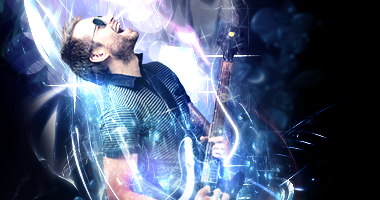
v1.
v2.
for last week's sotw!
And for sotw on GFXr (theme is Television Shows).
Text sucks, but meh.
I needed a new sig, so...
ALSO
I'll be taking sig requests if anyone wants one so yeah. Let em flyyyy~
HEh, I felt the same way about the right side xD. I'll fix it eventually, but for now a few requests I go hit with.
For tatty
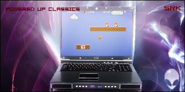
For Srk
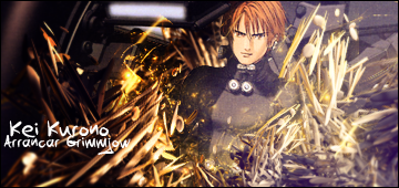
For Arrancar Grimmjow
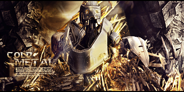
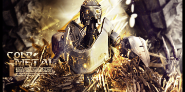
For Bsotw on GFXr (Theme is Fixed size: 450x125)
And for fun
I really really need to learn how to simplify my style....
Ohay almost at a third sig thread.
I'm probably not going to slow down on sigs for a bit....so here I go:
for sotw
That was my original entry....before I changed it.
TUTORIAL INBOUND!
There's a tut for that one on my DA account. Anime (Xuyzio or however you say it) asked me to remake a tut for a sig a few sotws ago for him so meh.
Imma spam my thread with sigs for now though.
Edit: ohay 9 more posts until 200!
Last edited by Bulf; 02-09-2011 at 11:17 AM.
TUTORIAL AAAHHHHHHAHAHAAHHHOriginally Posted by Aleyna

For the Samus one of course!
---
New stuffz
GFxr again. I love that C4D, sue me. >_>
My thread seems to be dying ever so slowly, so I'll update slowly...When I get my third thread though, it's on like all kinds of Donkey Kong.
Last edited by Bulf; 02-10-2011 at 07:51 PM.
More, some requests and practice runs, but meh. I found a friend who was nice enough to give me their copy of CS2 (they brought CS5), so....I'll make the best of it.
bsotw on gfxr
I am slowing down, honest! D;

I like the top 3 but not the botton 3 XD
4th is okay but the right side of the render just seems distracting for some reason :S
The 5th just seems low quality compared to the rest.
And the sixth has a weird blend and flow in terms of colors.
I like the top 3 a lot though ^_^
thanks man, it means a lot
only one:
v1.
v2.
Different borders, and added/removed some lighting and depth.
Might tutorial it if i feel like it, but probably not.
God, most of yours sigs look sexy but the text on the all never flows with the sig D:
Also ty for your tutorial.
I think you should add the border on the second to the first one because the first looks much better in my opinion, the text is a little much... maybe shrinking it would be better. Also he looks a lot more "pixaly" in the first on the second so if you can fix it by all means do. o_O;;
Last edited by Xeyuzio; 02-21-2011 at 11:30 AM.
There are currently 1 users browsing this thread. (0 members and 1 guests)
 Posting Permissions


Bookmarks