


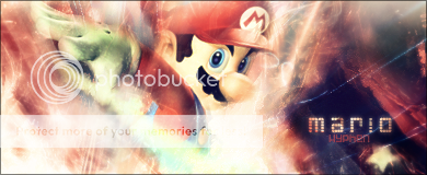
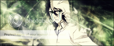
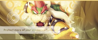
Yay I finally get a second thread! Well here's a few just to start it off:
I still haven't quite got it going, but hey I'm trying D:
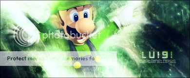
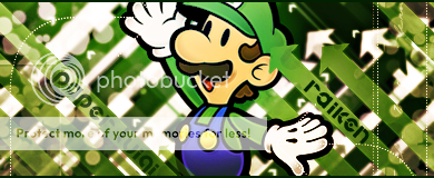
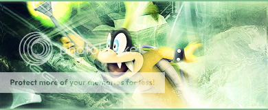
And for Raiken
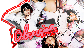
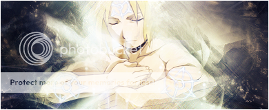
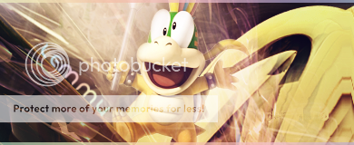
Then, the result of boredom:
I'll be making more soon, so be sure to look out for them!
 AnimeGalleries [dot] Net AnimeGalleries [dot] Net |  AnimeWallpapers [dot] Com AnimeWallpapers [dot] Com |  AnimePedia [dot] Com AnimePedia [dot] Com |  AnimeGlobe [dot] Com AnimeGlobe [dot] Com |


 .
.


 }
}


Bookmarks