


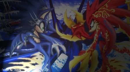
this is one i just got done trying
fate/stay night sig
unfinished sig for lilminx
 AnimeGalleries [dot] Net AnimeGalleries [dot] Net |  AnimeWallpapers [dot] Com AnimeWallpapers [dot] Com |  AnimePedia [dot] Com AnimePedia [dot] Com |  AnimeGlobe [dot] Com AnimeGlobe [dot] Com |
| AnimeGalleries [dot] Net | AnimeWallpapers [dot] Com | AnimePedia [dot] Com | AnimeGlobe [dot] Com |


this is one i just got done trying
fate/stay night sig
unfinished sig for lilminx
Last edited by FlashD; 10-28-2009 at 09:21 AM. Reason: Merged for convenience


where did my reply go ...
i guess ill re post it....
hey btw did anyone noticed that theres like 2 replies missing >.<
i love the sigs especially the green one ^^^ now add the text :OOriginally Posted by Teddy2116

Last edited by FlashD; 10-28-2009 at 09:13 AM. Reason: Don't quote images
you can't call me weird, cause im unique ^_^
btw if youre going to admire me, please tell me who you are, gracias
siggy by teddythankies ^^
**UPDATE** NEW DRAWINGS
* * * A R T ~ W O R K * * *
My sweet sweet family is located in my blog
if you want to be a part of our family, pm me

My fave is the green sig, considering she's one of my fave characters. lol


I would like to remind you to post a proper post. No one really needs posts with "It's so cool." in them. As you like to see your threads filled with actual criticism, this user likes to see their thread filled with actual criticism.
Thank you.
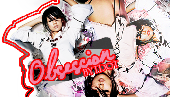
Signature and avatar made by Trinity Muse!
Well I guess you have a point. So what do you think of them. I'd like some pointers if you are willing to give some.


Wow I really like the green one, its so clear and matches with the bg. The first one is kind of blurry though. And the Saber sig needs to be rendered a bit more on her right side because there is a while outline (or is that part of her dress design?). In all, I think you did a great job and they're beautiful. You don't really need to do much to fix them anyway, and I like how you mix your characters with the background. I really really liked that last one though, it looks amazing.


I thought my vision got more blurry now :P
Sharpen the focal, thats the figures, now their blurry.
Especially on the Saber one.
And blend the figures more in
And use more layers then 3, 4 counting the text layer.
Now it`s just a figure, a c4d, a one coloured bg and text, to simple.
Check out tutorials on deviantart or check out the forums I`m advertising for in my sig ;D
Your renders are really stretched. o_o
When you're resizing them, hold Shift. That way it won't get all weird proportions wise.
You've improved a lot, I recommend adding a light source. I usually make a new layer, apply image, Filters > Render > Lens flare and set the options to what you like.
Keep it up!~
聞こえますか 僕の声が 君の事を そっと想う季節が続く
Hmm I see thanks for the tip Miny
Well, I think the sigs are way too simple >_<
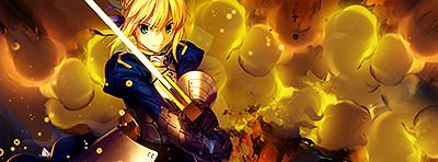
I'm guessing you only used 5 layers for the Saber one??
You can mess with more stuff... like filters, brushes, etc
Even though your sigs are tooo simple, the blending is actually good haha xD
And don't put your text in random places, put them close together ^^
And always sharpen your sig at the end cuz your sigs are a bit blurry >_<
Keep it up and post moar~

Just be careful with the resizing of your characters as saber is very stretched. Also, you don't have to get the whole render into the sig, like in the saber one. Don't be afraid to crop her to bring more focus to her. Your render should fill the sig a lot more as there is a lot of negative space. You could benefit from some tutorials. Have a look in AF's tutorial section and on deviant art for some beginner tutorials to help you learn more about using C4Ds. Keep up the good work and keep improving. =)
Hey I think i improved sightly.... maybe not.... eh you tell me lol


omg these are amazing
i like your sig the fate stay night one,sabers face looks so peacefula nd has a innocent feel to it
"Dark light come shine in her lost heart tonight
And blind all fears that haunt her with your smile
Dark light"-HIM

You've got the right idea with color - Your tags have a matching color schemes that work with your renders.
Something to work on that would compliment that color usage would be blending. Currently, it is very easy to distinguish between the render and the background - they appear to be separate. Try adding effects and lighting that blend the render and background.
thanks for the advice, I'm getting the hang of it so that good right lol

as has been said
you blend your colours well, im going to hazard an educated guess and say your a beginner, no offence intended, what i would suggest is centralizing you focal point, and not confining your text to various corners.
i believe you should look some tutorials up ^_^
Lex Luger R.I.P
¦ Sexy Logo By Me ¦ R A R E R E N D E R ¦ Tutorial requests and PSD Requests open ¦ Tag Thread

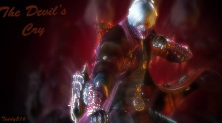
my latest piece of work
Last edited by Teddy2116; 11-13-2009 at 08:37 AM.
Not a very good way of using the lighting effects. It's too obvious, it just doesn't look good. Lower the opacity using normal blending mode or something like soft light. Because of what you did with the light the other effects (if there are any) are pretty much hidden.
The sig would look rather interesting if you could make one side red and one side blue (like you've done with the text) but alas, you didn't do that.
I would have made this sig more electrifying, if you know what I mean. It's pretty flat, right now.
@Love- Yeah I know what I wanna do with the sigs it just I'm still to nubly to do so. I think the lighting effect was edgy and dark at the time of me making it(which is what i was going for for this sig) but now after seeing it I see I was wrong /cry cry.
Well thank you for the advice, and please don't hold back and sugarcoat your criticism I really love it when people are honest with my work. If not then I wont learn right lol
I looked at a tutorial and these are my results
There are some serious proportion problems here.
They are also WAY too big.
I suggest trying one of Serated's video tutorials. He does a great job of explaining step by step on how to use different techniques and how to have fun with what you're doing.
IMO, your latest F/SN signature looks too dull and flat.
I greatly suggest saturating the colors a bit more, as well as filling up the background.
Over-saturating since '07

I like the colors in the signature you made for lilminx, but your sigs need great improvement. Adding a border and resizing the signatures are two good ideas. Try looking for brushes, fonts, filters, plugins, textures, masks, stocks, styles, and gradients to download online. Also look for tutorials to try out.
1st of all , I think you should make your signatures abit more smaller . Somewhere in 475x150 or something , try to experiment .
So far the effects in your signature is raw [try to use more layers experiment em .] . I see some nice ideas here and there . And also try to pick fonts that can mathc with the sig .
And again , like what some people have said already . Look up a tutorial , It wouldn't hurt.
Have fun also .
Signature and Avatar by ME .Signature requests are open too .
^ This, the largest i will go is 450x150
Lay off the glows too, they tend to ruin things.
Also try experimenting with layer modes when using brushes, also try using gradient maps and other adjustment layers.
Not to blow my own horn but i would suggest you try following my first tutorial, its very basic and perfect for beginners, here
Lex Luger R.I.P
¦ Sexy Logo By Me ¦ R A R E R E N D E R ¦ Tutorial requests and PSD Requests open ¦ Tag Thread
There are currently 1 users browsing this thread. (0 members and 1 guests)
 Posting Permissions


Bookmarks