


Guh-reetings!
I haven't been on AF for awhile now, so I decided to make a thread mostly for critique.
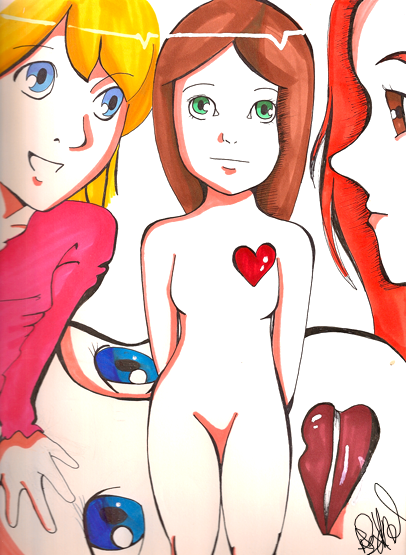
This is something random I did in Spanish class yesterday:
 AnimeGalleries [dot] Net AnimeGalleries [dot] Net |  AnimeWallpapers [dot] Com AnimeWallpapers [dot] Com |  AnimePedia [dot] Com AnimePedia [dot] Com |  AnimeGlobe [dot] Com AnimeGlobe [dot] Com |


 }
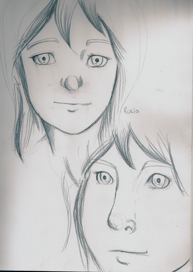
} ) and even when I was drawing anime a lot, my faces were always a bit.. deformed to say the least ^^;
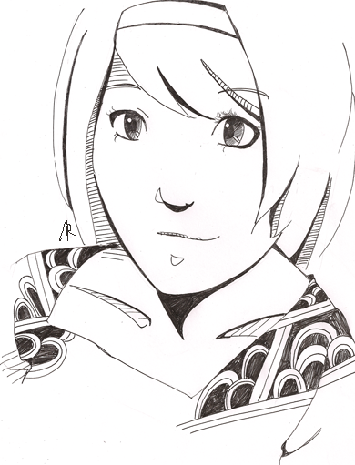

Bookmarks