


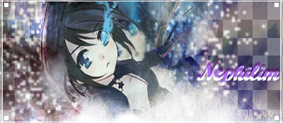
I haven't been doing a lot lately, but here's the last SOTW I did ^-^
Edit:
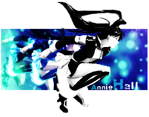
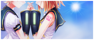
and also these, I decided to use some of Serated's Extractions ^-^
Edit #2:
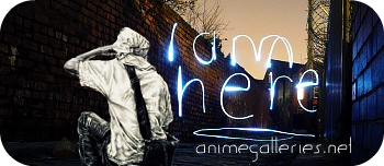
Request
 AnimeGalleries [dot] Net AnimeGalleries [dot] Net |  AnimeWallpapers [dot] Com AnimeWallpapers [dot] Com |  AnimePedia [dot] Com AnimePedia [dot] Com |  AnimeGlobe [dot] Com AnimeGlobe [dot] Com |


 Reply With Quote


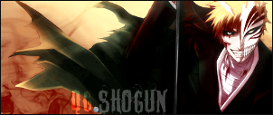
 Sig and avy by me.


Bookmarks