


This one is uber smexy. I'm loving the vectors. So bright and striking. *-*
 AnimeGalleries [dot] Net AnimeGalleries [dot] Net |  AnimeWallpapers [dot] Com AnimeWallpapers [dot] Com |  AnimePedia [dot] Com AnimePedia [dot] Com |  AnimeGlobe [dot] Com AnimeGlobe [dot] Com |
| AnimeGalleries [dot] Net | AnimeWallpapers [dot] Com | AnimePedia [dot] Com | AnimeGlobe [dot] Com |


This one is uber smexy. I'm loving the vectors. So bright and striking. *-*


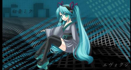
My new signature. Trying not to repeat my style so much xD
I think I need to crop it x__X


Ya other then Crop that one is very nice, I love the Lighting o.o
The Circle on the Left is cool looking, would be nicer in my opinion if there were a couple more circles like that.
Anyrate Gj, keep up the goodwork =)
Cropped it x3
- Thanks Evo

Hey! Thanks for dropping by! Your so cool I am humbled by your visit and even leaving with a comment.=)
The use of lighting, depth, flow, and placement of everything esp. the use of c4ds(if you have used them) is plenty nice.
Thanks for the comments. :3
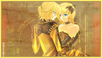
My newest signature:
It's very purple-y. >:X
Last edited by Dottie.; 07-27-2008 at 09:31 PM.
OoOhH~ This ones pretty infact all your works are pretty!
But I just think one the left with the person looking thingy
make it like fade-ish with the 2nd to 3rd one imo..
but great job!
Last edited by IchigoKiss; 07-27-2008 at 06:27 PM. Reason: tiny sp mistake
I love the Wired Wings one. Especially the text, and the wing next to it.
Purple is good.

Originally Posted by dotmyztick

It looks awesome. The fact that it's monotoned around purple makes it look really attractive and draws emphasis on the style. Excellent work.

I've never looked at your sig page before... and wow, you take my breath away. ._.
So yummy this sig is.
So made yourself a new sig again? man, your never running out of ideas >,<
new tag's awesome can't tell if it's your best or not(!) All of your recent works caught me in astonishment. Hope I properly worded it
Last edited by djinni; 07-28-2008 at 10:11 AM.
New sig.
My attempt at smudging and such. Something in it bothers me.


Yeah, I see why it bothers you. The lighting has several sources, ones in the back of the stock, and the one coming from the bottom. The text really does not appear to flow with the stock, and the colors are just really dark for a lot of the details to now show up. C4Ds might improve on this in some areas, but I think that the colors should develop more. That, or try the Black and White approach I typically use when color fails me.
Ok I tried to make it better:
If it isn't I'm not going to bother with it anymore. >:\

Thanks guys~ :3
Ok trying some new stuff:
Credits to Serated for the extraction
Last edited by Dottie.; 08-02-2008 at 06:35 AM.

Oh, wow, thats very creative. I love the concept a lot. The whole cape idea is really sweet and I love how it kinda corresponds with the right edge of the border. The pentooling is amazing as well. You just never run out of ideas. XD
AFAFSAFEGANOMQ WFONQF!!!!!
Holy moly thats creative!
Over-saturating since '07
Daaaaaaaaaaaaaaaaaaaaaaaaaaaaaaaaaaaaammmmmmmmmmmm mnnnnnn.
SHABLAM.
That's supah creative!
Every time I look at your signatures, I just get amazed at your creativity for EVERYTHING.
You will go far in the GFX business.
Trust me, with that kind of creativity...
YOU WILL PIERCE THE HEAVENS WITH YOUR PHOTOSHOP SKILLS!
Last edited by Balance; 08-02-2008 at 03:14 PM.
Here is my SOTW entry but it is too big for the SOTW requirements and I do not have enough time to fix it [AKA Biology assignment] so here I shall post it:
Hopefully I am not breaking rules and such, -cowers-
Wow gotto say NICE WORK! i am loving all of your sigs so far!!!! keep em comin!
dotmyztick siggies are Lawlietth's favs <3<33<333
your purple one is really amazing XD
And this one is so O____O
Wowee... Nice use of the liquify filter. ^-^ (and probably a bunch of other stuff I am ignorant of. xDD )
Thanks guys~
Heres a tribute to Macbeth, we are doing it in english and I was bored xD
Purely Pentool, text and shapes.

There are currently 1 users browsing this thread. (0 members and 1 guests)
 Posting Permissions


 |
| 
 Reply With Quote


Bookmarks