


Here are some photos for the clothing site "Bastard and Friends"
Please let me know what you all think, thank you
http://www.bastardandfriends.com
 AnimeGalleries [dot] Net AnimeGalleries [dot] Net |  AnimeWallpapers [dot] Com AnimeWallpapers [dot] Com |  AnimePedia [dot] Com AnimePedia [dot] Com |  AnimeGlobe [dot] Com AnimeGlobe [dot] Com |
| AnimeGalleries [dot] Net | AnimeWallpapers [dot] Com | AnimePedia [dot] Com | AnimeGlobe [dot] Com |


Here are some photos for the clothing site "Bastard and Friends"
Please let me know what you all think, thank you
http://www.bastardandfriends.com


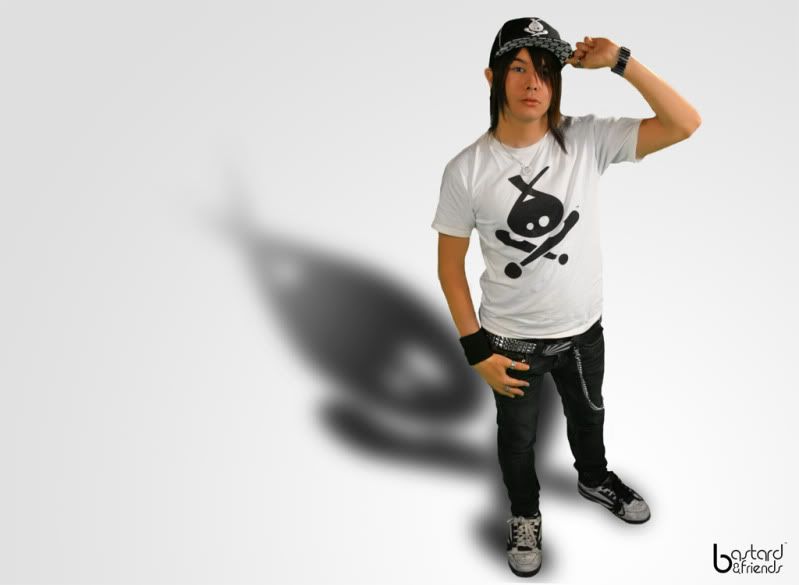
Overall very nice shoot. I do have a few critiques though... In the first two photos, the shadows aren't right. I like the concept of the skull shadow, but the execution is off... You need to get rid of the drop shadow or shadowed "glow" along the left of the first image, as it kills the effect of the skull shadow being projected on the wall behind the model. What you're doing is adding shadows at two different levels as if there were two walls, one close to the model (stage left) and one further away (stage right). Since we obviously can't see two walls, it kills the effect for both.
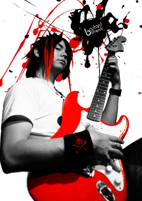
Similar problem with the second photo. The shadow is overspread at the model's feet, showing that it's pasted under him, not being cast by him. Where the shadow comes directly under the shadow caster, it is sharp and clear, not soft and blurred. It will soften up as it moves further away from the caster. So you've got a big perspective problem going on there...
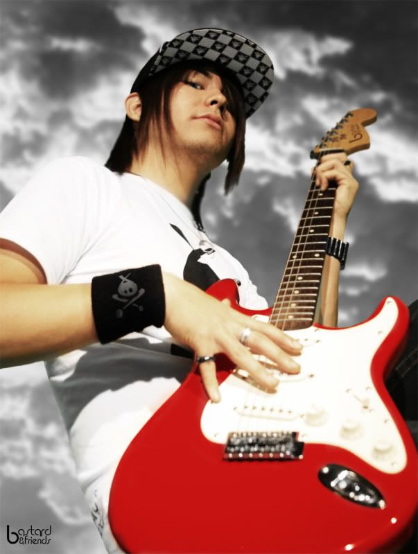
The third photo is just really badly clipped. I would actually ditch this image altogether... I like the branded guitar, though. =D
Other than that, well done. Nice concepts going on here.
Last edited by Neddog; 07-19-2009 at 11:09 AM.
Ned Yeung, A.C.E.
Awesome, thanks =) Yeah the third one was never really my cup of tea, problem was is that we did this all in a green screen (green spill is a pain.) Though this is probably the best critiques i received (i love it when people give useful tips rather then just praise it.) So I will indeed inform this to my photographer (he is the one that edited this, and also my very best friend) and when we shoot next time we will keep this in mind.
Once again thank you very much =)
Ah, yes. With still photography you don't need a chroma green or chroma blue screen, since you're only editing out a single frame. It's much better to have a neutral color like white, grey, or black, or else another solid color that matches the background you'll be placing the isolated image into. I generally use white for high-key images and black for low-key images. That will prevent you from getting unsightly color spills and color casts. Save the chroma green for video, where you need a definite color key which won't get mixed in with the highlights/shadows, since you can't reasonablly mask 30 frames per second of footage individually and manually.
Ned Yeung, A.C.E.
There are currently 1 users browsing this thread. (0 members and 1 guests)
 Posting Permissions


Bookmarks