


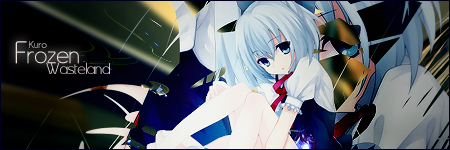
Mm, I see what you mean. Maybe I need to blur it some more. Thanks for the comment. ^_^Seems a bit too chaotic.
Thanks. I'll keep your suggestion in mind for next time. :3I like the chaos. I think the "blast" of effects are pretty cool in this sig. : )
But I'm not too fond of the text, though. I think it'd look better on the right side of the signature.
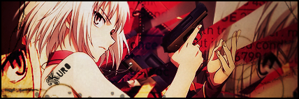
New set for me:
Extraction credit: Serated
 AnimeGalleries [dot] Net AnimeGalleries [dot] Net |  AnimeWallpapers [dot] Com AnimeWallpapers [dot] Com |  AnimePedia [dot] Com AnimePedia [dot] Com |  AnimeGlobe [dot] Com AnimeGlobe [dot] Com |


 |
| 


Bookmarks