


Tag your stuff with AnimeForum.com or something, make it hard for them to rip.Originally Posted by KuroTan

 AnimeGalleries [dot] Net AnimeGalleries [dot] Net |  AnimeWallpapers [dot] Com AnimeWallpapers [dot] Com |  AnimePedia [dot] Com AnimePedia [dot] Com |  AnimeGlobe [dot] Com AnimeGlobe [dot] Com |
| AnimeGalleries [dot] Net | AnimeWallpapers [dot] Com | AnimePedia [dot] Com | AnimeGlobe [dot] Com |


Tag your stuff with AnimeForum.com or something, make it hard for them to rip.
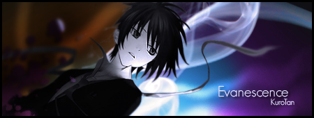
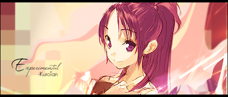
Tru Fax: Princess Minako wrestled Jesus... and won
OMG.Since when did I become an AA member?
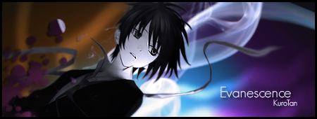
What's up with the title Mori's GFX?? o.o;
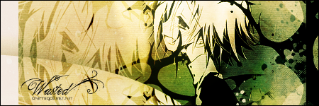
[cant' believe my work was stolen =( ]
Anyways.. your 'Nothing to say' is quite cute ^^
I just don't really like the stoke on her hair
on the right..I love it overall


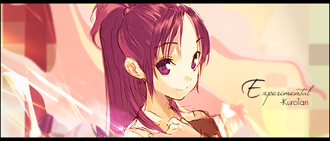
Believe that you got ripped. It means you're good enough that they're jealousIt's just the cleaning up after them that's annoying.


@Kersheys: Thanks for the suggestion.^^
@Jose: lol. We'll see.
@Jaggy: ^^
@FlashD: Thanks. And I will, next time. Sorry. ^^'
@HardGay: Text is hard to work with. @_@ But thanks.
@IchigoKiss: I'll see what I can do about it. I'n glad you liked it.
And to Unli, I tried to take him out, but when I did, it looked very untidy. So no go on that one. XD
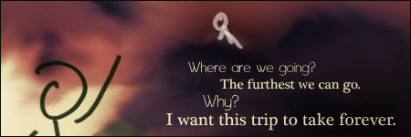
New one. Started as a "I want to do a tunnel painting", which moved to "Hm, they look like clouds, now that I look at it" to an accidental stick figure drawing that I think I might have taken too far.
Oh dear. So much text.


Oho. I get it.
Hes all like "Cmon" and shes all like "Why?" and crouching near a hill or something. XDD or you know visversa.
I love how you did the text and to differentiate between the two people.
And the simplicity of the background and the characters give it a nice calm feeling and flow. :3
Creative yes ;3
o.o that's so creative! It's so simplistic yet so amazing it's rather baffling ._.
The background is a masterpiece in itself, and the people just make so much better.
And the text... mucho grande amor!
That should translate to: Much big love!


Tunnel that ended up as a cloudy sig? That's a new one.And definately taken too far. that person in the side doesn'r exactly fit in. And what's with the white guy above the text??
But the text goes with the concept. But it still needs work (look who's talking) ...
@Dottie: EXACTLY. I'm amazed at how you got it that well. ;A; hehe. Thanks my love. :3
@Sarah: Ahaha. Thanks Sarah. viel Liebe. Oho, there's a little puzzle there. =D
@Twila: I wasn't aiming for scary though. But thanks. XD
@karuto: The people are like talking to the text. But yeah, I guess I didn't make it clear enough. ^^' Thanks for the CndC. Much appreciated. ^-^
New one! Because I thought it might be fun to try and make those little "Only On AF" things work.
And flipped!
Too bad I didn't get it to work though. XD Still, it was fun. And thank you Serated for the brushes. You can't see it very well, but it's there.
*edit*
Good GOD, my eyes. @_@ Flee everyone. Fleeeeeeeee.
*edit**edit*
Something really simple. Like, ubertastically so.
It's 4 in the morning and the little thingy in my brain that goes "Buddy, that's a bad idea" has gone to sleep hours ago. Oh well.
Last edited by KuroTan; 10-05-2008 at 05:51 AM.
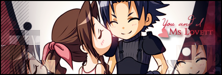
A gifteh for dotmyztick. ^_^
It's unbalanced. D=
Last edited by KuroTan; 10-05-2008 at 11:22 PM.
Kuro, that's so unbelievably cute I'm glad I was sitting down when I first saw it!
I love the extraction, it's perfectly cute. The background it sweet too, I liek the way you left the white as the main colour at the top
The overall sig... well I'm jealous of Dottie XD
Mwaa - pwnage! Great effects - I love the small square pixellations on the right top, and the text is floating lovelee. The colors look great. Heh - this sig makes me laugh. ^^
The "Only for AF" tag was kind of odd to look at.
But it's pretty good.
The colors is the only things that bother me.
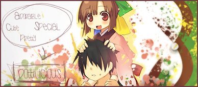
Now the Ms. Lovett tag.
That one is just pure cute.
That's one of the few things that I like about your styles.
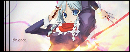
And I believe the pink lighting at the source of Aeris's kiss was good.
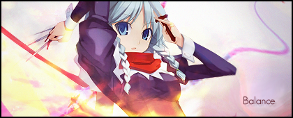
As Balance, I would have to agree.
But it seems like a cute painted canvas which is very interesting.
Although It looks very dirty at the same time when it's blurred.
But it's nicely done, and the handwriting is kicking butt.
But it seems like you could have done more to this.
You know what I mean.
You spelled my name right! *Gives a medal*
Very good, very good.
The first thing I see when I look at this signature is the very awesome text and scribbling. *0* & of course my wonderful "dottilicious" text right there O;
Although I think the signature lacks the depth factor. The background could have been filled in more with colour or another stock. But thats just my opinion. Maybe it looks better without the stock, I guess it would because the text wouldn't be as noticeable.
The colours all mix together well. I believe it is colours from the stock *0*. The stock is so very cute, and I love how the guy at the bottom has no form of eyes, so all the focus is set on the female. I liked how you balanced out the signature, with the pentool shapes on the right to mirror the text on the left. Awesomeness attention to detail there :3 - even if you didn't do it on purpose.
I love it ~ Thank you <3
& yeah I'll stop talking now.
@Sarah: XD Thanks. I'm glad you thought so. And it's only white because I'm too lazy to do extractions and the stock had white as a background. ;-;
@Mira: Ahaha. It's a warning to rippers! XDD Nah. Thanks.
@Balance: Yeah.. Now that I look at it, I think there's too many prominent colours on that sig. And I'm only now realizing that no blurring is not a bad thing. I blame all the depth tutorials. ehehe. Thanks for the awesome CndC Balance. I appreciate it.
@Dottie: *wears medal* \o/ I'd have liked to do more with the background, but I'm no good at extractions. ;-; And hey! I did that on purpose. Totally was thinking about that while I was making it. I'm glad you love it. :3
New ones!
That one is very emo. ._.
And all hail the off-centered noobness. 8D
*edit*
Forgot to put in an avi.
Dodged and burned ftw.
*edit**edit*
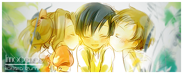
Another gifteh. This time, for Zumitron. ^_^
Text reads "Innocence - Konata Izumi" Poor poor text skills. ._.
Last edited by KuroTan; 10-09-2008 at 10:30 PM.
Oooooh, these are lovely kuro!
Well, that first one is creepily fascinating. It looks liek the stock's head is being held up by dark black branches ._. and he's absolutely pooing himself cus of it. But overall, a very nice effect. I like the textures you used to fill in the background too, very nice work.
I like the second one a lot :3 The choice of stock is great, it definitely reads: 'what the heck am I doing over here'
The third one, I like the colouring/lighting on thisBright and happy which gives out the gooey-warm feeling of innocence ^^
I say! Good show, Kuro m'boy!


omg. It's so-so cute. *___*
That so should've been the ending to Code Geass. I think it's really beautiful how you were able to smudge the grey bits in to fit in with the color. The border goes well with the text.
in other words.
BRB. Planning something.
@SSD: Ahaha. Thank you. I'm glad you liked them. ^-^ And as much as I'd like to take credit for the black thingies on the first sig, I can't. It was a part of the stock I used. XD
@Zumitron: It so should have been. 8D I'm glad you love it. =D
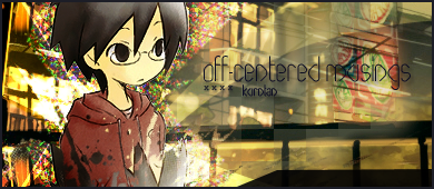
New one. It's so small. ._.
Thanks to IchigoKiss for the extract.
Off-center shows machoness *cough*
Very nice blending there *^* the colorful noise at the back especially, its so new to me xD
Text a bit too wide of space imo, but still its good xD
Very nice use of background btw, where is that? (brings memories, like in Thailand xD) Though the vividness at the left kinda exceeded my tastes. And you could've used more of that colorful thing at the right
Flow is pretty damned nice, forced me to read the text haha
Sepia overalls is pretty nice. Goes in tune with the dude's jacket actually
(Send me the Stock background! D: <)
Over-saturating since '07
That was me playing with halftones. 8D Stock used was in the latest Intuition resource pack yo Unli *cough**cough* XDD
Thanks for the CndC! I reeeaally appreciate your input on the stuff I make. ^_^
And now, some new ones.
So pink. ._.
And two versions of the same sig
And my patented signature organizer thingymabobby. 8DD
Fun fun fun with randomness.
*edit*
Another one. Thanks to Mira for the awesome extract.
New one. I'm pretty damned proud about this one because aside from that one texture, and of course the text, I drew it all. Tablet ftw.
The avatar is crap though.
*edit*
New one. Inspired by that smexylicious coldplay viva la vida ad that itunes ran a few months ago.
I followed a tutorial for a bit, and then it all just went blergh. XDD
*edit**edit*
A gifty for Balance, because he's the internet ninja. Credits to Tanuuuuuuuuuuuuuuuuuuuuuuuuuuuuuuuuuuuuuuuuuuuuuuu ki for teh extract.
Two versions, because I seem to like flipping stuff lately. ._.
Plus a redone version of my current siggy
Last edited by FlashD; 10-21-2008 at 02:11 AM. Reason: Don't double post, use the EDIT button or respect the two days delay.
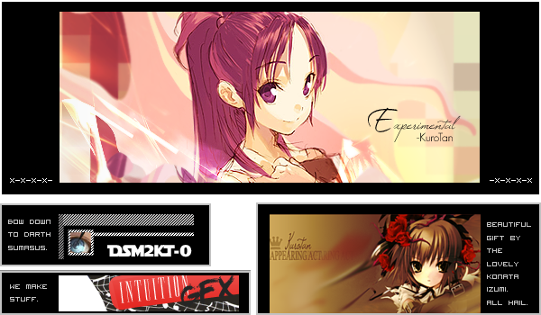
Just look at that wall of sigs *0*
Something halloweeny. Wasn't really supposed to be, considering how the stock was a Code Geass/Harvest Moon crossover. XD
If anyone wants to use it, go ahead. Send me a PM if you want your name in, or just post here. Whatever works.

There good! Well I thought they're good, and mostly people like them too. Just go with some C4D's and linear lights, my most favorite tool is the pen dynamics, smudging, and of course. Teh all mighty, "Filters"
Heh, awesome. I love the softer, more subdued colors in the first one. The tile effect is really nice, especially with the greens on the right. I'm loving the font used for "Experimental".
Nice work with the tablet! The overall sig really reminds me of fall. Colors are really nice, from the lights to the darks. Fabulousness (yes, I can say that) ^^
@Fox: Thanks. Suggestions noted. ^_^
@Mira: Fabulousness. What a smexy word. >] Thanks for the CndC. Much appreciated. =D
Sera's challenge thingy. I was going to submit it for AG but I was already well into the sig before I realized that AG has a size limit x.x
But all is not lost. This one goes to YYA instead. 8D
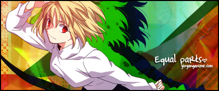
Equal parts because it's part vector part textures part c4d. Much love to the iGFX resource pack for the texture and c4d.
Oh and Unli, for his "a coloured sig should have red green and blue on it" speech XD
Last edited by KuroTan; 10-25-2008 at 03:18 PM.

Sera's challenge! I thought it was very hard, but you pulled it off nicely. Very many Unleh colors. I think you used the textures really well. But I dunno, the colors just really don't blend with the signature. I blame the stock! [Sorry Sera] Also, I think you should make the text bigger and move it up some more and use a more less curly font. It'd look more dominating. Overall, good job though.
There are currently 1 users browsing this thread. (0 members and 1 guests)
 Posting Permissions


 |
| 


Bookmarks