


I thought I had a thread around here somewhere....
EDIT: Danke so much for the name change.. xD
 AnimeGalleries [dot] Net AnimeGalleries [dot] Net |  AnimeWallpapers [dot] Com AnimeWallpapers [dot] Com |  AnimePedia [dot] Com AnimePedia [dot] Com |  AnimeGlobe [dot] Com AnimeGlobe [dot] Com |
| AnimeGalleries [dot] Net | AnimeWallpapers [dot] Com | AnimePedia [dot] Com | AnimeGlobe [dot] Com |


I thought I had a thread around here somewhere....
EDIT: Danke so much for the name change.. xD
Last edited by Yuuki Kurosu; 12-09-2008 at 08:33 PM.
I Sig by Hakuchuumu<3 I
We're Waiting For You. :]
Bump~.
This was a gift to a friend on another forum.
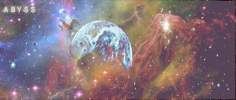
Space sig!
Last edited by Yuuki Kurosu; 12-22-2008 at 11:21 PM.
I Sig by Hakuchuumu<3 I
We're Waiting For You. :]
Bump~
Serious ***-cramping here.. >>;
4 hours of work and MANY layers.. VOILA!
AMAZING render credit goes to the amazing Serated. <333 Thankies!
Last edited by Yuuki Kurosu; 12-28-2008 at 12:47 AM.
I Sig by Hakuchuumu<3 I
We're Waiting For You. :]

Your latest is uber cute!
The smudging is excellent and all of the colors blend very nicely.
But I don't really like the wireframe at the bottom. Maybe set it to Color burn? Otherwise I love everything about it! Especially the text and border. :3
Awesome job~
Ohh! Thank you very much for posting! ^_^
And so far, you're the only person who has liked the border. xD Haha.
I put the wireframe there cuz it looked kinda plain in a way.. Lol.
Thanks again! =)
I Sig by Hakuchuumu<3 I
We're Waiting For You. :]
Bump! New sig.
It's for meh friend, Heath.
I promised him a new sig a long time ago... I kinda procrastinated. Haha.

Last edited by Yuuki Kurosu; 12-29-2008 at 07:09 PM.
I Sig by Hakuchuumu<3 I
We're Waiting For You. :]
New set . . .

I Sig by Hakuchuumu<3 I
We're Waiting For You. :]

They're all well done...Good job keep up the good work.
Thank you so much for the reply! =)
EDIT:
New sig~.
This was kinda rushed, and I don't like it. -.- xD
Last edited by Yuuki Kurosu; 01-02-2009 at 09:52 PM.
I Sig by Hakuchuumu<3 I
We're Waiting For You. :]
New sig!
V1 -
v2 -
( Like this one more. :3 )
I Sig by Hakuchuumu<3 I
We're Waiting For You. :]


I do love the purple color. I think the text in V.2 looks better, but the face in V.1 is smoother. So maybe combining them both would have a nice outcome. I also think that the flower in V.1 would look nicer if it was sharper and more defined. The flower seems like it would be a better focal point, so making it stand out would be good. The border of this signature would look good if it were black so that it would make it seem more complete. Overall, pretty pretty siggy.
Thank you so much! ^__^
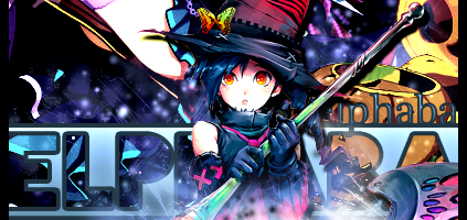
New sig! Just finished it for my friend.
Credit goes to an awesome tut by Bexpix on DA. :3

I Sig by Hakuchuumu<3 I
We're Waiting For You. :]

Originally Posted by Yuuki Kurosu
 i like these ones the best.
but the one with gravity is my favorite
it catches my attention so much.
[set by blueangel06661]♥
Thank you so much!! ^_^
Yeah, Gravity is also my fav. X3 Lol.
I Sig by Hakuchuumu<3 I
We're Waiting For You. :]
New sig, made it for a SOTW I am hosting:
Jack Sparrow ftw!
I Sig by Hakuchuumu<3 I
We're Waiting For You. :]
No, no. It's fine.
Thank you so much! =)
I Sig by Hakuchuumu<3 I
We're Waiting For You. :]
Ohaio dear ^_^
Oh god i really like ur work !! it's charming ..
I liked this one because of the colors ...
Try 2 use Photoshop u will be creative with such a good program ^^
also make ur designs full of live by using different techniques >>
for example : don't make the color of the words like the color of the background ... it may make ur work a little bit boring .. belive me i'v tried this & it looked ugly >.<
see ya around,, keep going !!
o.o; lol.
This is a.. Really, really old sig... XD
I don't use that technique anymore.
Thanks though.
And I use Photoshop. : p
New sig.
Request by the sweet Wendy_l =)
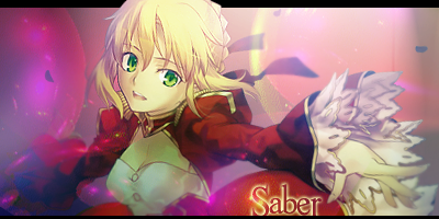
New sig!!!
Awesome render by Serated! :33
Last edited by Yuuki Kurosu; 01-10-2009 at 10:46 PM.
I Sig by Hakuchuumu<3 I
We're Waiting For You. :]
wow! your sigs are really beautiful..
i really like this one..
the colour is so pretty..and the character is yuuki.. hehe...
...really cool sig made by...Nespa... =]
Yeah, haha. XD
VK ftw! Lol.
Thanks for the comment. :3
That is a really old one. x.x
But I still like it. xD
I Sig by Hakuchuumu<3 I
We're Waiting For You. :]

Yuuki your sigs are awesome=)
you have to make me one. i love the effects~
Sig by the lovely Cotaku
__________
Thanks. : )
And sure thing. Just PM me with details and I will get on that as soon as possible. : )
EDIT:
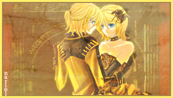
New set made for KazuYuki. =)

Last edited by Yuuki Kurosu; 01-12-2009 at 06:18 PM.
I Sig by Hakuchuumu<3 I
We're Waiting For You. :]
KazuYuki's set is SO cute! The star on the avatar's cheek is totally adorable.
I like the text on the siggy too.
The sig you're currently using is nice too. The character is glowing very nicely. =)
Thank you very much! ^__^
Yeah, I did some smudging for my sig, and she looks like she's glowing.
I liked the outcome. xD
And yus, Kazu-San wanted something cute or pretty - my specialty.
And that was the outcome. ^-^
I love it. xD Haha.
I Sig by Hakuchuumu<3 I
We're Waiting For You. :]
I love the KazuYuki set - the colors are very nice. It looks a little sharp to me, but other than that, lovely set. Kawaii!
I also really like how the Skip tutorial sig came out - very nice coloring of the sig, and I think your text work is the best in that one. Great improvements from your first sigs to your most recent ones! ^^
There are currently 1 users browsing this thread. (0 members and 1 guests)
 Posting Permissions


Bookmarks