


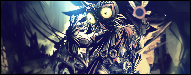
Oh I love this new one that you made it looks really nice. and i also love the effects on your background. though you can add a lil bit more to it. but besides that. Nicely done
 AnimeGalleries [dot] Net AnimeGalleries [dot] Net |  AnimeWallpapers [dot] Com AnimeWallpapers [dot] Com |  AnimePedia [dot] Com AnimePedia [dot] Com |  AnimeGlobe [dot] Com AnimeGlobe [dot] Com |


 Awakening Sin's Avatar")


Bookmarks