


Well...I was twiddling around and I got this!
I would like some comments so that my GFX skills are all refreshed.
 AnimeGalleries [dot] Net AnimeGalleries [dot] Net |  AnimeWallpapers [dot] Com AnimeWallpapers [dot] Com |  AnimePedia [dot] Com AnimePedia [dot] Com |  AnimeGlobe [dot] Com AnimeGlobe [dot] Com |
| AnimeGalleries [dot] Net | AnimeWallpapers [dot] Com | AnimePedia [dot] Com | AnimeGlobe [dot] Com |


Well...I was twiddling around and I got this!
I would like some comments so that my GFX skills are all refreshed.
Careful, I don't take you lightly.Sig set made by Daken_________________________________________________S. O. S. Finest Swordmaster


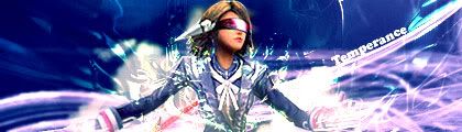
You're overusing it with the C4Ds and it's not working all too well. Overuse of C4Ds can cause sharpness in your stock which is the case here. The steamy effect is rather nice I just think you need to do some erasing. Stock placement is good and centralized and text is rather nice, just lower the opacity a bit.
I erased it :P
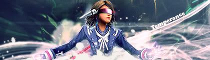
w/o color modifications
Careful, I don't take you lightly.Sig set made by Daken_________________________________________________S. O. S. Finest Swordmaster


I like that color moded one most, the blue one`s colors are too instense for my liking(says he who has many sigs. with intense colors lol)
Hmm I wonder how that one would look if you`d added some hint of green in the c4d there.

I like the edit colour version much better, alot more mellow and visable then the last.
MY ANIME-PLANET WATCH LIST
AF FAMILY
Astral_Mage - Younger Brother/Confetti Brother
horrendous - Older Brother
1nterest1ng - Confetti Brother

[color modified signature]
I like this one.
But I have to agree with whatever Konata said. It's all sharp now. If you can manage to correct the colors and quality, I think it will make a really great sig. Try using gradient maps and other adjustment layers to help you out.
And on the right side, erase some of the C4D used as it looks a bit overdone.
Last edited by UrusaiSevera; 11-10-2008 at 09:37 AM. Reason: quoting images
Coming close to a hundred!
now first I'd like my finger to glide on something
the whites from the extraction >_> Really shouts out, I have to say
Honestly speaking, this is pretty good! One of your best! xD
Flow might be a little off, but its going in one direction at least
Effects are pretty okay, but what I mostly like is the composition of some of the things especially the white clouds; left shoulder has some, right doesn't, perfect.
I like version w/o color mods (well, maybe pump up the colors a tad bit, and it'll look okay)
but the clothes shes wearing is totally off, thats why it didn't work too well imo. And then there's no lighting source to put some depth to the shine in the headgear she's wearing
Well done!
Oh, lastly, kill the stray blue C4D at the top right corner >_>
Over-saturating since '07
Time to go reach higher graphic lvls xD
Comment if you like ^^;
Last edited by LittleMomo; 11-23-2008 at 03:30 AM.
Careful, I don't take you lightly.Sig set made by Daken_________________________________________________S. O. S. Finest Swordmaster
I don't like the stroke around the girl or those drop shadows. If you want them, fix the angle so it's behind the girl on the left side and a bit down...
And too much negative space. You can cut the size with 30-50px or so.
I think you might need a light source also.
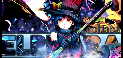
one of your better tags!
This one has a more clean feel than your usual busy sig @_@
The clips at the right is pretty awkward imo
But removing it makes it kinda way too empty, maybe do something for the background? Perhaps tiny stars spammed around the canvas :3
Over-saturating since '07
Been a while since you've posted something.
I totally agree with Unli. The sig looks really clean, a nice change of pace than your usual crowded sigs. Feels kind of empty so maybe you should have centered her and made the canvas smaller.
The fact that it lacks that busyness you usually achieve with C4D's is nice. One of your better ones so far, imo.
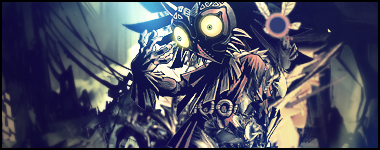
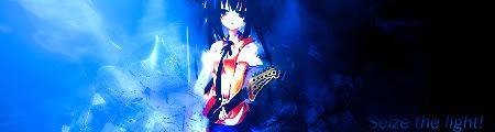
|Power of The Mask|
*Cough* total computer glitch on the last message.
I like the effects arounf the character, but it could stand to be more centered I like the simplicity of the font, and the cut out pieces of the character, but there's a tad too much empty space on the signature, maybe if you centered the character more and added two-or-so more light beam strokes it would help it a lot.
It's a really great signature, awesome job.
Last edited by *Shiori Tenka*; 11-23-2008 at 05:43 PM.
Signature and Avatar set by me. Taking requests.
My Signature Area
"If you have to choose the greater of two evils choose the one you haven't done." --- fortune cookie 10/29/08
Jag lovar jag ska inte gråta.

Okay guys, here's the deal. I'll be giving you guys hints to what I'm gonna make next just to surprise you and they are simply in the sigs. So I'll post another soon...when I get the time xD
Careful, I don't take you lightly.Sig set made by Daken_________________________________________________S. O. S. Finest Swordmaster
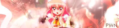
Well, I haven't been sig making much (holiday shopping would be my excuse) and well this is for someone's b-day (20th) .beat of angel because he.... PWNS!!
If you wants to comment, then go ahead ^^; I probably need some re-adjustments anyhow.
Careful, I don't take you lightly.Sig set made by Daken_________________________________________________S. O. S. Finest Swordmaster
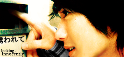
Likey-Likey zee regret but , the screen cap thingy (Is that wat u call em ?)
needs a border do . The girl would be better in the middle and also the kanji text , and if the sig would've been brighter abit .
But overall I love the CONCEPT of it . and the stuff ,
After all that, well this is what I can do for now. Then next up is other people's requests.
Yes I know the text and I'm sorry I was in such a hurry to get it done. You can leave comment if you want to ^^
Careful, I don't take you lightly.Sig set made by Daken_________________________________________________S. O. S. Finest Swordmaster
Post #167::
Too many flow directions, perhaps? My eyes are following the right side more though.
The text up there isn't a very good idea either. Why don't you place it elsewhere?
Now, your extract/focus is pretty small. So why don't you try working more on the background instead of pentooling a bunch of lines in all directions upfront? Making the background a little busier than what it is and using some C4Ds to help it flow from the bottom would help your tag look better.
Try it ^_^
I came back, friends persuaded me to go back, especially the sig friends who talk to me the most. ( You know who you are >.~)
Comments if you like ^^
Careful, I don't take you lightly.Sig set made by Daken_________________________________________________S. O. S. Finest Swordmaster

Honestly i loved all your signatures. The colours , background , everything is well matched for me. All sig have some meaning , and thats all that matters to me.
Great job.
wish me luck for furture guys!!!!Thanks for everything!!! ^___^
^___^
Welcome back to graphics Temp!
I love the vivid mix of colors here :3 And the clip-mask(?) at the right looks pretty good too! The shortened name looks very neat, and pretty good positioning there.
But, I do think the contrast is a bit strong ^^;;
Over-saturating since '07
Nice...
Glad to see you're making stuff again.
The recent tag seems to be a bit too vivid. Lots of smudging, I see. And you worked the lighting well too. But you'll need to tone down the colors a little bit.
I haven't done these in a long time so here:
New sig for me
The second one, I just went wild on it and it turns out to be like that xD Comments if you want to leave any. x3
I had to re-make the second one because I didn't like how small it was, so here:

Last edited by UrusaiSevera; 06-23-2009 at 05:52 PM. Reason: no double posting plx
Careful, I don't take you lightly.Sig set made by Daken_________________________________________________S. O. S. Finest Swordmaster

i love them all the ones on the last page are my favorites
do you take requests?
[set by blueangel06661]♥

It's not so bad I like the glow effect particularly and the fact you focused on the character rather then the background they're in.Originally Posted by Jump_for_Luck

Gero Server Guru

There are currently 1 users browsing this thread. (0 members and 1 guests)
 Posting Permissions


Bookmarks