


I wasn't sure if I could post this here, but there IS a game section on AW...so here goes nothing:
Good/bad/needs work?
 AnimeGalleries [dot] Net AnimeGalleries [dot] Net |  AnimeWallpapers [dot] Com AnimeWallpapers [dot] Com |  AnimePedia [dot] Com AnimePedia [dot] Com |  AnimeGlobe [dot] Com AnimeGlobe [dot] Com |
| AnimeGalleries [dot] Net | AnimeWallpapers [dot] Com | AnimePedia [dot] Com | AnimeGlobe [dot] Com |


I wasn't sure if I could post this here, but there IS a game section on AW...so here goes nothing:
Good/bad/needs work?

Wow holy crap... O.o that is mindblowing. Awesome job.
I like your sigs as well btw.

Missing your namae and Animewallpapers.com on it. Always handy to have that so we know who made it and where it came from.
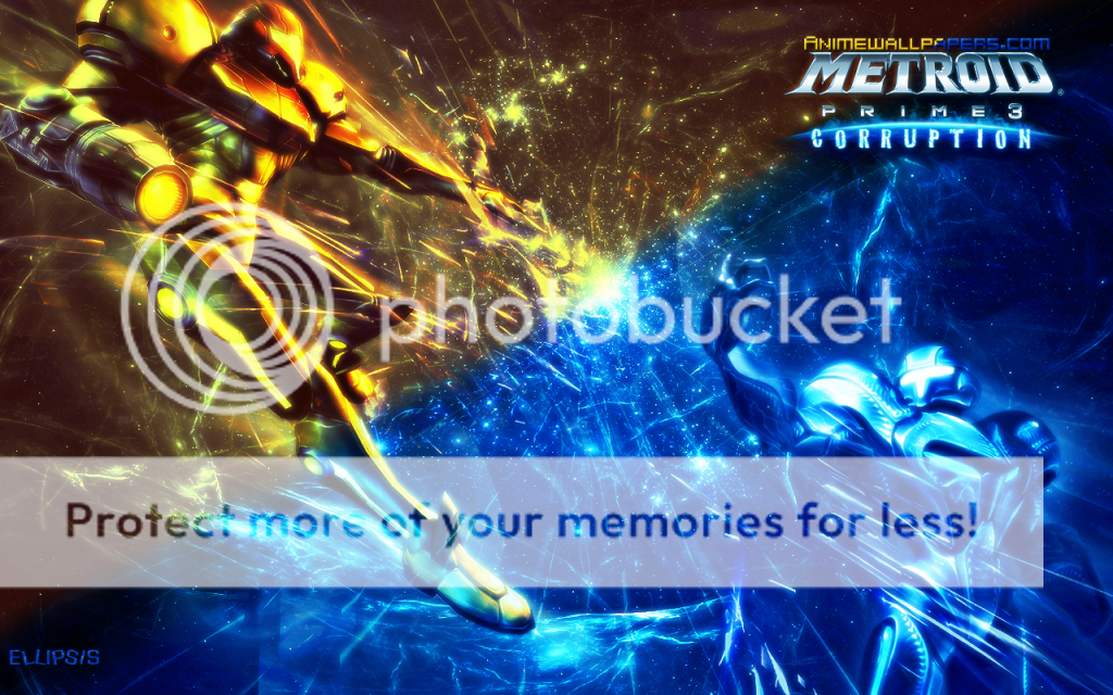
I think theres a bit bit too much blue, and regular Samus kind of feels, I dont know, under colored? What you could do, is divide the wallpaper diagonally and amplify the blue on Dark Samus' side, and purge the colors of regular Samus on the opposite, so it look more like a clash of the titans so to speak.
Sort of like this? (I think I overdid Samus's colors)
http://i342.photobucket.com/albums/o...allpaperv3.png

Oh, very awesome looking. It really strikes the eye.
I like the first version, but the second version is just as good looking. Samus doesn't look overdone, but it is a bit bright, unless that's just my monitor.
月の光は愛のメッセージ

In general, I think it's prettier if your name and aw logo are really small on the bottom. That way, it will be covered under the task bar. Either way, I think the second one is overdone on Samus' side. o_o But I dunno how to fix, sorry.
Last edited by Capernicus; 06-23-2009 at 07:38 PM.
Back, by popular demand! Now with new avy.
Magnificent job on this. Sent it to a Metroid-obsessed friend o' mine who has vowed never to change his wallpaper ever again. XD
"When a girl ceases to blush, she has lost the most powerful charm of her beauty." ~Gregory I
I have to say that this wallpaper is extremely hot. I would be willing to change my wallpaper to this today...
Thanks

Note:
Character to the left = C1
Character to the right = C2
Text:
Alright, so the overall is pretty good. Could use a few touchups here and there, but I'm not going to go into details about that. You might as well leave it as it is.
Anywho.
The way C1 seems to be striking down to C2 doesn't really feel right. To me, it feels like C2 is standing way too close to 'you' as the third person, and C1 will simply slide in behind C2. Field of depth is failing.
I think this is something you should fix, cause it's seriously bugging me. <-<;
Anywho, overall grade: B minor.
| Someone painted the sky || Forever in my heart |
Game Developer/3D Character AnimatoreSports Commentator & Senior Server Administrator for LionsEK

i like the first one better, it may have too much blue but the second one has a weird combination of colors. maybe if you change the color or sometihng, otherwise it's really good
you can't call me weird, cause im unique ^_^
btw if youre going to admire me, please tell me who you are, gracias
siggy by teddythankies ^^
**UPDATE** NEW DRAWINGS
* * * A R T ~ W O R K * * *
My sweet sweet family is located in my blog
if you want to be a part of our family, pm me
There's a lot of blue in it, because the whole game centers around Phazon (which is blue). And everything in it has a sorta blue tinge to it. But I'll work on that Soph! (I actually didn't see that post until just now D

Originally Posted by Ellipsis

I like this one! The golden hue really emphasizes the armor. The first one (blue) kinda looked dull. I love the way toy made it in this God motif!
There are currently 1 users browsing this thread. (0 members and 1 guests)
 Posting Permissions


Bookmarks