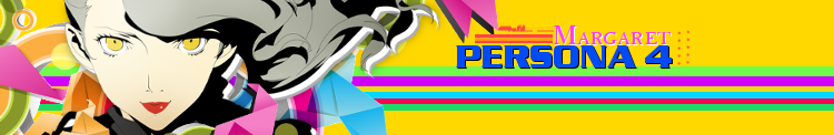


HI i just made a new wallpaper could you guys tell me what you think of it just click on it below
 AnimeGalleries [dot] Net AnimeGalleries [dot] Net |  AnimeWallpapers [dot] Com AnimeWallpapers [dot] Com |  AnimePedia [dot] Com AnimePedia [dot] Com |  AnimeGlobe [dot] Com AnimeGlobe [dot] Com |
| AnimeGalleries [dot] Net | AnimeWallpapers [dot] Com | AnimePedia [dot] Com | AnimeGlobe [dot] Com |


HI i just made a new wallpaper could you guys tell me what you think of it just click on it below


First, that yellow text - what does it even say?
The violett text is also barely legible...
In generell you should lose at least 3 of the characterpicture in that thing...
It's way to congested and all the text is making it seem very nervous...
The eye has no point to rest on...
I think the "trend" in wallpapers currently is rather clean, empty and silent
so that it's pleasant to look at on your desktop but not the maincenter of attention...
I hope I made my point good, it has been a while since I last gave a comment on a wallpaper ^^°
___________________________________________
Spammers busted: 正
Taking your advice I will make it Simple and clean(KH Reference)

You really haven't done much to say the least. You took an image, duplicated it, flipped it vertically, blurred it, threw on massive text to cover it up. I think the fundamental flaw here is that you just have done anything to make this wallpaper to make it feel 'your own.'
Another thing is that the text is so massive and making it almost impossible to read. The thing that text should be is off to the side, so we know what you want us to think. Do you want us to feel excitement here? Happiness? You have to do more design wise.

The font is way too big. And I wish that you would have made Yui more noticeable.

Bring me back!!!I lol'd at thisOriginally Posted by edward10

There are currently 1 users browsing this thread. (0 members and 1 guests)
 Posting Permissions


Bookmarks