


It looks almost complete. But whatever, i'll comment in it's current state.
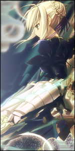
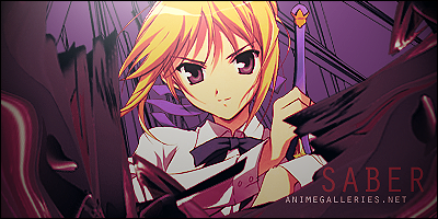
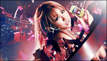
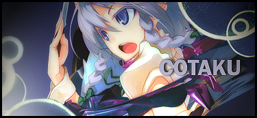
lighting is good, but the circles in the top left hand corner I don't like.
Maybe they were suppose to be a light source? Maybe an attempt at blending? Whatever, it doesn't fit, it looks random, it looks like saber is going to bump her head on them and die.
Or, if you really, really love the circles, make them fit better onto the background so saber doesn't look like she's going to have an accident. Make them more blue, darken them, do what you have to, to get them closer to the background and away form the foreground.
Here's what I like. The shapes underneath her and the subtle blending near her arm is good.
You're lighting has dramatically improved. =D
Love the flow. Especially how the background really give the sig flow. But the spike protruding from her arm does not follow the flow...._.
Any ways, if you're not too busy, can you make me a sig? =3
 AnimeGalleries [dot] Net AnimeGalleries [dot] Net |  AnimeWallpapers [dot] Com AnimeWallpapers [dot] Com |  AnimePedia [dot] Com AnimePedia [dot] Com |  AnimeGlobe [dot] Com AnimeGlobe [dot] Com |
 Reply With Quote


Bookmarks