


Competition? >.< You mean like a SOTW thing?
Is the sig you're using the one you're talking about? ._.
 AnimeGalleries [dot] Net AnimeGalleries [dot] Net |  AnimeWallpapers [dot] Com AnimeWallpapers [dot] Com |  AnimePedia [dot] Com AnimePedia [dot] Com |  AnimeGlobe [dot] Com AnimeGlobe [dot] Com |
| AnimeGalleries [dot] Net | AnimeWallpapers [dot] Com | AnimePedia [dot] Com | AnimeGlobe [dot] Com |


Competition? >.< You mean like a SOTW thing?
Is the sig you're using the one you're talking about? ._.


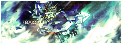
yars angelic C:
and here's muh latest
Lex Luger R.I.P
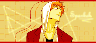
¦ Sexy Logo By Me ¦ R A R E R E N D E R ¦ Tutorial requests and PSD Requests open ¦ Tag Thread

Ooh I see... Don't tell me you only used brushes in that sig o_o;
I think the brushes ruins the flow :/ And the sig is too plain imo >.< You should add more stuff to it =]
The text is very nice though ^^
Post moarrrr~~♥
ahhh but im experimenting miss angellic C:
trying to find a NON VECTOR style :P
Lex Luger R.I.P
¦ Sexy Logo By Me ¦ R A R E R E N D E R ¦ Tutorial requests and PSD Requests open ¦ Tag Thread
shizzle

Last edited by .Tatty.; 11-04-2009 at 07:29 PM.
Lex Luger R.I.P
¦ Sexy Logo By Me ¦ R A R E R E N D E R ¦ Tutorial requests and PSD Requests open ¦ Tag Thread
Wow you make sigs so fast xD
I like the last three the most :3 The blending and flow is really nice. For the fourth one, you used the 3rd sig as background right? ^^
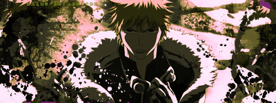
Anyways for the Ichigo one, I think his face is abit too dark >.< And the lighting isn't that good imo, but it's still very well done ^^
Post moarr~~~ <3
very onbervent yeah
number 3 is a background for number 4
i saw that swiggly line to the side and thought hold on!!!! :O that looks like a can but a guitar thar D:
thanks for the comments
and the ibhigo one, the render was quite dark to begin with ;o;
Lex Luger R.I.P
¦ Sexy Logo By Me ¦ R A R E R E N D E R ¦ Tutorial requests and PSD Requests open ¦ Tag Thread

Last one is your best :3 You need to try and use more color though :3
ein, zwei, drei, vier bin endlich weg von Dir
fünf, sechs, sieben, acht Du hast jetzt keine Macht
♥


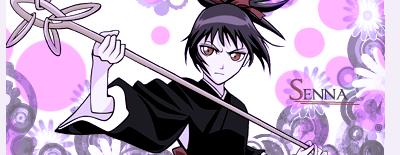
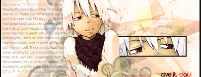
Whats the focal in this one?
http://i565.photobucket.com/albums/s.../A-FSOTW17.png
It`s waaaay too dark, and looks very messy.


You would be surprised how many reasons there are, actually. Moved to Dazzle us.Originally Posted by Tatty Bojangles

Signature and avatar made by Trinity Muse!
Alrighty a few updates D:
(dropped)
test with C4d's and various other things (hense the sigs name ALSO DROPPED)
(request on another forum)
EDIT: boarder sucks but meh D:
Last edited by .Tatty.; 11-22-2009 at 07:22 PM.
Lex Luger R.I.P
¦ Sexy Logo By Me ¦ R A R E R E N D E R ¦ Tutorial requests and PSD Requests open ¦ Tag Thread


Lots of sigs that time...Lets see. I think the first one is pretty good, there's just something on the left side bugging me, and I can't figure out what it is, so I'll get back to it. The second one is too monotone for my taste (even though my sigs are VERY monotone most of the time.) I can't really think of anything else for that one. The 3rd one is great! the text is extremely hard for me to read though (what does it say?) I wouldn't change anything on it besides the text though. The 4th one is...kinda okay-ish. I don't like the tiled bg too much, and the wireframe looks a little out of place. The colors are kinda weird too though, they kinda seem to clash a bit. The 5th one is prefect; I wouldn't change a thing on it! And the last one is pretty good, but the border is killing me D: The Yugi in the background looks kinda weird too. It looks like something happened with the colors back there...they got all...funky. But yeah, good job! (I think this is the most I've ever typed in a post)
Last edited by Bulf; 11-23-2009 at 02:05 PM.


really good work, alot of your color schemes are perfect, but also don't get caught up in characters for all your sigs sometimes pure graphics are they way to go.
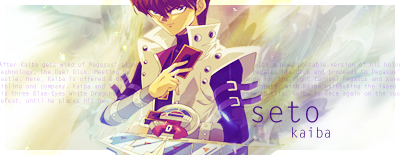
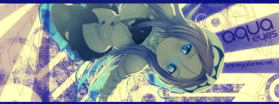
the "aqua eyes" one is amazing O_o.. beautiful colors and everything is on the right place
keep it up
- Now! This is it! Now is the time to choose! Die and be free of pain, or live and fight your sorrow!
- Life is but a passing dream, but the death that follows is eternal.
1st one, Thanks, could it be the line brushes in the top left being lighter then most of the tag?
2nd one yeah not one of my best, i had like 30minutes before the deadline for that SoTW was due so its fairly rushed, i hate it >_>
3rd one, yeah the glows killed the text and the line, i will get back to that sig in the foreseeable future >_>
4th one, yar i hate it xD just playing around with c4d's and clipping masks, i uploaded to PB by mistake when i was uploading all the latest works
5th one, yeah the tock was so easy to blend in, and its only 7layers which is wow for me >_> and the boarder was by request of the user, they wanted a white boarder and a dark background, god knows why >>
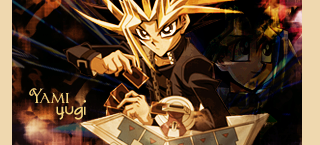
6th(yugi) one,
the top corner near little yugi's face, i noticed that and cant fix it without killing the sig as a whole...oh well xD, its less noticeable with the dark boarder me thinks
Thanks :3
Ah you do have a point about characters there, the yugi one is a good example, i was too fixates on bringing out the darkness the surrounds yugi throughout the "Waking The Dragons" arc of yugioh!
Thanks for the positive feedback :3
shame it came 3rd /tear xD
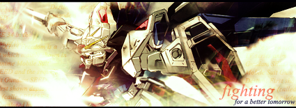
OKAY!!!!!! Few requests done (now im up to date with them thank god >_> )
(too much negative space on the right side i know /tear and the typography sucks but meh the user seemed happy with it)
(im very happy with how this one turned out! Makes a change xD )
Lex Luger R.I.P
¦ Sexy Logo By Me ¦ R A R E R E N D E R ¦ Tutorial requests and PSD Requests open ¦ Tag Thread
Yoo suck, go away! >:I
jk
Don't use more than one render for them, it distracts from the focal. Also, make sure the vector brushes are more solid :3
Last edited by FlashD; 11-24-2009 at 01:50 PM. Reason: Language
ein, zwei, drei, vier bin endlich weg von Dir
fünf, sechs, sieben, acht Du hast jetzt keine Macht
♥
;o;!!
anywho would you be referring to ze yugi sig?
and a new one, i dont like how it turned out but meh D:
Lex Luger R.I.P
¦ Sexy Logo By Me ¦ R A R E R E N D E R ¦ Tutorial requests and PSD Requests open ¦ Tag Thread

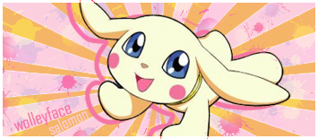
I really like that on Tattyface. It looks great imo.
The negative space really makes it feel clean and pretty.<33
thanks for the input wolley face :3
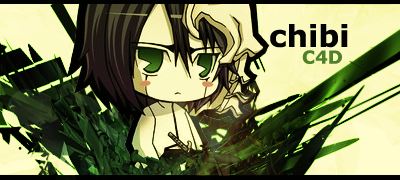
workin on that digimons sig O=
quick sig i made for fun,nothing serious xD

Lex Luger R.I.P
¦ Sexy Logo By Me ¦ R A R E R E N D E R ¦ Tutorial requests and PSD Requests open ¦ Tag Thread
(has been about 48hours)
thanks for the comment rags ^^
heres a request finished,
(Cute and digimon theme adhered to? xD )
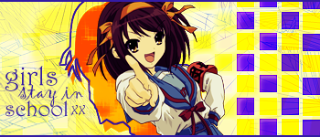
and finally a SOTM Winning Entry as of 1AM this morning :3
(Theme "school")
Lex Luger R.I.P
¦ Sexy Logo By Me ¦ R A R E R E N D E R ¦ Tutorial requests and PSD Requests open ¦ Tag Thread
Some poor poor updates D:

Lex Luger R.I.P
¦ Sexy Logo By Me ¦ R A R E R E N D E R ¦ Tutorial requests and PSD Requests open ¦ Tag Thread

Theres something odd in nearly all of yours signatures that I just can't point out.
Do you image>apply image then filter>sharpen>sharpen your signatures once you have finished?
Maybe that is it, cause some of your texts are really blurry compared to others.
I really like the third one out of this lot of signatures.
Except my only concern is that the close up on the right has a thick border which is kinda drawing attention away from the focal.
Also another tip, try to keep your text in the centre of signatures, like near the extractions, rather than in the corners.
I don't know why but it really bothers me when people do that.
uhhh, also try experimenting with borders. Sometimes borders can make a signature that much more interesting. Idk.
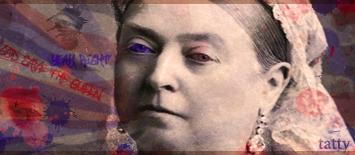
keep on truckin, cat face.
cat face!? O_o
anywho remember im still a novice young miss dottie ;3 but thanks for commenting! im trying to learn from my mistakes xD
ANDDDDDDDDD Three new pices, still trying new styles
You should ALL be happy, in the last three sigs theres only ONE gradient map D: and thats black/white set to luminosity 60
Lex Luger R.I.P
¦ Sexy Logo By Me ¦ R A R E R E N D E R ¦ Tutorial requests and PSD Requests open ¦ Tag Thread
I'm really loving the second one, especially the text!! The negative space in the last one bothers me though idk why.
And the first is top notch<33
Ouh, well your a cat face cause your a tatty bojangle, which reminds me of a cat.
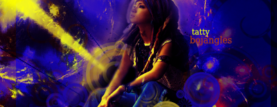
And I love the colours in the first one, and the placement of the text. The smudging is pretty good too :3
What font is that? I wants it.
The second one is a bit too oversmudged, I cant really see a focal.
And the third one is good, I like the simplicity and your use of the C4D.
There are currently 1 users browsing this thread. (0 members and 1 guests)
 Posting Permissions


Bookmarks