


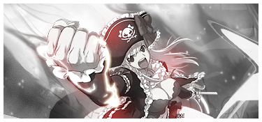
A new set. I quite like this one. It's not my usual style, but I think it works well.
 AnimeGalleries [dot] Net AnimeGalleries [dot] Net |  AnimeWallpapers [dot] Com AnimeWallpapers [dot] Com |  AnimePedia [dot] Com AnimePedia [dot] Com |  AnimeGlobe [dot] Com AnimeGlobe [dot] Com |
| AnimeGalleries [dot] Net | AnimeWallpapers [dot] Com | AnimePedia [dot] Com | AnimeGlobe [dot] Com |


A new set. I quite like this one. It's not my usual style, but I think it works well.


Very nice siggy SS ^^
Really nice lighting on it.
Nothing negative to say about it.
Your so creative, can I borrow some of it? lol
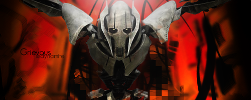
New set:


Nice concept, I can see what you are trying to get at here, but I don't think it worked out that great in my opinion.Originally Posted by SSDynamite

I mean, the apophysis is very nice to look at, but perhaps if you just did a bit more work on that, I think you would be able to create something more interesting.
Also a border would be nice. =D
Also, one more thing, it seems like that there is a light source in this signature. Perhaps if you went to Filter>Render>RenderLighting Effects, then perhaps you would be able to manipulate the lighting situation a bit better.
Very nice composition though. Just have small details to work on.


On post #76. Seems you really got the pen tool down, I'm so proud. Even with the clipping mask the right side seems a bit unloved. I really don't like the pixel effect on the left, the pen tool gave it a sort of flowy feel and the pixeled clipping mask don't work well here. The set is pretty amazing, I really like how you change the text color depending on the background, or was that just the blending mode?
Signature on post 78, too big in my opinion, I love how you blended the extraction here and the c4ds here are just amazing. Like Balance said, lighting source is the left side, at least that's what the extraction seems to show, you did make that side lighter but perhaps the right could of been darker... Add a border XP, increase the epicness factor.
New set
For my return.
Last edited by SSDynamite; 11-30-2008 at 12:41 PM.

Haha, how lovely Sarah. I love the way you did the background. It really brings out the focus of the signature. The pentooling looks really cool too. It doesn't seem unrelated. I like the text and how its small and not distracting but looks good. You blended the siggy very nicely too, so good job with that. Overall, very nice siggy. Good job.
Since I'm going to see him in the beginning of May, here's a Derren Brown tribute.

My last thread was closed due to inactivity *hangs head in shame*
However, now I'm back to carry on making sets and stuff, so I welcome any constructive criticism and basically general opinions
Also, I guess I'm up for one or two requests :/ if anyone wants them...
So here's my first set for the thread :3

Looks very simple and pretty, and the color scheme works well with the stock you used. I like it. Those swirls are a nice addition to the generic circles too. For the avie, I like the how you positioned the stock. I think overall it's cute, and I'm not good enough at sigs to really provide any criticism. <3
Welcome back.
Back, by popular demand! Now with new avy.
I went yellow this time. Although I think I left a bit too much empty space in the top corners... I dunno. Anyways, here it is:
I also couldn't think of anything to do for the text... sticks out a bit :/

You made that Ichigo one too right?
That one was very plain and well not something I`d expect from you SSD(even if it was months since last sig)
But your coming back fast I think
The newest one:
Nice c4d`ing.
But ehm 600x300 px? :O
Go smaller.
Their sigs, not semi-banners hehe.
That Purpley sig:
Nice colors.
And I`m crossing my fingers that you`ll get back to you old pentooling queen self
Like the gorilaz tag
SSD is back, brighter, bigger, and better than ever O_O I LOVE IT!
The yellow does not hurt my eyes! Thats very awesome. I think the stock you used could be a bit sharper to match that its huge. And some sigs look great without text, so maybe you should get rid of it if you don't like the sticky-outy-ness. *cough* I want a giant sig plox *cough*
So I made Jaggy a big-sig :3
I hope you like it, though I can add a border if you want one.

Okay >< this is my first sig done using a photo (not mine, found on deviantART)
So, the verdict?
I was thinking of doing some more clipping masks, or more effects but I didn't want to over-do it.
The yellow/orange in the right hand corner is a bit bright...But i still love your work...Tell me if you take requests...
Magical Soul, I will make you a sig if you would like me to
Anyways, here's the first version of an idea I've been thinking of for a while. I might make a series of these along side any other sigs I do :3
This is just a... prototype? Basically I drew it up in illustrator and plonked it into PS. Didn't work very well, but I like the idea of having a mascot kinda thing for my sigs. (I was going to say 'a signature signature', but it didn't seem to make sense o.o) But, yeah, this is Thunder Frog.


Ugh ....i have to keep asking myself....why didnt i looked at this thread before ? Oo"
One word , Marvelous!!
You have such a different style i must say.
And the one with the frog , i totally loved the expressions of it...tee hee heee...=D
I hope i dont miss more of your work , keep posting !! ^^
wish me luck for furture guys!!!!Thanks for everything!!!^___^
So here's the sig for Magical Soul:
(sorry if it's too girly)
Also, I just realised you live in Pontefract. RIGHT ON! I have relatives there
And thank you for the nice comments to the people who've posted ^.^

Your signatures are so awesome. They all have a unique style but I think they all show your creativity. They really are awesome and I enjoy them very much. I wish I could make sigs as awesome as you do. ^^ Please keep posting. I'd love to see more of your work. ^^
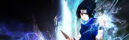
[Click ♥] Ask me something please? o ~ o
♥ Sasuke Uchiha ♥
|♫|"Cause I was born to tell you I love you, and I am torn to do what I have to,
to make you mine. Stay with me tonight."|♫|
Sig for Silent Madness:
I could fit in the colours you wanted, it didn't really look right. But hopefully you'll like this one
Hmmm...nice i really like it. Actually i was feeling already grateful that you took my request , and its a well done , this will go straight to my collection with your name =D
And anyways , anything related to Lord Vicious is always great ...tee hee hee...
Thanks.
(Alice)
Last edited by Necro'lic Enigma; 04-08-2009 at 11:29 AM.
wish me luck for furture guys!!!!Thanks for everything!!!^___^
It's a good job there's no limit to how many updates you can do in a day.
Anyhoo, a new sig for myself. Though is it better with or without the gradient map?
with:
without:
I just realised. This is REALLY similar to my boba sig... nvm.
I think it looks cooler with the gradient map gives a bit more depth...
Wow, welcome back.
It's good to see that you are really active...again.
What I suggest is try messing around with smaller sizes.
Also try different techniques on blending.
Because from what I'm seeing, you try to place effects or C4Ds over the subject and call it good.
Look around and try different styles as well.
Honestly though, you're doing really good...
And it's quite surprising that you can still make good signatures after such a long break.
I'm not quite confident with my skills right now. -__-;;
There are currently 1 users browsing this thread. (0 members and 1 guests)
 Posting Permissions


Bookmarks