Referring to Unli's gift sig;;
The text work is troubling me. The pixle font is fine, but the kanji underneath...maybe it needs to be smaller?
Also the colors aren't very good. Maybe add a few gradient maps or something to soften those colors??
AnimeGalleries [dot] Net | AnimeWallpapers [dot] Com | AnimeLyrics [dot] Com | AnimePedia [dot] Com | AnimeGlobe [dot] Com |
Referring to Unli's gift sig;;
The text work is troubling me. The pixle font is fine, but the kanji underneath...maybe it needs to be smaller?
Also the colors aren't very good. Maybe add a few gradient maps or something to soften those colors??
Some recent works
<3 The 2nd one...
Really good blending....And love your choice of colour....
Awesome works Middy! I especially like the colors on the second one - it's very warm, and I love the lighting.
The first one is well constructed - I like the black-white with the touches of orange.
For the third one, the right side is very nice, but the smudging on the left seems to conceal a little too much, and it's a little too blurred - maybe more sharpness.
I love the last two - great colors and lighting. Awesome sigs - I always loved your style. ^^
|Sig thread|---|Extractions!|Sooo many thanks to .Celeste for the lovely avvy!!! ::INTUITION GFX
the blend of colors where nicely done and all of them where great
1st one: It seems too big for the render, crop it :3 The compo of the orange lines seems funny, but cropping may help
2nd: Vibrant reds are very pleasing to the eye, perhaps move the render up? The foreground effects are also choppy.
3rd: This is hot, I'd just sharpen some of the foreground smudge a bit
4th: I'm not too sure about the smudge here, it just seems to pop out instead of gradually going into the background, thus making it seem flat.
5th: Another hot one, just the foreground effects are too sharp again, otherwise its great :3
Hope this helps
ein, zwei, drei, vier bin endlich weg von Dir
fünf, sechs, sieben, acht Du hast jetzt keine Macht
♥
I like this one.. Love the pose and the green colour as well!
I really like the concept.. It gives me a deep impression..
Ah, I don't know what I have to say.. Too awesome.. >,< Great skill.. I hope I can do the same thing as you did.. XD
Once could be a fluke and twice a coincidence, but thrice proves it's a real ability.
JaceKitty - Which signature were you thinking about using? I usually don't mind if people wear my stuff as long as they give credit.
Thanks guys for the comments and critiques.
I"ll try to work on keeping sharpnesses at the right level.
Here' some stuffs
Credit and Thanks to Serated for the extract on the first one and if I recall for the Shana one as well -So many awesome extracts from Serated that sometimes I lose track
shana was pretty nice and awesome love the redness of it
Archer: This is very nice and the lighting goes well, but some of the c4ds are really choppy, make sure to keep an eye on em if you rotate/resize!
2nd: The purple lighting at the top really doesn't fit, and is way too saturated. I like the colors, but once again the c4d is choppy
K': This is sexy, don't change a thing <3
Shana: A bit plain, looks unfinished IMO, I'd like to see some more detailed flames
L: I think you over did the wind here, it covers up all the effects and makes it seem really plain.
ein, zwei, drei, vier bin endlich weg von Dir
fünf, sechs, sieben, acht Du hast jetzt keine Macht
♥
I demand a tutorial for tags 1 and 3 if I am slaving away extractions for you......please?
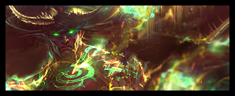
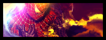
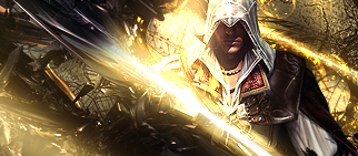
Anyway, enough of my begging. Tag 1, its just really powerful. I mean, jeez, if you had all of that flow covering the entire tag, it would be pretty amazing, but I guess because the extraction was sort of lopsided, I can understand.
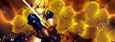
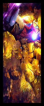
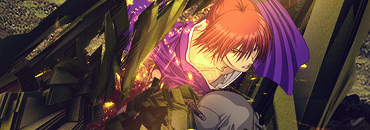
Tag 3, it just flows, perfectly. Its missing a few things, but sprites kind of make those things obsolete.
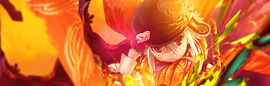
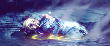
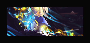
The Shana tag feels a bit empty. All the stuff you have going on around it really draws me in, but it feels a bit half done so to speak.
Whoo - the third and fifth ones are smexy!! L never looked so good.
I love the effects on the third one - I love the left side being black and just having a bit of effects on the right - nice colors.
The effects on the L sig are great - I think the light over his torso is a tad too bright, but everything else is perfect!! ^^
Heh, tuts would be awesome.
|Sig thread|---|Extractions!|Sooo many thanks to .Celeste for the lovely avvy!!! ::INTUITION GFX
The blending on your sigs is amazing....I want to see more...
Really appreciate the great Cnc guys!!
Serated, you picked my most messy .psds to request tuts on ^_^
The Archer tag would be relatively simple except for the fact that about halfway though the effects ended up centering the extract, so I was forced to add it again, resize it, and then blend it back in. That's why it probably looks lopsided, but I still think it's better than a centered focal.
I think I'll try on the Archer tag, but I don't know how it will come out.
I've never really done a tut..I think I might just outline my steps.
Did this for a request.
The extract looks really bad quality, but still you did awesome with it...
Another request
+ More Vert experimentation
I need to stop using these borders, lol.
FFFFFFF those colors! *w*
I just don't really think the effects of the first really match spiderman. Maybe some web-like or urban-ish effects?
ein, zwei, drei, vier bin endlich weg von Dir
fünf, sechs, sieben, acht Du hast jetzt keine Macht
♥
Lovely colors and effects. I just think the negative space should be black, it would add more depth
ein, zwei, drei, vier bin endlich weg von Dir
fünf, sechs, sieben, acht Du hast jetzt keine Macht
♥
bump by request
HOOOOOLY CRAP
http://www.animeforum.com/showpost.p...3&postcount=48
I AM A YEAR LATE.
This piece of shex I must wear!
Thanks a lot!
--
I adore the Assassin's Creed signature you've made. I've been trying to analyze it a bit to try and copy it, but my C4D usage skills is so miniscule, I can't get anywhere close to it D':
Great work! Keep inspiring me onii chan!
There are currently 1 users browsing this thread. (0 members and 1 guests)
Bookmarks