
Originally Posted by
Kersheys

First, Second, Third and Ninth are my personal favorites.
The first one is the best one, imo. Brilliantly done. Did you do the background yourself?
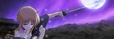
On the second though, the image seems a bit too blurry compared to the sharp sky and stars. Belldandy is a bit oversharpened as well. The ninth one (Lol sorry I can't really identify her right now) on the other hand, is undersharpened. Too blurry compared to the near vectors and there seems to be a thin white outline around her.
Otherwise, great stuff. I look forward to whatever you may come up with~


 AnimeGalleries [dot] Net
 AnimeWallpapers [dot] Com
 AnimePedia [dot] Com
 AnimeGlobe [dot] Com


Bookmarks