


These are few my first avatars I made in photoshop.
Please, tell me how I did.
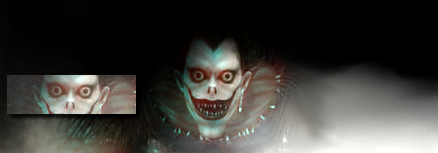
This is my avatar now.

 AnimeGalleries [dot] Net AnimeGalleries [dot] Net |  AnimeWallpapers [dot] Com AnimeWallpapers [dot] Com |  AnimePedia [dot] Com AnimePedia [dot] Com |  AnimeGlobe [dot] Com AnimeGlobe [dot] Com |
| AnimeGalleries [dot] Net | AnimeWallpapers [dot] Com | AnimePedia [dot] Com | AnimeGlobe [dot] Com |


These are few my first avatars I made in photoshop.
Please, tell me how I did.
WARNINIG!!WARNING!! Vegitto/Gogeta obession HERE!!!!!

Well, the first one looks a little blurry.I'd try fixing the lighting, and letting more of the character's face show up.
The seconds one looks better, although you may want to fix the text and once again the lighting.
The third one, I understand what you're trying to do, but you have to let the character's face appear. Just be careful how you highlight and adjust the brightness.
Great work though.
Thank you, Aushkei.
It was my first time making avatars and sigs and you're right the second pic does look good, I'll fix the other two.
I fixed the first one.
I made it similar to the second one.
Last edited by Lady_Saiyan; 01-07-2009 at 10:12 PM.


Hmm, they're good. But you need to fix the lighting.
The second try of the first one is better, but try to not get renders that are blurry. Try to use more variety with how you make it.
And try to use better quality.
Hi there ..
if it was ur first time i may say it's good ...
Try 2 work harder on the pics & use frame for it ( we call it stroke at the phtoshop world )
it's make the pics look cool even though if u didn't make a lot of work ^_^
Go ahead .. see ya
Thanks everyone!
Here's the third one fixed and another one.
Please comment on how I did!
There are currently 1 users browsing this thread. (0 members and 1 guests)
 Posting Permissions


Bookmarks