


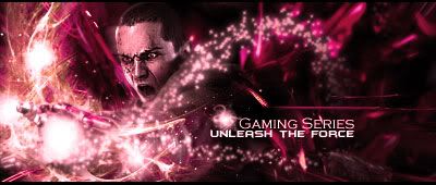
Well here is some of my sig's
Hope you liked it ^^
 AnimeGalleries [dot] Net AnimeGalleries [dot] Net |  AnimeWallpapers [dot] Com AnimeWallpapers [dot] Com |  AnimePedia [dot] Com AnimePedia [dot] Com |  AnimeGlobe [dot] Com AnimeGlobe [dot] Com |
| AnimeGalleries [dot] Net | AnimeWallpapers [dot] Com | AnimePedia [dot] Com | AnimeGlobe [dot] Com |


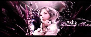
Well here is some of my sig's
Hope you liked it ^^
Last edited by DHPD Shar; 12-22-2008 at 08:28 AM.

Hmm. Well, let's start with some advice, eh? You seem to be lacking proper flow in most of these, so I would suggest you study some tutorials on the subject--it'll do wonders, trust me.
Also, don't be afraid to use many/different methods to create a backround. As long as you don't over-cram it or draw too much attention away from the render, you'll be able to use as many C4Ds, brushes, and/or clipping masks as you like.
Experiment, stay inspired and keep up the good work! ^^
Jang Hyunseung is perfect in everyway. SO-1 FIGHTING.
Iceflower made this dazzling signature.
like this
thanx for the advice
Heres another one i just made
Another one >.>
Again
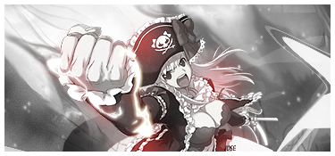
Sasuke!!!
Tried something new...
Any comments?
Last edited by DHPD Shar; 01-05-2009 at 01:30 PM.
i like your new sigs better! the gogeta(did i get it right?) seems cool. and i'm loving the one with pain :3
and as for the sig you're currently wearing, i think there's too much space on the center?
anyways, i love the sigss and keep it up :]
Last edited by jnLL; 01-18-2009 at 08:25 AM.
»
inactive ;

they're actually pretty good sigs you have here. Now i think you can add more flow to it rather than shading around the render. Try not to use such a small render though as your focal, hard to see. And a comment on the last one, really and i mean really try to avoid double renders. Two focals make eyes jump which can irritate the viewer. I think you should just crop out the sig without that part of the render on the left hand side because it looks great other than that ^^
both made by me
i really like this two sigs.. they're so cool! especially sasuke sig.. for the first sig, the colour is so beautiful! anyway, good job! keep up the good work, okay..Originally Posted by DHPD Shar

Last edited by FlashD; 01-22-2009 at 04:28 PM.
...really cool sig made by...Nespa... =]
Wow thanks guys lol
here are new ones
[image removed]
Avatar >.>
Criticize it
Last edited by UrusaiSevera; 02-11-2009 at 04:43 PM.
wow still no replies 0.o
i made a new avatar?! i guess..

Hmm...your avatar is nice , i think what makes me not like too much is because of the colour , its kind of down , but its ok. And i dont feel like its matching the anime girl in it and i cant seem to read the text..but you can do better next time...
Your signature , the third one with the text anime for ever , was nice and dark type which i liked it.
Last edited by Necro'lic Enigma; 02-15-2009 at 07:45 AM.
wish me luck for furture guys!!!!Thanks for everything!!! ^___^
^___^
Ok i made a new avatar but i dont think i cant post it in here cause it's ecchi xD
well i made this sig for a friend of mine >.>

Oh still no replies
Made a new sig , finally followed a tutorial in a long time xD


Wow you improved alot since your first post well done i love them. ^_^
made a new sig for a friend

My apologies for replying late , your signature , the one which you made for a friend is nice , a little bright to the eyes but its elements are nice and really catchy for me.
Good job.
Hope to see more.
Last edited by Necro'lic Enigma; 02-23-2009 at 10:05 AM.
wish me luck for furture guys!!!!Thanks for everything!!!^___^
Wohoo
i made my first web layout what do you think??

You need more work on blending, your extraction are too obvious (as in the stand out too much) in the signature. Some of your signatures need more centering, as the extraction should be the main focus of your signature, not just to the side.
The biggest problem I see is all the negative space, and the lack of effects. You usually place your extraction at random and paste a background stock, and then leave it alone. You seems to know what flow is so just keep that in mind whenever you make your next signature. Just remember more effects. Use some of photoshop's defaults (blur, smudge, filters etc)

Wow, in each new post you make i notice lots of improvements. I think you should try some more varied effects, the latest sig needs some more effects to create a good flow.
The layout, i just think the banner needs better blending :3
ein, zwei, drei, vier bin endlich weg von Dir
fünf, sechs, sieben, acht Du hast jetzt keine Macht
♥
I agree , there are less effects in the layout. Hey your doing great , just become a bit wild too and give it a look which you think you couldnt have done it...you have that much potential.
Even in your signatures and avatars, keep in mind about the colors flow and the effects your giving out.
In your layout , i can see lack of effects. Go a bit wild and give a try to something which you think is difficult for you.You can do it.
wish me luck for furture guys!!!!Thanks for everything!!!^___^
Thanks guys for the comments =D
A sig request by animefan ^^
What do you think??
Last edited by DHPD Shar; 03-02-2009 at 09:02 AM.
Still no Cnc's 0.o
where are you silent !!
made a new sig for sotw (on a other site)
what do you think?
png file
and gif file

The background looks really busy and really fuzzy in the latest one. The focus seems very distinguishable, probably because the extraction doesn't really mix nicely due to the theme of the background, blending and lack of foreground props (like...things that makes her seem like she's "inside" of the canvas).
The major problem for the image is that is has way too many light sources distributed around the canvas, and having too many lights from the start makes it hard for you to work the design later on. For example, the text, you placed it on an area without those pesky lights around. If you reduced those lights more, you have more choices to place your text and such.
You may want to try your hand at finding/making a more subtle background for your other pieces soon.
--
The Sasuke piece looks hot!
Although, I do recommend making his face... more of a natural color, and also try improvising a bit with those cheap-looking blue lighting. ^^;
I do see improvements going around, and as Jose said, try working on the negative space, but try not to take the shortcut of choosing a busy looking background for it.
Great stuff DHPD!
Keep it up!
Last edited by Famahama; 03-08-2009 at 01:07 AM.
Over-saturating since '07
I like the second one..Could II get that one???
I really like it!
^_^

Your sigs are pertty great <3
Most of them have really cute backgrounds <3
I'd work on blending the backgrounds a little better though.
Set by me.
I was Hieko.
Sorry guys for the inactivity =P
I made this a week ago tell me what ya think ?

Ignored >.< :'(

There are currently 1 users browsing this thread. (0 members and 1 guests)
 Posting Permissions


Bookmarks