


They are not very good but I like them.
 AnimeGalleries [dot] Net AnimeGalleries [dot] Net |  AnimeWallpapers [dot] Com AnimeWallpapers [dot] Com |  AnimePedia [dot] Com AnimePedia [dot] Com |  AnimeGlobe [dot] Com AnimeGlobe [dot] Com |
| AnimeGalleries [dot] Net | AnimeWallpapers [dot] Com | AnimePedia [dot] Com | AnimeGlobe [dot] Com |


They are not very good but I like them.
Last edited by LexxieLuu; 12-10-2008 at 07:15 PM.

That's great.
You might just want to fix the last three up.
Don't make the person in the fourth and fifth one so bright.
I personally wouldn't pick a sig with various colors like that but if you really like it, I'd suggest in making a color (perhaps the red) on the woman match the background.
I know what you're trying to do in the last one, but I think it would look better if you sharpened it up and not let so much of the yellow take over the character's face.
Good job though, they're pretty good.
Thanks for the feedback.
I did the fourth and fifth a long time ago.
I usually don't do avatars and signatures that often but I do want to get better.
So thank you!!! I will definitely fix up the ones that you commented on!!!
Thanks again Aushkei Ver =D.
Rider Sig
The character looks too light to blend with the dark background ^^;;
When the overall doesn't make too much sense, that's what we call lack of depth
Anyway, I think you'll do well if you keep practicing on your background and depth
Over-saturating since '07
Ya I will fix Rider and make her not as bright and make her blend into the background some more or match the background.
Thanks Unleh!

I like but the last banner i really like alot do you have any avvies i can see?
Heske ~ Cousin
Miss I ~ sister
[~] Gummy Bears & Muffins rule [~]
K N Cousin
What I got there is all I have but I will make some more today!!!
=D.
I personally think your Naruto one is a killer on the eyes, it is way to bright so try to work on that. Other than that, your sigs are pretty good, keep up the good work and post more sigs when you get the chance.
http://i209.photobucket.com/albums/b.../bsiggie-1.jpg
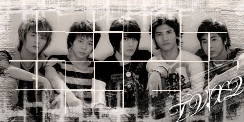
Btw, who is this?
Last edited by Anime Forum; 12-11-2008 at 03:25 PM.
Nonon Jakuzure - Best Kill la Kill baePretty damn great! #spoke2soonOta "The Cutest Otaku" 2016 - Lol, how's your account doing lately? Oh wait.
Why thank you for the comments <3.
I love people critiquing my things.
He's from Vampire knight the one in the blue signature and avatar.
hey! that's Kaname from vampire knight, right? =D
hehe.. anyway, i like the blue sig..
its really nice...
...really cool sig made by...Nespa... =]
Well thank you and that's his name. I am no good with names haha!
Also I made a new signature but it is not Anime ><.
What do you guys think?
It's good, but it's one of those sigs you might want to add more text to.
Or just resize it because it looks rather plain.
Great job though.
I stared at it for so long thinking of what else to do with it and I had no clue!
But I will keep on trying to get a good signature and do more avatars!
Thanks Aushkei Ver!
Edit!!!
I made a new set and I think its the best on yet!!!!
Last edited by LexxieLuu; 12-15-2008 at 09:01 PM.


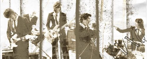
Right, well if it goes without saying, welcome to AnimeForum. Late, but I think its necessary. Here are a few tips that I think should help you improve.
About the signature:
You are getting he idea early with placement, a lot of people get off to rocky start with that. Always include the faces or just the over shape and feel of your stocks. Your flaw here however is that you make the stock fill the entire space, leaving no negative space for text, or even room for flow or blending. On this current tag of yours, the focuses are not really defined, but I like how it feels like a vector, but I dont like that you have these spatters in the way of them.
The other aspect of this signature that I want to address is a lack of color. And that really cripples important things like depth, lighting, and just the over balance of the signature.
I would advise looking at a few tutorials, and see what results you get. Good luck, hope to see you improve.
Last edited by FlashD; 12-16-2008 at 11:29 AM. Reason: No need to quote ;)
Originally Posted by Fleur Dalis

Okay thanks Fleur Dalis.
Sad thing is mostly all I do oh Photoshop if from tutorials. Like that Signature. It's suppose to look old but I added some more to it to make it look cool guess I did a very bad job ><.
I will keep trying T___T.
There are currently 1 users browsing this thread. (0 members and 1 guests)
 Posting Permissions


Bookmarks