


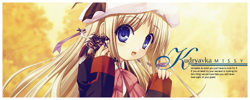
it took me like, a minute to find where ellipsis was o.o
besides the text, i love the sig.
 AnimeGalleries [dot] Net AnimeGalleries [dot] Net |  AnimeWallpapers [dot] Com AnimeWallpapers [dot] Com |  AnimePedia [dot] Com AnimePedia [dot] Com |  AnimeGlobe [dot] Com AnimeGlobe [dot] Com |
| AnimeGalleries [dot] Net | AnimeWallpapers [dot] Com | AnimePedia [dot] Com | AnimeGlobe [dot] Com |


it took me like, a minute to find where ellipsis was o.o
besides the text, i love the sig.
{}


lol Not to mention that you cut off a chunk of Luigi's face. I know his mustache needs a trim, but...
I wish Medusa would stop objectifying people.


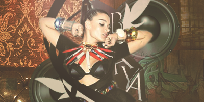
That was actually intentional. I erased parts of the arrows so they wouldn't look like they were just going in front, or just behind them. It was supposed to make the arrows look like they were in front, AND behind like in the Yoshi one.....I think it worked fairly well.Originally Posted by AoiKumo

Yeah, I recently got a load of requests, so here goes:
^Made for Elle.

^Teed's
AoiKumo
^FoxMcCloud's
And my entry for sotw
I absolutely love the text on that one, but sadly I sent the wrong sig to serated D:
I totally fail at using real people in sigs D: It took me a while to realize, that I can use real people, I just need to find a style to fit them. So my next few may be a bit different than usual.
Last edited by Bulf; 10-12-2009 at 03:14 AM.


My favorite out of the batch you just posted is the Mario one. It has pretty good flow, yet it also has an edge to it. I noticed a color scheme in the ones above. Very "bronze"
The placement of the text in teed's sig seems a bit messy. Creative, yes. But off balance, visually.
I love the contrast in AoiKumo's sig. Is there text in there? If there is, I am unable to spot it heh.
Signature brought to you by Balance.
Yeah, I've been having this kinda bronze/gold phase lately, I need to get out of that D: I couldn't think of anywhere else to put the text in teed's sig, so I just threw it in some random space. I wasn't sure about where to put her name, so...yeah I just naturally fail at text :Ð. In Kumo's sig, there isn't any text, mainly because I couldn't think of anything to say, and she didn't give any instructions for text D: But yeah, the Mario sig is probably my favorite one so far!
(You should all go enter sotw)
Experimenting with C4D's; didn't go well.
Bad text, bad blending, and bad sig. Yeah, I failed =/
Been a while since I've updated this, so here's something for all of my fans out there (yeah, I can see you looking)
Just going out of my style again, to try something new-ish. So, good? bad?

Not one of you best sigs, though it is good. I think that the C4D you used around Luigi is way too overpowering of Luigi himself. I think you should maybe turn the opacity down or maybe erase some of it. I also think that the background could blend with luigi a bit more, although it already blends pretty well.
Sig by Feferi <3
"Don't go around saying the world owes you a living. The world owes you nothing. It was here first."
-Mark Twain
...I was actually really proud of that, until you pointed all of that out ): I had a really hard time with the background though, so I decided to leave it be, rather than do something terrible to it. And the C4D around him was supposed to make it seem like he was riding down on it or it was shining on him in some weird sort of way. I totally failed on that though D:
But, here's a few more for tonight:
I'm pretty proud of those two. They were requests on another forum, but I thought I did such a nice job, that they should be posted here too! Yes, Im sort of relapsing on my styles, but I think they work fairly well for these. So, any comments on these?

http://i342.photobucket.com/albums/o...arbagecopy.png
That one looks pretty cool.
Nice c4d usage.
Text could be better.

i really like the bowser and marth ones the best
the marth ones are just as u said icy and has a cool feel abou it
"Dark light come shine in her lost heart tonight
And blind all fears that haunt her with your smile
Dark light"-HIM
Well, I think your sigs are abit monotone? For example, the background for "The People" tag is all blue-ish >_< You should add more colours to it, like the colour of his cape/sword.
And try to use something else other than C4Ds... you can try some brushes, filters, smudging, etc.
But the text looks really nice, better than what I can do xD
Thanks guys!
@Des: Text isn't really my strong point, and the guy I was making it for wanted it done kinda fast, so I did what I could D:
@Angelic: I'm not usually too good with using more than one color for a bg, which is why they're so monotone D: I'll probably try and blend colors more often for a better background. I actually tried to use most of his colors...but it turned out a complete mess D¦. And I do use brushes, just not in those last few (check out my vector ones ;D) C4D's just look so cool...and so...C4D-ish. It's really hard to resist using them D:
I decided it's time to change things up a bit, so I'll be really using the tips, and stuff you guys give me! I made this next one after Uru gave me some tips, then I followed some more tips from you guys's comments:
Ignore the text, but I mainly tried to get rid of the monotone background, and excessive C4D's in this one; so what do you think? I only used 2 C4D's (yay!) and yeah! Any tips/comments/whatever are welcome (and needed)!

Sweet! The new one blends good, but almost too good. It took me a minute to find samus.
Okay, after this I need to finish some requests, so heres some more experiments:
failed
v1.
v2.
Nothing different besides the bottom line of text.
So, any comments on these? D:
I'm not to fond of the pink one to be honest. I have seen some far better sigs from you.
The White one is quite good, nice blending and the text fits, although the second line could do with resizing perhaps.
Bowser one is also quite good. I like the blending and colours. =) The only thing that I'll pick on is the bevel text with drop shadow. I used to use these text effects in all of my earlier sigs. Experiment more with typography, that is the main thing that you need to work on. Type can oftern make or break a signature, or any design for that matter. Other than that, I do love most of your sigs.
Last edited by Darkandiel; 11-07-2009 at 10:23 AM.
Honestly, I don't like the pink one either. I was following a tutorial, messed up, and didn't feel like going back to fix it. As for the text on the Bowser one, it looked too plain without the bevel and shadows D: I -had- to do something. It's always the text that kills me in the end Ц
Ugh, getting close to 200 posts now D; Here's two more experiments though:
What do you think?


both look well blended, well done and have some sexy typography
no fail
good ellip :3
Lex Luger R.I.P
¦ Sexy Logo By Me ¦ R A R E R E N D E R ¦ Tutorial requests and PSD Requests open ¦ Tag Thread

I love the new sigs, they blend well and look awesome. Keep it up!
Edit- Just noticed its kinda hard to see sa on samus. But other than that, still awesome! Samus one is my fav.
Last edited by .Sev; 11-13-2009 at 11:40 AM.
Thanks! I'm still exploring this newer style, and tweaking it a little, so here's another one:
I don't like the colors as much, but oddly they match the main colors of the game. So yeah, any comments are appreciated! ^_^
A few more
For Arrancar Grimmjow
And my failed sotw entries

Wow your really good! Your color is right on and it blends perfectly with the text. I also like where you placed the text on the sig, very nice decision on your part! I'd rate the sig a 9/10 and now I'm really pumped about that Princess Peach sig!
Nonon Jakuzure - Best Kill la Kill baePretty damn great! #spoke2soonOta "The Cutest Otaku" 2016 - Lol, how's your account doing lately? Oh wait.
There are currently 1 users browsing this thread. (0 members and 1 guests)
 Posting Permissions


Bookmarks