


You've improved alot, i'm amazed wel done to you.
 AnimeGalleries [dot] Net AnimeGalleries [dot] Net |  AnimeWallpapers [dot] Com AnimeWallpapers [dot] Com |  AnimePedia [dot] Com AnimePedia [dot] Com |  AnimeGlobe [dot] Com AnimeGlobe [dot] Com |
| AnimeGalleries [dot] Net | AnimeWallpapers [dot] Com | AnimePedia [dot] Com | AnimeGlobe [dot] Com |


You've improved alot, i'm amazed wel done to you.


All 3 of these new ones are just experimental ones, nothing serious:
I wanted to see what I could make in 15mins, and came out with that. It's got a lot of C4D in it, but I'll remake it eventually if I get enough time.
I tries one of those sigs where the person looks farther from the background. (I did a bad job explaining that) I don't think I did this one too well. >.> Falcon is kinda just...there, and the border it a bit big, but it works.
v1.
v2.
Again, those two were the product of excessive boredom, and a need for sleep. I'm not sure which one I like better though...
And thanks for the comments/tips. They've helped a lot. :Ð


Okay...umm..dude. Lets start with cleaning up your work first. A lot of your sigs look like they are LQ. Try using higher quality images. Secondly, try not to use C4Ds if you consider yourself still learning Photoshop. Work with stuff like the smudge tool, filter effects, etc. Also, try to minimize the use of brushes. Using brushes to make your background is good just to see how they work and all, but try not to make sigs in that manner.
Only 2 more for today D:
v1.
v2.
Just different borders on these two. I really like both of them, but i'll go with v2. No c4D in these, just brushes, renders, and a load of gradient maps.
v1.
v2.
I don't like either of these too much D: They look messy. I can't think of much to say about these either...so yeah :Ð

Elli..this is Strawberryman..your sigs are beautiful. MAKE ME ONE! ;.; I suck at adobe.
"A sword is used to protect the things that are valuable."
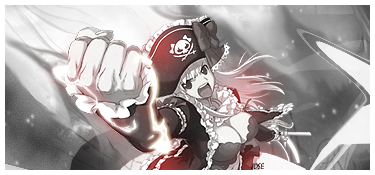
This is the only time i'll try a anime sig:
I can't work with 2D images, it's harder. D:
To me it seems that a majority of your signature rely heavily on c4ds. You use too many effects over the extraction and cover up the focal points.
On your latest signature the extra copy of the extraction in the background destroyed the flow, try centering you extraction that way you don't have so much awkward negative space on one side of the signature. Just keep at it, photoshop will become more and more familiar and easy to use as you progress.
I see what you mean, but the render was kinda cut off at the side, so I had to put it close to the edge. I couldn't find any better renders either, the other ones looked as if they'd been taken right from a manga. I'll keep practicing, but don't expect me to do another anime sig. It's just harder to work with 2D images than it is to work with 3D ones for some odd reason. Also, if anyone have any really good tutorials, or tips please let me know.Originally Posted by Jose

Yay more sigs:
v1.
v2.
v3.
I'm surprised I haven't done any Toad sigs yet D:. I like how these came out, but the background doesn't seem to match that well. Apart from that, nothing too bad in these.
I redid my old Wolf sig, and came out with this:
It still looks pretty similar to the old one, but I like this one better.
And finally:
This was done for a friend on another forum, he liked it, but I don't like it too much.
Also, I noticed...most of my newer sigs seem to look the same, or close to it. I might try something different soon, or just experiment a bit.
No posts that time...oh well. More sigs!
v1.
v2.
Not much to really say about them D:
Made that for SOTM on THB. It'll probably win....my competition isn't that great D: I need to go back and change the text. It's huge!
v1.
v2.
I made these for SOTM on another forum (Yes I like SOTM) I hope it wins...It's not all that good though lol. Hopefully I get some posts this time. >.>;
Last edited by Bulf; 03-17-2009 at 02:37 PM.
lol very funny
good work!
but from where you have the rights to use mario and luigi in signatours (copyright...)

Gotta love a Nintendo fan and his AWESOME sigs! I don't care what all the graphics people say, I <3 them.
Back, by popular demand! Now with new avy.

I think I've commented already but still I really like that Luigi one bro. Again, this is Seth. XD Or Strawberryman. Peace out!
Minato Namikaze 2007. www.Minato.us ( Yondaime Hokage. )
I've got a few more! (I make sigs really often >.>)
v1.
v2.
Just different borders on them, v2 seems to fit better though.
v1.
v2.
I went for something different in the last two. Again, just different borders, but not that bad overall. I still can't work right with text >.<


As I said earlier, my sigs are starting to look really similar. So, i'm gonna be trying out some new styles, and adding a bit of my own to them :Ð here's what I have so far...:
v1.
v2.
I really like how the first one turned out. The fire looks better than in my last one. I couldn't think of much for text, as usual. >.>
I found a decent render of what Mr.L would look like if he was in Brawl, so I had to make it. I messed up in a few spots, and on the background...but other than that, I like it :Ð. And if you've played Super Paper Mario, then you'd know that he always says "Have at you" before he starts the fight.
Idk what happened to this one...It changed sometime between uploading, and saving it. The original one looked way better. I'll go back and fix it eventually though D:
For now, I'm gonna keep experimenting with effects, and other things I've overlooked. And of course, I'm gonna keep working with that text! So that's all for now.
You make some pretty decent tags, have you thought about entering one of the SOTWs in the contests section? A little competition might be good for you.
Anyway, your most recent tag really all feel the same when you look at them. All of the effects, lighting, etc, is purged into the center with a mass of negative space (black) surrounding them. That's not bad, but it makes your style repetitive. You might want to brighten up some of the tags themselves with a brightness and contrast layer or something. Curves might be better though.
A few other minor things are the fact the colors on them are either too saturated, or there is just one color making it all up (the dark Samus blue, the Mario V2 being red). I think the most effect way to get rid of this is to spread the effects around more, it will allow you more color availability, and wont make your signatures feel clumped together in the center.
Try out this: Layer > New Adjustment Layer > Gradient Map > Use with the Magenta/Orange/Green or the Blue/Red/Yellow and set this layer to 'Screen' and mess with the opacity until you get sometihng nice.
I've been thinking about entering one of the SOTWs, but I usually forget, or I can't think of anything to match the theme. But i'm gonna try out the gradient maps that you suggested, and hopefully I can liven up my sigs a little bit. :Ð And I can't really think of anything to put in the huge blank spaces in my sigs, so I leave them blank and hope it looks ok. But i'll be experimenting with other styles and tutorials, and hopefully they help. D:
How's this for different?
I really really like this one. No bad complaints :Ð
v1.
v2.
I tried to make these ones look fiery, and it kinda worked. D:
And who can forget Peach?
A bit darker than I would've liked, but I love it :Ð
Last edited by Bulf; 04-03-2009 at 10:49 AM.
I've been going around and trying random tutorials, and here are my results:
v1.
v2.
These came out looking kind rough and scratchy...I don't like either of them too much..
v1.
v2.
It's a lot going on in the background in both of these, but I like v2 better. I finally did something different with the text! I didn't think it was gonna look right, but it's not that bad now that I have a good look at it.
I tried working with C4D's again e.e; I'll get the hang of it eventually...it's probably gonna take some time though. Other than that, it's kinda dark...I like bright sigs D:


I really like the Samus Sig,The quality is really good and the darkness make it blend perfect,in my opinion.
"Nothings gonna take us down"
Here are some more experimental ones:
The text was the same on all of them (I like how it looks) I made those without C4D or tutorials :Ð
And I redid my Dark Samus one:

I don't get many posts...Maybe I should slow down on the sig making D:
I think I spelled her name wrong...I can never remember. It's pretty hard to see the text too D:
I tried something new with this...and failed pretty badly D:
I wanted those to be symmetrical, but I decided to do something differently at the last second. These turned out pretty awesome though. I'm getting better with the backgrounds though, That's good :Ð
There are currently 1 users browsing this thread. (0 members and 1 guests)
 Posting Permissions


Bookmarks