


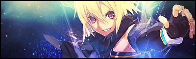
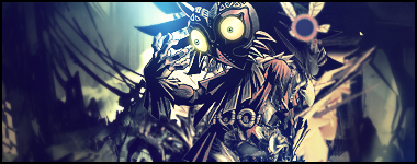
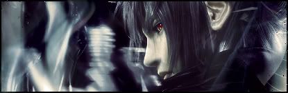
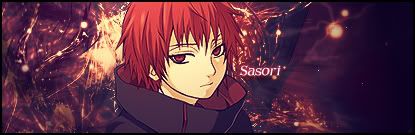
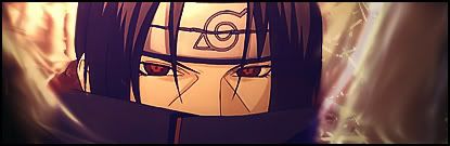
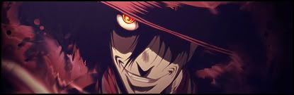
The first one is good except in my opinion, i would have had more of his body showing instead of having the effect render over most of it. I love the flow of the signature :3 it works well. Nice work on the second one aswell, its simple and neat.
 AnimeGalleries [dot] Net AnimeGalleries [dot] Net |  AnimeWallpapers [dot] Com AnimeWallpapers [dot] Com |  AnimePedia [dot] Com AnimePedia [dot] Com |  AnimeGlobe [dot] Com AnimeGlobe [dot] Com |


 |
| 
 Heske ~ Cousin


Bookmarks