


Hi. I have worked with photoshop only for few days. ;\
critic?
 AnimeGalleries [dot] Net AnimeGalleries [dot] Net |  AnimeWallpapers [dot] Com AnimeWallpapers [dot] Com |  AnimePedia [dot] Com AnimePedia [dot] Com |  AnimeGlobe [dot] Com AnimeGlobe [dot] Com |
| AnimeGalleries [dot] Net | AnimeWallpapers [dot] Com | AnimePedia [dot] Com | AnimeGlobe [dot] Com |


Hi. I have worked with photoshop only for few days. ;\
critic?


Only a few days? Not bad. You're pretty good actually oO;
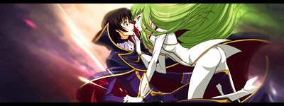
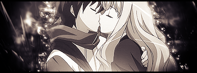
The first could use blending on the image but the flow is good. The background helps as well. Mmm.. I like the second one more though. A bit more work on the flow here but it's nice as it is.
Looking forward to what else you've got up your sleeve :3
First off, yay for yet another signature maker around AnimeForum and welcome. Hmm, the first seems empty to the left of the render, could use some text or brushing work to blend it better but nice background, nice placement. Second one, a lot better ... I love the colours you opted to use and the render and background blend together great ... just needs textwork and good to go.
Seeing as you say you've only worked in Photoshop only for a few days, you're already off to a great start .. keep up the awesome work.
Sig thread Last Updated: Not Updated|My Blog|
| Back Old Skool - Signature by myself truly. ||Still Learning Photoshop CS2||
thanks (:
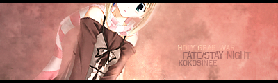
Ooh. Not bad. I like the idea going there but a lot of work could be done on it too. First, why did you cut the head? ;_; I suggest you resize the canvas and make it taller and narrower so that you can include the rest of the extract's head and remove a lot of the empty space.
The first line of the text is hard to read, particularly the second word. Maybe a different text color? Something that doesn't blend completely into the background.
Also, there's almost no flow in this one. There's no focal point where the eyes of the reader are drawn to. I suggest you find a way to fill in the negative spaces and work in a flow while you're at it.
._. I'm sorry if it seems too harsh. D:
I concur with Kersheys on most of the critigues.
The general idea for this signature is good, but the execution leaves much to be desired. Perhaps if you aded a glow around the character/and or some swirl brushes coming from the character it would be much better simply by doing little things like that to it.
And also like Kersheys said I think you should've resized the image to fit beet in the signature and take up some of the empty space in the signature.
As for the font, you should either, in my opinion, make it lighter or darker on the first line, so that the words are easier to read.
Still the sig is cute and for a beginner it's very very good.
Signature and Avatar set by me. Taking requests.
My Signature Area
"If you have to choose the greater of two evils choose the one you haven't done." --- fortune cookie 10/29/08
Jag lovar jag ska inte gråta.

Wanting to try a cut off style eh?
Next time you do that, make sure you cut off the eyes; one eye looking at you is pretty awkward >_>
Overall, kill the plainness, smooch up the colors
Over-saturating since '07

There are currently 1 users browsing this thread. (0 members and 1 guests)
 Posting Permissions


Bookmarks