


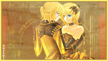
These are my newest sigs........I'm pretty pleased with them. ^__^
 AnimeGalleries [dot] Net AnimeGalleries [dot] Net |  AnimeWallpapers [dot] Com AnimeWallpapers [dot] Com |  AnimePedia [dot] Com AnimePedia [dot] Com |  AnimeGlobe [dot] Com AnimeGlobe [dot] Com |
| AnimeGalleries [dot] Net | AnimeWallpapers [dot] Com | AnimePedia [dot] Com | AnimeGlobe [dot] Com |


These are my newest sigs........I'm pretty pleased with them. ^__^
LOL I hope my sig doesn't gross anybody out XDD I needed a banner that people would click on. What can I say? Yaoi fangirls love this stuff.
For the second one, it just looks plain. And a border might be a good idea. I'm not really sure what else, but adding something would be a good idea, I think.
I like the first one more. It's cute.
What program do you use?
Good luck! =)


I think the problem with the second was is...it's not busy enough. It's not busy enough just because of its size, maybe. ._. that's really all I can think of.
With A Tip Of My Hat ///////// I Bid You Farewell

I like the first one. =)
Though I think they are kind of large and need a border.
I agree with Chocobo and think the second one isn't busy enough.
Add some effects? Lol.
Anyway..! Good job so far. ^^
I'd like to see more. =)
I Sig by Hakuchuumu<3 I
We're Waiting For You. :]
do you guys think I should add a pattern of some sort to the background? Mabey some textures? I've thought about it and I totally agree with the border idea, I'll totally do that. Thanx for the feedback ^__^
LOL I hope my sig doesn't gross anybody out XDD I needed a banner that people would click on. What can I say? Yaoi fangirls love this stuff.

Yeah, I was about to say that about adding something to the background, and like Chocobo said, maybe its the size? If you reduce the size of your sigs, they will look busier anyway.
But great job, they are both really nice hope to see more!!
xoxox
[[Sig made by me (:]]
There are currently 1 users browsing this thread. (0 members and 1 guests)
 Posting Permissions


Bookmarks