


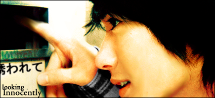
Hello! These are my current works to date., comments and tips are appreciated. Just be gentle. okiez' XD
XD
XD
XD
 AnimeGalleries [dot] Net AnimeGalleries [dot] Net |  AnimeWallpapers [dot] Com AnimeWallpapers [dot] Com |  AnimePedia [dot] Com AnimePedia [dot] Com |  AnimeGlobe [dot] Com AnimeGlobe [dot] Com |
| AnimeGalleries [dot] Net | AnimeWallpapers [dot] Com | AnimePedia [dot] Com | AnimeGlobe [dot] Com |


Hello! These are my current works to date., comments and tips are appreciated. Just be gentle. okiez' XD
XD
XD
XD
I love your signatures!~
I am very fond of the 2nd one
It's pinkish colors are soo cute
yet with grace at the same time
some text could be added though on
the right side where the boxes are but
that's just in my opinion!Can't wait to see moar!

o___O;;
Those are all epic. I love the first one, the colors are vibrant yet gives off a peaceful feel. Only beef with it is that all of them are very bright, you should try burning here and there to give off shadows and stuff. Overall, your sigs are great.

These two are my favorites, very nice sigs. The color matches perfectly which is a big up in the sigs and I love Grimmjow so that gives that sig bonus points. I love the text, color, and the size of them seem perfect to my eyes, keep up the good work and continue to post your sigs, I'll admit that they are a tad bright, but still nice.
Nonon Jakuzure - Best Kill la Kill baePretty damn great! #spoke2soonOta "The Cutest Otaku" 2016 - Lol, how's your account doing lately? Oh wait.

[quote=akuchi;2157588]Hello! These are my current works to date., comments and tips are appreciated. Just be gentle. okiez' XD
Out of ur siggy works , this is my faves .
1stly . The 1st sig is very well done , you've totally blended in the extraction . Its really kewl . And the atmosphere of the sig is really soothing in away , its like a cold breeze . But the breezy thing on the
right side of her is too much on the highlights abit (or maybe its my screen >__<) the second one is , well it has alot of attitude and spunk especially grimmjow with his flipey sign (LOL .)but i think its overshapened abit do but I like the crazy vibrant backround also .It would be better also if you can put some text on the sigs so the sigs can stand out more . Keep em up ! ^__^
Last edited by Dotbeat.; 10-29-2008 at 04:40 PM.
Yes,yes Thanks for all the input. Ive figured they were a tad bright r (jus t0o bright?!>xD can someone help me out pls? ..my eye for shadowing.. ngGGAaRrr!!
O_o;
You just love making new accounts >_>
Grimjaw and the second tag, best of the batch imo
Very colorful, controlled abstract, just freaking love it all. Pattern usage on the second one is pretty, very pretty *_* Tut please!
4th can be improved with more contrast at the grays at the background
All around, just lovin' it
DAMN,
Your skills is breaking my sig restrictions
Last edited by Famahama; 10-30-2008 at 11:46 AM.
Over-saturating since '07
Very nice sigs. I especially like the second and fourth one. Nice blending, especially on the second sig. There is a small part on the bottom left where the smudging is a little muddy looking, but other than that, I love the colors!
The left side of the fourth one looks somewhat bare in the background. I'm loving the right side though. Nice sigs - I really like your use of the rounded border as well. ^^

Gentle?! Gentle?! What is this word?! It''s not in my dictionairy! D:
All fun and jokes aside, you do have some wonderfull things in here, though all of them are a tad bit.. (a lot)... too bright.
The second would have been great, if it hadn't been so bright. There is depth to the signature, but there is no dynamic depth. To bluntly say it, you just but the focus on the character in the middle and faded it out to the sides. I'm sure you didn't do this, but because it's so bright to the sides it might seem this way.
I don't have a lot to say on the third, it's very lovely, I like the perspective and all in all it has a nice look, even though it's a bit bright on the eye. I just loath the little plus near her shoulder ~stabs it~.... >_>'
The fourth is your best out of the bunch, it has great flow and the colours are soft yet not too bright. The only thing to improve on this one is the focus on the character, perhaps sharpen it a bit, that way there'll be more of a focus on that too.
Last, but not least, the last one. I like it.. it's chaotic and I like the vector look of it. It's a bit rude, but aren't we all xD. The only thing I don't like is how sharp the face of the character looks.
Very nice works overall, keep up the good work
Aye, like the others said, some of them are too bright. The Grimmjow one would be excellent if the brightness was lowered a tiny bit. I'd have to say though, I'm in awe of your skill. Those are just wonderful :)
The second needs a bit of work though the swirls are a great idea. I'd say the fourth is my top favorite out of them all, it's just really well done.
Hello everyone! My gfx skills have dried upBut here are 2 tags ive made 3weeks ago:


Dried up? No way.
I love the purple + darkness in the first sig. It just looks so good together. I think the quality of the character's hair looks a bit low, like jaggedy, but sharpening might take that away. I like the simple text, it looks really nice, but it seems like it could be a bit more blended. I do love the focus of purple and softness behind the text though.
The second sig is just wow. The red/orange/yellow on black just blends really nicely together. The edges of the scythe look really awesome because of the contrast from light to dark. The little sparks also coming off from the yellow/orange focal add a nice effect. Overall, very very good.
Really? 0_0 Thanks! On that note, I feel like having a fresh new start


OMG. Your sigs are spectacular. I really like the Grimjaw one, as well as the Saber one. The others are also really good, especially the backgrounds. The only one I don't like is the Ulquiorra one. It just doesn't look as good as the other ones. The rest are really great. Continue doing a good job.
There are currently 1 users browsing this thread. (0 members and 1 guests)
 Posting Permissions


Bookmarks