


Wow.
Those are just absolutely, incrediblely, undenianblely AWFUL.
Keep up the good work! I just might have to get a new set soon.....
>.>
 AnimeGalleries [dot] Net AnimeGalleries [dot] Net |  AnimeWallpapers [dot] Com AnimeWallpapers [dot] Com |  AnimePedia [dot] Com AnimePedia [dot] Com |  AnimeGlobe [dot] Com AnimeGlobe [dot] Com |
| AnimeGalleries [dot] Net | AnimeWallpapers [dot] Com | AnimePedia [dot] Com | AnimeGlobe [dot] Com |


Wow.
Those are just absolutely, incrediblely, undenianblely AWFUL.
Keep up the good work! I just might have to get a new set soon.....
>.>
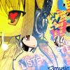
samba bamba, llama momma.
need a new set, feel free to offer. :3
Awhhh thank you very much ^_^
I'd take a request, just so you know, if you feels like it.
Made the text more vibrant, and brightened the sig too. Yay! :]
and don't forget to comment my other new one on the previous page, ya? :3
---Originally Posted by .GOGO

Last edited by .Gogo; 01-02-2009 at 10:57 PM.
&& all the world's a stage
i existed because i dreamed it;
i dreamed the world...//
I like the text placement better in the origanal.
XD On the little blue word with the arrow. ; )
I like all the business going on in the background. It goes well with the picture coloring.
samba bamba, llama momma.
need a new set, feel free to offer. :3
Thank you very much for your comment, much appreciated <3.
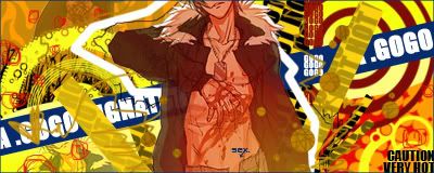
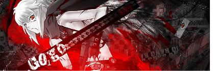
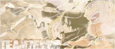
Here's a new, Jo from b.tenshi. I think it's hawt. I went through over 9000 versions of this sig </exagerration> but these were the two versions I settled for, the last one being my favorite which I finally settled on. I'm not too sure if it's my 'best' work thus far... however I like looking at it, and I sort of acheived what I wanted.
What do you peoples think?
---
&& all the world's a stage
i existed because i dreamed it;
i dreamed the world...//
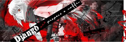
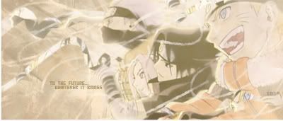
SOTW #36[?] entry;
Lol, so like nobody likes my style, which I'm cool with I suppose.
Though I'm pretty sure I've been flopping at graphics lately... I don't know. Maybe I actually should start looking at tutorials.... :/
I don't want to start, though.
---
Last edited by .Gogo; 02-08-2009 at 02:43 PM.
&& all the world's a stage
i existed because i dreamed it;
i dreamed the world...//


I wouldn't be so sure of that. =p
Nonetheless, in my opinion your style is better then most. Either way, if you think you should start looking at them go ahead. In my opinion it's better to learn by doing, like that you can grab your own style. Unlike on most forums I've been on everyone's style looked exactly the same thing. >_>
Nice going on the SOTW, by the way. Although, I think you should get rid of her duplicate. Just my opinion.


?? .Gogo is Maid Mia? Whaa!!! I really have been gone for a long time now! LOL! Haven't been here for ages!
Anyway on with the siggy. Your SOTW entry in your latest post is cool I can't even understand why you say nobody likes your style. I love the calm colors in the sig. It's very nice, overall.
Set made by GoodyLucky. Fans are in my Journal. Thank you so much!

~at. post 155:
~No, no, no O_O I like your gfx ^^ I am not using any tut's, too xDD
Now to your latest sig:
It has really nice and matching colors, just add a bit more contrast and it would look great :3
You are WAY better than me :3
Last edited by .fnhvmnvmv; 02-10-2009 at 09:25 AM.
Referring to Post #154::
I like what you did with the text bit there ^^
But don't you think that kind of ruins the flow?
Oh And good job on the bg too.

You have some cool works.Some of them are too simple.Anyway good job
Awwws, wow look at all those comments *_* Thanks all for your opinions, it's appreciated.
Link; That's exactly why I don't follow tuts, I think it's really important for everyone to grasp their own style, like you mentioned, because otherwise everyone is just copying from eachother and looking the same :/ Not like there's anything wrong with it, if you see something you like and wonder 'how did they do that?' or, if you're a gfx newbie, then tuts are very useful. I personally just never used them or felt the need to. Thanks so much for your comment, btw :3
Hinata; Lol, yes, and it must have been awhile for you bc I haven't used that username since 2006 I believe, lmao! Thanks for the comment~
Fishiiiie; Thanks for stopping by my thread, you're very sweet but I'm deffinately not not not better then you o____O;;;
Karuto; Ouh, thanks for posting in my thread <3 I see what you mean, and thank you. I guess I just wanted it to stand out, not to mention that the in stock I used, Jo's b00b3h is nearly exposed, so think of it as censorship, haha ^^;;
Dreamscape; Thank you for your opinion, and I understand what you mean. Many of my sigs I hurry through, and leave them simplified when I could add more.
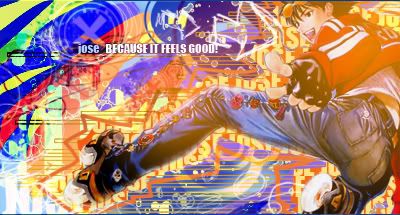
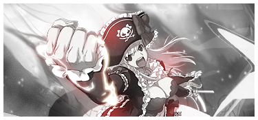
NEW:: Set request for my homefry, Jose! <333 He made me very happy by requesting from me, so I wanted to do a good job. Here's what I came up with.
I can't say I'm a huge Air Gear fan as I've barely read the manga, but I absolutely love the art style! So I decided to use it for this sig, which I was trying to convey an edgy, urbanlike look with. Oh, and I don't believe in matching avs :3 It always bothers me when an av looks like it was cropped out of the sig, too...
And this is like, the biggest sig I've ever made o____O;
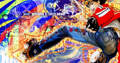
Edited Version, [thanks jaggy :3];
....I think I might switch off of sigs for awhile, and work on avatars... that is, unless I get another request or something.
---
Last edited by .Gogo; 02-11-2009 at 04:36 PM.
&& all the world's a stage
i existed because i dreamed it;
i dreamed the world...//

Whoa! The effects you added look amazing with this sig. I love how vibrant the left side of the signature is. When I look at the sig, my eye automatically draws to the leg and then the foot and if thats the intended focal point then thats nice, but if you wanted the eye to go the the character, I think you should take the orange light focus off. I think you should also make the red on the jacket brighter by brushing over it in red or orange and seting the layer to color. I also feel like everything in this sig kinda needs to be the same color quality. The difference in color is a bit too drastic and it takes away the vibrant feel. Overall, I love it! You do a very awesome job with effects and pentooling.
Thank you very much for the comment Jaggy, I appreciate it and it was really useful! :]
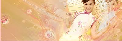
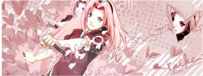
Here's a set request for -Raiken-, using this stock of Sakura. Beings it is Sakura and she looks really cutesy in this stock, I decided to go with something really girly. Raiken did ask for light pinks, so... I mean, I don't know if this is Raiken's style but I hope so.. ^_^;;
Version one, it has more colour effects to make it really pink, and more blendable;
Version two, no colour effects, has more of the stocks original colours;
I hope you like it...? *_*
---
Last edited by .Gogo; 02-15-2009 at 01:50 PM.
&& all the world's a stage
i existed because i dreamed it;
i dreamed the world...//
Yes I do like it, thank you very much Gogo. The reason I wanted bright pink was because I just wanted to experiment with colors. Anyways I like them both, I won't use the avatar though, I hope that is okay with you.
Nonon Jakuzure - Best Kill la Kill baePretty damn great! #spoke2soonOta "The Cutest Otaku" 2016 - Lol, how's your account doing lately? Oh wait.
Could use some sharpen, otherwise I think it's really good. *-*
@Raiken; Oh, no that's fine, I had realized too late that you had only requested a signature and not an avatar, I just threw it in anyhow. I'm glad you like the signature, though. And sorry if it's too girly... see, I had your gender confused until after I made the request.. haha ^_^;; opps.
@Lovebeat; Thank yews, I appreciate the comment! :] And it's all good, short sweet and to the point works fine enough for me too. Thanks for taking the time to comment, thoughs.
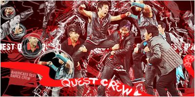
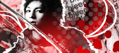
Here's a new, I am ADDICTED to America's Best Dance Crew, and I am in lovelovelove with Quest Crew. Don't get me wrong, though, Beat Freaks are some awesome chickas as well! But Quest Crew is sooo the smex, [yummeh]
Ahum, well, here is my latest, in case you can tell I've been sticking to a certain style lately, as I think this works the best for me, and I'd like to think I've developed my own unique style now... what do you peoples think? C&C is very much appreciated! <33.
---
Last edited by .Gogo; 02-18-2009 at 06:41 PM.
&& all the world's a stage
i existed because i dreamed it;
i dreamed the world...//
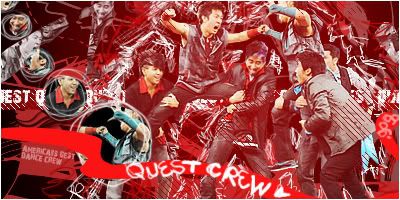
I actually stole this a while ago thanks for the signature Mia<3333. I actually love both the avatar and signature. As far as the Quest Crew sig does I do like the without the extra color a bit better. I would of love to see some polygon pen tool around the extraction in a very unsaturated pink-red type color (the color that Unleh username is) that would of been awesome in my opinion. Wish you would used other types of colors in this one =D, but everything turned out great.
Sorry for the late reply Jose, thank you very much for using the set, I really appreciate it and it was very nice of you to request one from me, because at that time I was feeling very very discouraged with my graphic works. You're a good pal :]
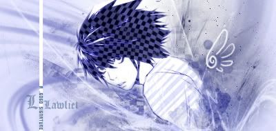
After a mini break from making any major graphics [besides myspace bgs really] I have created a couple new signatures and one new avatar. [The L one] Three of the avatars are kind of old, but I hadn't posted them yet. So here goes it, please share your thoughts :3


---
Last edited by .Gogo; 04-05-2009 at 09:32 PM.
&& all the world's a stage
i existed because i dreamed it;
i dreamed the world...//

Well thank you very much m'am for commenting! <3
Here's a new, just done today. I wanted a more soft, memory-esque feel, something that would give you an old photograph feeling when looking at it. But, still wanted it to retain my more dynamic styling, to hold true to my own gfx ways.
Hope it worked out okay... here's two versions, one with some chunky textwork, and one minus all the text.
Thoughts?
---
Last edited by .Gogo; 04-12-2009 at 10:54 PM.
&& all the world's a stage
i existed because i dreamed it;
i dreamed the world...//

I have yet to grasp how you do you really crazy flow. What do you use, some weird filter? Your style is quite interesting, but also random. A lot of your tags lack some general blending, and they are usually a mass explosion of vibrant colors, which is good, but something is missing. I think its because every tag you make never has lighting in it. Not really sure, but its really your style.
Tutorial one of them maybe?
Post #163:: Too much blending, maybe? There's way too much pink in there. It took me a while to notice the text. And what's with the squiggly lines? Is it for flow? IMO, it would be better to take them off the extract because it's only messing things up.
Post #170:: Again, too much blending. You've got the squiggly stuff all over the focal.
Why don't you try to experiment more with colors? Like, be a bit more dynamic with them? Also lighting. There's barely any lighting in your sigs, I think.
I like your style. All of your signatures are vibrant and exciting, and make me always want to look at them.
The most recent one is good, but has too much blending (like other's have been saying). It's too bright, you don't really notice anything immediately. It doesn't quite 'pop'.
On this day of days, most epic and prideful, you were born 15 whole American years ago!
Through the odds and by doing the impossible, you beat out hundreds of thousands of siblings in the great sperm race for the coveted egg.
Probably via hax.
Regardless! You won!
So remember, whenever someone picks on you or calls you weak or small.
Just remind them that you beat out a few hundred thousand other wimps.
And the grand prize was not dying!
There are currently 1 users browsing this thread. (0 members and 1 guests)
 Posting Permissions


Bookmarks