
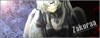
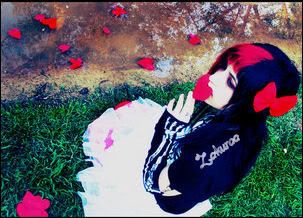
Well about this one, personally I think you could of put more time in this one, the text looks a little shaky to me, but it is a decent sig.

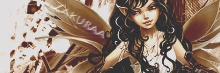
Well I like this one, cause I see you are a member of A4, which I am also. I like the text you used for this one, so keep trying, and good luck on future drawings.

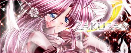
Now this one really caught my eye, very good work, the colors in it was a very good choice.

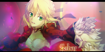
Also another one that caught my eye, good details, this one seems to be one of your best so I can't offer any advice on it.
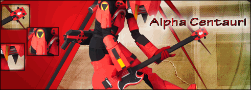
This one is not as good as the others, I mean you did an ok job, it is just the color choice in this one, like the red portion of it does not fit the sig, so I would try a different combination, except for that, it is cool. [/quote]


 AnimeGalleries [dot] Net
 AnimeWallpapers [dot] Com
 AnimePedia [dot] Com
 AnimeGlobe [dot] Com


Bookmarks