


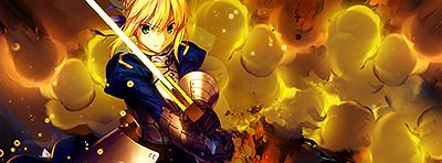
Ohlala the last one is very nice and colourful
And you obviously didn`t fail.
 AnimeGalleries [dot] Net AnimeGalleries [dot] Net |  AnimeWallpapers [dot] Com AnimeWallpapers [dot] Com |  AnimePedia [dot] Com AnimePedia [dot] Com |  AnimeGlobe [dot] Com AnimeGlobe [dot] Com |
| AnimeGalleries [dot] Net | AnimeWallpapers [dot] Com | AnimePedia [dot] Com | AnimeGlobe [dot] Com |


Ohlala the last one is very nice and colourful
And you obviously didn`t fail.


I don't know what you're talking about in terms of failOriginally Posted by Darkandiel

This is probs my favorite sig of yours.
Excellent use of colors and flow, and a very dynamic comp.
Last edited by FlashD; 10-30-2009 at 03:17 PM. Reason: Don't quote images


The colors you use are simply AMAZING.
I mean they really really catch my eye and not in an overwhelming way either.
I love it!!!!


i.t doesn't fail :/
some Irish lady has extremely high expectations xD
RIGHT, The "Shannon" text is subtlety put in and looks beautiful and also its blended well. However the Mio text on the glove if iffy, i mean the effect C4D is striking through the o in mio and it looks wrong. Its also a colour explosion and my eyes are all @______@; but a controlled one lol.
back to the mio text, why not have that on the line underneath "shannon"? Just a thought.
Overall nice work :3
Lex Luger R.I.P
¦ Sexy Logo By Me ¦ R A R E R E N D E R ¦ Tutorial requests and PSD Requests open ¦ Tag Thread


Thanks for the comments guys. I do tend to be extremely over-critical of my stuff sometimes and I guess this was one such case.
I was given some other advice about the lighting and dept etc and made some fixes. You know, the more you look at something, the more little annoying things you'll see. haha!

this one looks pretty, i love how you mixed the colors. its not too bright or too low .yea i love the colors the most XD
you can't call me weird, cause im unique ^_^
btw if youre going to admire me, please tell me who you are, gracias
siggy by teddythankies ^^
**UPDATE** NEW DRAWINGS
* * * A R T ~ W O R K * * *
My sweet sweet family is located in my blog
if you want to be a part of our family, pm me
Made a new one today o.o

right well this sig its nice and simple
strangely not named PolkaDotSig
the only thing i would say
is the PolkaDots on the image, erase them
that is is all i can suggest really
Lex Luger R.I.P
¦ Sexy Logo By Me ¦ R A R E R E N D E R ¦ Tutorial requests and PSD Requests open ¦ Tag Thread
Oh wow your sigs are so colourful xD Maybe you should make a rainbow tag next time haha jkjk
I feel like the sig is a bit too colourful though, And I don't like how the left side is all pink-ish >.< Btw you really like to make guitar sigs eh? xD
Oh btw I saw Shannon on it just now o__o I think I need glasses lol, I can't believe I didn't see it when I first looked at the sig o.o
Last edited by Angelic~; 11-03-2009 at 07:23 PM.


I love how your sigs are so colorful! And the text always blends well.
thanks for the critiques and comments =)
New sig. I've been working on this one all day since...well PS has been kicking my butt. XD

I think that one is my favorite out of all of them so far! The colors match well, but the only thing bothering me is the orange C4D on the left; it looks a little out of place to me D;
V.2 - The orange thing did look out of place

bah! Made this last week and forgot to finish it. Guess I can post it up now.

Oh nice! It looks like it's laying on water or something. I don't really see anything wrong, or odd with this one, Good job!
There are currently 1 users browsing this thread. (0 members and 1 guests)
 Posting Permissions


Bookmarks