AnimeGalleries [dot] NetAnimeWallpapers [dot] ComAnimeLyrics [dot] ComAnimePedia [dot] ComAnimeGlobe [dot] Com


User Tag List

Closed Thread
Results 1 to 8 of 8

Thread: Kana's sigs

  1. #1
    Junior Member Kana-kun has a reputation beyond repute Kana-kun has a reputation beyond repute Kana-kun has a reputation beyond repute Kana-kun has a reputation beyond repute Kana-kun has a reputation beyond repute Kana-kun has a reputation beyond repute Kana-kun has a reputation beyond repute Kana-kun has a reputation beyond repute Kana-kun has a reputation beyond repute Kana-kun has a reputation beyond repute Kana-kun has a reputation beyond repute Kana-kun's Avatar
    Gil
    240.00
    Gender
    Mentioned
    0 Post(s)
    Tagged
    0 Thread(s)
    Latest Post
    10-15-2008 12:36 PM
    User Info Thanks / Tagging Info Gifts / Achievements / Awards vBActivity Stats
    Join Date
    Aug 2008
    Threads
    2
    Posts
    12
    Rep Power
    0

    Default Kana's sigs

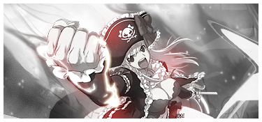
    I'm still a beginner sig maker and I thought I could use some feedback and as well tips on how to make my sigs better.


    What do you make of them?


    Edit


    Also avatars I made (just cropped and border added):

    Last edited by Kana-kun; 10-13-2008 at 06:08 PM.


    Signature credit: Aozo.

  2. #2
    Jose does not forgive! Jose has a reputation beyond repute Jose has a reputation beyond repute Jose has a reputation beyond repute Jose has a reputation beyond repute Jose has a reputation beyond repute Jose has a reputation beyond repute Jose has a reputation beyond repute Jose has a reputation beyond repute Jose has a reputation beyond repute Jose has a reputation beyond repute Jose has a reputation beyond repute Jose's Avatar
    Gil
    263.55
    Gender
    Gifts 151 - Mew
    Mentioned
    0 Post(s)
    Tagged
    0 Thread(s)
    Latest Post
    07-17-2011 08:27 PM
    User Info Thanks / Tagging Info Gifts / Achievements / Awards vBActivity Stats
    Join Date
    Jan 2007
    Location
    75703
    Age
    33
    Threads
    75
    Posts
    5,685
    Blog Entries
    207
    Rep Power
    6913
    Gamer IDs

    Wii Code: PMMEFORTHIS

    Default

    The first one has a major resize problem, try holding shift or resize by percent. My favorite would the fourth one. Love how the green text matches the green the greens eye good job.

  3. #3
    Junior Member *Charlotte has a reputation beyond repute *Charlotte has a reputation beyond repute *Charlotte has a reputation beyond repute *Charlotte has a reputation beyond repute *Charlotte has a reputation beyond repute *Charlotte has a reputation beyond repute *Charlotte has a reputation beyond repute *Charlotte has a reputation beyond repute *Charlotte has a reputation beyond repute *Charlotte has a reputation beyond repute *Charlotte has a reputation beyond repute *Charlotte's Avatar
    Gil
    260.00
    Gender
    Mentioned
    0 Post(s)
    Tagged
    0 Thread(s)
    Latest Post
    10-13-2008 10:18 PM
    User Info Thanks / Tagging Info Gifts / Achievements / Awards vBActivity Stats
    Join Date
    Oct 2008
    Threads
    1
    Posts
    13
    Rep Power
    0

    Default

    You have pretty nice extracts--so kudos to you on that, and you're actually good for someone whose just started out!

    However, they're a bit plain, and need something else that makes them POP! I don't really know how to suggest on what you should add...but I just feel they're still missing something.

    For the avatars, you should crop them down into squares rather than rectangles...it just seems more suitable (IMO).


    The fourth signature is my favorite.

  4. #4
    Junior Member Triangler has a reputation beyond repute Triangler has a reputation beyond repute Triangler has a reputation beyond repute Triangler has a reputation beyond repute Triangler has a reputation beyond repute Triangler has a reputation beyond repute Triangler has a reputation beyond repute Triangler has a reputation beyond repute Triangler has a reputation beyond repute Triangler has a reputation beyond repute Triangler has a reputation beyond repute Triangler's Avatar
    Gil
    480.00
    Gender
    Mentioned
    0 Post(s)
    Tagged
    0 Thread(s)
    Latest Post
    08-21-2009 11:20 PM
    User Info Thanks / Tagging Info Gifts / Achievements / Awards vBActivity Stats
    Join Date
    Oct 2008
    Location
    Canada
    Threads
    2
    Posts
    24
    Rep Power
    0

    Default

    ^I would have to agree with adding something that needs to make them stand out and catch your attention. The 4th one is quite good and is definitely doing that, but the first 3 banners lack that. Maybe try to put more emphasis on the girls, like adding some colouring or some extra layers that really show them off as they are your focal point. I think you should also work around with the font because some of them don't really go with the banners too well.

    I actually like the size of the avatars though and I like the pale colours they use.
    Last edited by Triangler; 10-14-2008 at 08:43 PM.

  5. #5
    Yo . Dotbeat. has a reputation beyond repute Dotbeat. has a reputation beyond repute Dotbeat. has a reputation beyond repute Dotbeat. has a reputation beyond repute Dotbeat. has a reputation beyond repute Dotbeat. has a reputation beyond repute Dotbeat. has a reputation beyond repute Dotbeat. has a reputation beyond repute Dotbeat. has a reputation beyond repute Dotbeat. has a reputation beyond repute Dotbeat. has a reputation beyond repute Dotbeat.'s Avatar
    Gil
    3,300.00
    Gender
    Mentioned
    0 Post(s)
    Tagged
    0 Thread(s)
    Latest Post
    03-22-2009 12:43 PM
    User Info Thanks / Tagging Info Gifts / Achievements / Awards vBActivity Stats
    Join Date
    May 2008
    Location
    currently in ireland *
    Threads
    11
    Posts
    165
    Rep Power
    505

    Default


    I really liked this one , but the lighting is toooo much .
    I can see the text but , some people might not see it since
    it clashes with the white backround so maybe you can make the blue darker or change the colour . And It would've been better if the render
    is in the middle , then the backround is more like into the sig than just
    the white (cloud) , and again make the light like you're in heaven abit , but at the same time its like you're just flying away ......


    this one is good also but idunno bout the backround do .
    maybe you could've changed it into more of a part of a room
    (with a window beside or behind) to make it more dreamer-ish .
    overall its good .


    This is one that caught my eye , its sooooo vibrant
    and greeny . But ease up on the lighting do make it abit darker and the fields (flowers ? idk .) make them visible abit since it might not be completly visible for others . Btw's I like the way that you've put everything together , but again pls ease up on the lighting .


  6. #6
    Junior Member Kana-kun has a reputation beyond repute Kana-kun has a reputation beyond repute Kana-kun has a reputation beyond repute Kana-kun has a reputation beyond repute Kana-kun has a reputation beyond repute Kana-kun has a reputation beyond repute Kana-kun has a reputation beyond repute Kana-kun has a reputation beyond repute Kana-kun has a reputation beyond repute Kana-kun has a reputation beyond repute Kana-kun has a reputation beyond repute Kana-kun's Avatar
    Gil
    240.00
    Gender
    Mentioned
    0 Post(s)
    Tagged
    0 Thread(s)
    Latest Post
    10-15-2008 12:36 PM
    User Info Thanks / Tagging Info Gifts / Achievements / Awards vBActivity Stats
    Join Date
    Aug 2008
    Threads
    2
    Posts
    12
    Rep Power
    0

    Default

    Another I whipped up the other day. I think it came out decent.


    I don't like the font at all. I need better font or need to figure out how to work with it. Can anyone tell me how to make the font transparent and blend in with the background?


    Without text.

    Something I just made that I'm entering in a contest. I think it's my best sig so far. ^_^


    What do you all think?


    Signature credit: Aozo.

  7. #7
    Junior Member Triangler has a reputation beyond repute Triangler has a reputation beyond repute Triangler has a reputation beyond repute Triangler has a reputation beyond repute Triangler has a reputation beyond repute Triangler has a reputation beyond repute Triangler has a reputation beyond repute Triangler has a reputation beyond repute Triangler has a reputation beyond repute Triangler has a reputation beyond repute Triangler has a reputation beyond repute Triangler's Avatar
    Gil
    480.00
    Gender
    Mentioned
    0 Post(s)
    Tagged
    0 Thread(s)
    Latest Post
    08-21-2009 11:20 PM
    User Info Thanks / Tagging Info Gifts / Achievements / Awards vBActivity Stats
    Join Date
    Oct 2008
    Location
    Canada
    Threads
    2
    Posts
    24
    Rep Power
    0

    Default

    For font transparency and stuff, try going to layers on the side. Click on the font layer and then go to where it has the scroll down menu with "opacity", which allows the font to fade away.

    I definitely agree that your newer one is definitely your best. I would just fix the font because it's barely readable (I didn't even know there was font >.<). Maybe make the font a darker pink/red to match with the render.

  8. #8
    Senior Member SoRen-Ji has a reputation beyond repute SoRen-Ji has a reputation beyond repute SoRen-Ji has a reputation beyond repute SoRen-Ji has a reputation beyond repute SoRen-Ji has a reputation beyond repute SoRen-Ji has a reputation beyond repute SoRen-Ji has a reputation beyond repute SoRen-Ji has a reputation beyond repute SoRen-Ji has a reputation beyond repute SoRen-Ji has a reputation beyond repute SoRen-Ji has a reputation beyond repute SoRen-Ji's Avatar
    Gil
    2,280.00
    Gender
    Mentioned
    0 Post(s)
    Tagged
    0 Thread(s)
    Latest Post
    12-21-2008 06:56 PM
    User Info Thanks / Tagging Info Gifts / Achievements / Awards vBActivity Stats
    Join Date
    Aug 2008
    Location
    Neo-Venezia :p
    Age
    34
    Threads
    9
    Posts
    114
    Rep Power
    156

    Default

    hmmm...what to say? let's see..the aura seems white. You always use glow effects, try not to use it sometimes. ^^
    Borders are cool, someone taught me that.
    ^_^ ~..ara ara..~ ^_^
    ...Hazukashi Hazukashi Hazukashi Hazukashi Hazukashi Hazukashi...
    "Hazukashi Serifu Kinshi!"

Closed Thread

Thread Information

Users Browsing this Thread

There are currently 1 users browsing this thread. (0 members and 1 guests)


Similar Threads

  1. Two Sigs Unsure of best!
    By Altair in forum Art Forum
    Replies: 17
    Last Post: 02-22-2007, 04:38 AM

Bookmarks

Posting Permissions

  • You may not post new threads
  • You may not post replies
  • You may not post attachments
  • You may not edit your posts