


Thats bad right?
 AnimeGalleries [dot] Net AnimeGalleries [dot] Net |  AnimeWallpapers [dot] Com AnimeWallpapers [dot] Com |  AnimePedia [dot] Com AnimePedia [dot] Com |  AnimeGlobe [dot] Com AnimeGlobe [dot] Com |
| AnimeGalleries [dot] Net | AnimeWallpapers [dot] Com | AnimePedia [dot] Com | AnimeGlobe [dot] Com |


Thats bad right?
Alot better since when?Originally Posted by Magical Soul

My very first post, or the last post?
Since my last post(s) this one imo is worse
Since my first post, yeah alot better hehe.


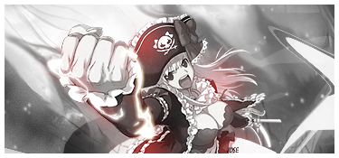
~Nah, I dont think it is bad. It looks very good. I just think that you could place something in the red area. It looks too empty.... <3


I always like your sigs Des. They are really creative and nice. You are better at making them then I am.


Des, you need to work on flow, this extraction had excellent flow, but the pentooling wrecked it, also try to center it more and use a text that fits the signature better. MORE COLORS please. =D
Yeah...
Well I found it hard to come up with a theme for that render, so therefore it became bad :P
More colors ey, then your probably not going to like the new sig xP
But I like it very much xD
And an ava I did following a tut(I suck at avas right :P)
--------------------
And I did try to make a ninja sig for the sotw, but the text got too bad, and I made this one day before deadline
Oh and I haven`t entered it, so that people won`t wonder why I show it now :P
And I made this some weeks ago but I thought it became a too bad quality, and I had no clue what text I should have on it.

Last edited by FluffyDango; 02-28-2009 at 10:24 AM.
*bump*
Comments would be much appriciated xD
Your most recent sig is awesome! I like the colors you used - it has good depth, and I love the flames coming up from his arm! - nice color management on those. The text is a little bothersome to me...I'm not precisely sure why - I think it's a little too sharp, but other than that, awesome sig! ^^

Des I love this new siggy and the type, although a bit pixelly fits (that is possibly over-sharpened). Really nice choice of colours too. The flames are a nice effect too ^^ This is a massive improvement on those in your previous post. gj

Des..okay here's my honest opinion...THAT SIG LOOKS AWESOME BRO XD Love the contrast and lighting. It's just perfect if you ask me. In my eyes atleast I see it as great work. Good job man. Keep it up.
Minato Namikaze 2007. www.Minato.us ( Yondaime Hokage. )
Mira:
Thank you
Yeah the text became too sharp, I blurred it a bit, but forgot to add it here(I`ll do that now hehe)
Dark: Thnx ^^
Minato: And thnx you
----------------------------------
Due to lack of motivation I haven`t posted anything for awhile.
(Except extractions though)
So I know this update sucks, but I was trying a tut, 3d stuff
V1
V2
PS crashed when I was adding text, so I had to restart ps, but I took a screenshot befor closing ps :P
And so it may be bad quality now
Last edited by FluffyDango; 04-03-2009 at 03:16 PM.
3 days since last post and no one has commented(well I can understand it, the last sig sucked
New one, a request.
Related to a game I`m playing.
Text is in norwegian.
And that fairy is tinckerbell(peterpan right)
Wow, Des o.o I leave for a couple of months and you've started your own sig factory ^.^
These are all really good, and getting better each time, I love the last two you've put up, the first is really cute and the second has verrry good lighting
well done des :3


The new sig screams adorably fluffy! I'm not a big fan of italized text and I really don't think it fits the sig much. And the motion blur type effect doesn't really look that good behind the text. The focus of the signature is really soft, so maybe sharpening it up would help some. Good job :3
SSD:
Thnx for commenting ^^
And neh, sig factory? :P
One sig every 2 weeks, or longer?
Jaggy:
Hihi yeah XD
The "motion blur" effect your talking about is actually a c4d
I tried something with the text work I sawon a sig on DA
Should have done something else yeah xP
And thnx for commenting ^^
-------------------
New sigs:
It`s for some guy on a forum related to an online game I play, the guys nick is Urge xD
I made 4 versions, but liked that one most.
The logo thingie I had to vectorise
Original pic: http://i40.tinypic.com/1ictaw.jpg
And I entered the SOTW with a bad sig lol

Last edited by FluffyDango; 04-17-2009 at 05:31 PM.
Wow, I really like the Urge Intense sig text work. The colors are nicely vibrant, though maybe the top of the orange blob should be a brighter orange. Also perhaps the sig would look better if you added some of the patterns like the ones on the original bottle.
The Megaman sig is awesome! I really like the colors on that one. Maybe the background details should be sharpened somewhat, but the foreground is very nice. Awesome sigs!
The text work is really good with the urge signature. I'm not a big fan of the green you used, but thats okay. Though like Mira said, they are very nice and vibrant.
The SOTW entry is extremely good. The text isn't very awesome, but the overall outcome is really nice.
Mira:
Thnx for the comment :3
Patterns, hmm ok I`ll see if I can make some patterns like that.
Jaggy:
Thank you too for the comment :3
The green and the yellow for the bg on the Urge tag I eyedropped from an Urge bottle, yellow as in the color of the soda, and the green from the label.
Wow you really think the sotw is extremely good? xP
The text was damn hard to get nice :S hehe
-------------------------
New set


I really love your Ori-hime signature. The colors and sparkles make it look awesome. :]
月の光は愛のメッセージ
One more I clashed together for a SOTW on another forum(about 1 hour work)

Wow Des!,
You really really really got better!
I remember you just started out with PS. :P
Dunno if you remember me tho ><
But I've been looking through your sig thread and you really surprised me.
You got so much better!
Keep up the good work!
Sig by me
And after aaages I am going to reply to your thread OwO
Sowwie, dear :33
I really love your AF-STOW entry. As Mira said, the background details could be a bit more sharper but it looks very good overall. I love the pinkish color x33
And...oh my gawd, it is a VERTICAL siggie!! =DD I love vertical ones.
Your newest set is very....flower-ish xDD I don't know how to explain.
The only thingy I don't like is the font. It is hard to read ^^;
Thnx for the comment Jimbow
Ofc I remember you xD
And thnx you Celeste for the comment too
---------------
Ok my Pokèmon sotw entry.
I got votes yey xD
It seriously made me very happy xD
But it did get 5 votes really, Rem nightfall`s vote that follwed the voting rules got deleted :/
Hmmm....
Des, I thought this sig was so cute. You did really well with it. =)
You improved so much since your first post. Keep up the good work.
Something new. and robably not that good :P
Border
No border

There are currently 1 users browsing this thread. (0 members and 1 guests)
 Posting Permissions


Bookmarks